Direct Delivery: the launch


Update: I’ve been informed that Viewers that have the Merchant Outbox as a folder may need a code port in order for it to work.  

The long-awaited Direct Delivery system was launched today in what amounts to a very low-key announcement that hasn’t been promoted to the Featured News section of the blogs and people’s dashboard. In development for around a year or so, the system has been subject to a range of issues, technical and otherwise and – at time – a dearth of information coming out of the Lab, something which itself has caused no small amount of concern from merchants.

What is Direct Delivery?

New DD folders as they might appear in some TPVs.(Note the Merchant Outbox FOLDER as displayed may be non-functional in the early days of DD)

For those not in the know – and there are some going on the number of “What’s that?” I’ve received when asking if people are ready for its introduction – Direct Delivery is, in a nutshell:

  • A means by which content creators and merchants can manage the goods they sell through the SL Marketplace without the need to use Magic Boxes to store inventory in-world. Everything can be handled directly from within their inventory / within their Viewer
  • A new means by which anyone buying from the SL Marketplace will receive items they buy / received gifts other have brought for them via the Marketplace, using a new section of the inventory panel / a new folder called Received Items.

The system uses two new elements in the Viewer: the Merchant’s Outbox panel / folder and the Received Items panel / folder. Whether a panel or folder is used is the choice of the Viewer developer.

Torley is back (Go, Torley!) with a video overview of Direct Delivery:

Essential Information for Merchants

As a part of the launch, LL have announced the following for the overall migration from Magic Boxes to Direct Delivery:

  • April 2 through 13, 2012: In-world Q&A sessions on using and migrating to Direct Delivery
  • April 18, 2012: All listings priced L$10 and lower must use Direct Delivery
  • May 16, 2012: Magic Boxes no longer allowed for any Marketplace listing
  • ANS is currently NOT supported with Direct Delivery – it will be “turned on in the next couple of weeks”.

Receiving Goods via Direct Delivery

Until the launch of Direct Delivery, items from the Marketplace would require that you manually accept them (via an in-world pop-up) before they would be delivered to the OBJECTS folder in your inventory.

With the launch of Direct Delivery, this now changes:

  • Any items you purchase from the Marketplace  – or which are bought for you as a gift – will automatically be received; there is no need for you to be on-line when they arrive
  • Items will be received into a new panel, called RECEIVED ITEMS, which is either a panel that will become visible at the bottom of your inventory floater when you have received one or more items from the Marketplace (most V3-based Viewers), or which will appear as a folder in your inventory (V1-style Viewers – see image above).
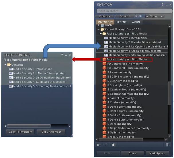
Direct Delivery: from the Marketplace to you (some steps omitted, example uses a V3-based Viewer with Received Items panel within the inventory floater) – click to enlarge

You can then drag and drop folders from the Received Items area into your inventory, from where you can rez items in-world as usual.

Notes: 

  1. If you don’t see Received Items ether as a panel in your Inventory floater or as a folder, then try following this link and obtaining your Direct Delivery Linden Bear (limited time offer from LL) – note you may have to log-in to SLM to get to the page. This will trigger a delivery to your Received Items panel / floater.
  2. Until the 16th May, merchants can continue to use Magic Boxes if they wish, and some may opt to do so while Direct Delivery “beds in”. Where this is the case, please note that items purchased from the Marketplace will continue to arrive in the OBJECTS folder of your inventory.

Converting Magic Box Contents to Folders for Direct Delivery

Note that boxed items can still be delivered via Direct Delivery, if required – boxes will be delivered within their own folder.

You can convert your current Magic Box items ready for Direct Delivery as follows:

  • OPEN the magic box and COPY TO INVENTORY. This will create a folder of all the items in your magic box – including the Magic Box’s own scripts
  • Delete the Magic Box scripts, as they are not required
  • Drag the first item from the Magic Box folder in your inventory to the ground and:
    •  EDIT it
    • Copy the name of the item from the General tab (highlight & CTRL-C)
    • Create a new folder in the Magic Box folder in your inventory and re-name it the same as your item (CTRL-V)
    • Open the Contents tab of the item in EDIT, and select / drag the contents from the item into the newly created folder in your Magic Box folder.
  • Make any required adjustments to the contents of the folder itself (i.e. if you have additional boxed items, these can be placed in suitably named sub-folders and the additional boxes themselves deleted)
  • Delete the original item from in-world and your Magic Box folder
  • Repeat for the next item.

This process is summarised in the diagram below.

Notes:

  1. In order for your items to be automatically linked with your existing Magic Box listings, it is important that the folder is given the same name as the original item (hence the advised use of copy/paste above when creating the folder).
  2. If a folder is named differently to the original item, it can still be linked to an existing listing, but this must be done manually.
  3. Once you have converted your Magic Box items and uploaded them to the Marketplace (see below), there is no need to keep the Magic Box folder – you can upload to the Marketplace from anywhere in your inventory.
Continue reading “Direct Delivery: the launch”

Firestorm goes FUI

Firestorm 4.0.1.27000 has rolled-out alongside Phoenix 1.6.1.1691, and brings with it a whole host of changes – including the implementation of the team’s take on the Flexible User Interface (FUI).

As is common for Firestorm, it is recommended that you perform a completely clean install with this release.

The changes to the Viewer are apparent from right off the bat: on logging-in for the very first time, a pop-up is displayed asking you if you wish to have which Viewer you are using displayed in the Phoenix / Firestorm support group chat windows – a requirement resulting from the recent TPV Policy changes. Clicking Yes will append “(FS)” after your name when using Phoenix / Firestorm support group chat sessions, clicking No will not display your Viewer choice in the group chat. This is a one-time only pop-up, and only occurs the very first time you use Firestorm (just check the box above the options). Should you wish to change your mind later, you can enable / disable the option directly through a Phoenix / Firestorm support group chat window.

The FUI

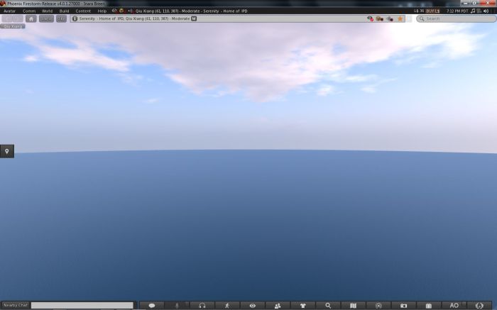
The biggest single change to this release of Firestorm is the adoption of LL’s 3.2 FUI – although with the exception of a single button on the left side of the screen, you’d actually be hard-pressed to know Firestorm is now using the FUI. Quiet and full of cunning is the Firestorm team…!

The new UI: only a single button reveals the truth…

If you do need further proof that this is FUI, simply right-click on the buttons at the bottom of the screen and select TOOLBAR BUTTONS; the familiar button picker toolbox will be displayed – and is filled with a tidy range of additional buttons beyond those offered by LL.

Buttons: we haz them

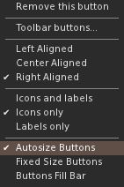
As is common with V3.2-based Viewers, buttons can be placed to the left and/or right of the screen and/or along the bottom of the screen, and can be displayed as text or icons or both. However, in a welcome departure from the norm, buttons on the bottom of the screen can be left / right aligned and those on the left or right aligned to the top or bottom, rather than simply sitting in the middle. Hoorah!

Button alignment and size options

Additionally, and allowing for your screen resolution / size, you can set the buttons along the bottom so that they:

  • Fill the available space (as shown above, where they fill the entire space between the chat bar and the right side of the screen), and will dynamically resize according to how the chat bar is sized
  • Will auto-size themselves to the smallest possible size (depending on whether you opt to use icons, labels or icons and labels & the number of buttons on the bar, this may cause the buttons to wrap over two or more lines
  • Will fix the buttons to a given size (again, depending on the amount of space available, this may wrap the buttons over two or more lines)
Auto-sized buttons

In another move away from a weakness in the FUI, the chat bar in Firestorm is, by default, anchored to the lower left corner of the screen – again: hoorah!

Gimme Some Skin(s)!

Firestorm has, for a goodly while, had an appearance option in the log-in splash screen offering a set of default UI skin effects. These were called Phoenix, V3 and Hybrid. The Firestorm team caught a lot of flak over the use of “Phoenix”, because the UI didn’t look like Phoenix when used.

With 4.0.1.27000, the appearance option button is still there – but it now has four buttons, and does a whole lot more. For a start there are now four options:

  • Firestorm: which displays the default skinning and look seen so far in the screen shots in this article
  • V3: displays a more V3.2-like feel to the viewer (the chat window includes chat headers, etc.) and uses Hitomi Tipomi’s Starlight skins
    • Hitomi’s Starlight CUI option is also available from PREFERENCES->SKINS, which allows you to set custom button colours, etc.
  • Hybrid: uses the MetaHarper skin and utilises a degree of transparency around various elements of the UI (such as the buttons)

However, it is the final option – currently still called “Phoenix”, but potentially to be re-named “V1” – that should silence critics over the use of the “Phoenix” label. Here’s why:

Firestorm goes V1

Obviously, the UI isn’t totally V1 – “Radar” is called “People”, the menus are still the V3.x menus, pop-ups may not appear as expected – but various additional options (such as IM notifications appearing in the chat console, bottom left) can be set through Preferences. Given the layout has been built from scratch by Zi Ree, herself a V1-style Viewer user, this should satisfy the requirements of most who prefer that look and feel, offering a more than acceptable compromise.

Snapshot Floater Update

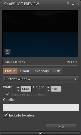
Snapshot floater updated

Firestorm 4.0.1.27000 sees the snapshot floater overhauled, with the “slider” effect used on the Build floater being used to open / close the additional snapshot options. PLUS – in a move that will have many cheering – you can now send snapshots to your web profile feed!

Direct Delivery and Other Bits

With Direct Delivery due for roll-out on Wednesday 21st March, this release incorporates the required support for Received Items.

This release also gets the Destination Guide floater (re-worked by Leyla Farazha) and the Avatar Picker floater common to Viewer 3.2 (and their associated buttons).

There are a host of other fixes, tweaks and revisions all of which can be found in the release change log (complete with originator attributions), and which include:

  • Growl support for Windows (still a work-in-progress)
  • Optional viewer tag colors based on distance (chat, shout, beyond shout range)
  • Option to include distance to other avatars in their name tag
  • Toolbar buttons for area search, statistics, web browser, debug settings
  • “Eject from Group” on the group participant context menu
  • RLVa updates
  • Ability to hide empty system folders in a dynamic way
  • The AO button is now a single button for configuration with an inset button for turning AO functions on / off.

Feedback

Possibly one of the most anticipated Firestorm updates since the Viewer was first launched, this release packs a lot into it, and it is clear the entire team has worked hard to incorporate a lot of features and people’s feedback, and rise to the challenge of producing a Viewer that can meet the needs of a very diverse audience.

And I think they’ve succeeded.

There is much here to please those who still feel frustrated with the V3.2 in terms of buttons and alignment, those who like the existing Firestorm layout and those who prefer a V1-style approach to their Viewer. Equally, there are probably a couple of things that are going to be missed for those who liked them, such as the Sidebar-like sliding of floater from the right side of the screen (although obviously, panels can be moved there and will persist on opening between log-ins). But we should all try and move with the times…

Performance-wise, this release is on a part with other Viewer releases of late, with fps rates around the mid-30s on reasonably busy sims, dropping to mid-teens with shadows enabled. I’ve not run the Viewer fast or hard enough as yet to really consider stability, but in logging between appearance settings I didn’t have any of the “locking up” on log-out I’ve experienced of late with 3.3.0.24880 (in particular) and .24882.

While it may be my eyesight and the lateness of the hour, shadows appear to render somewhat more sharply with this release, and I’m finding myself wishing Firestorm has a gamma correction capability for photography – but we can’t have everything!

I’m particularly enamoured of the button alignment / autosize functions. These have allowed me to retain the look-feel from 3.3.0.24882 and be able to position my custom “multi-HUD” where it is both within reach and nicely tucked out of the way. Coupled with the anchoring of the chat bar, this alone makes this release of Firestorm a winner in my book.

Firestorm Videos

Two videos introducing the Firestorm FUI Beta

Related Links

Phoenix gets set for Direct Delivery

Phoenix 1.6.1.1691 has been released today. This has been expected since the recent updates to the TPV Policy required the removal of the on-line truth status from the profile floater.

More importantly, the update prepares Phoenix for the forthcoming roll-out of Direct Delivery, scheduled for this Wednesday, the 21st March. As such, it is very important for Phoenix users to upgrade to this release if they wish to be able to use the SL Marketplace to receive items once Direct Delivery is launched and merchants switch over to it. Additionally, the Viewer includes the V2 inventory fetch system.

Other updates include:

  • RLV updates (Kitty Barnett)
  • Optional support group viewer version identification (Zi Ree, Kadah Koba)
  • GPU table updates (TankMaster Finesmith)
  • Added CHOP, MAINT, EXP, SINV, PATHBUG, and DOC to jira parser (TankMaster Finesmith)
  • Option to show script time in either ms or µSeconds (Kadah Coba)
  • Allow /me’ when using viewer prefix (Inusaito Kanya)
  • Support for CreateInventoryCategory capability (Henri Beauchamp)
  • Backport of V3 inventory loading at login (Henri Beauchamp & Singularity Viewer)
  • Additional fast timers from V3 (Henri Beauchamp)

It is recommended that a clean install is performed for this release.

Related Links

Niran’s Viewer 1.30: pushing the envelope

Note: Niran subsequently released versions 1.31 and 1.32 following this review. Both contain tweaks and additions to 1.30, including further floater layout alignments (most notably the People floater (1.31) and the Merchant Outbox is translated and functional in German (1.32). You can catch these updates on Niran’s blog

NiranV Dean has released version 1.30 of Niran’s Viewer, which is described as “a complete overhaul” – and there is enough that has gone into it to justify that comment.

The Viewer has been something of a differentiator in the TPV world on a number of fronts: elements of UI presentation are markedly different (such as the menu presentation and things like the Build floater), the Viewer also offers a huge amount of nips, tucks, tweaks and changes to the graphic end of things which, while geared towards higher-specification machines, offer much that is of benefit to machinimatographers and photographers. Finally, and as the Viewer has developed, NiranV has not been afraid to seek to incorporate more of a game-like approach to things.

The changes in this release are extensive – and some are not always obvious (such as localisation in the log-in and log-in progress screens),, which doesn’t make them any less time-intensive to produce. I’ve aimed this piece at covering the more visible changes.

Over-the-Shoulder

The first noticeable difference between 1.30 and earlier versions is that the camera default position has been moved to an over-the-shoulder view. This may not be to everyone’s liking, but it does offer an improved world-view in many respects. As someone already using Penny Patton’s camera offsets to achieve a similar result, I found the look very familiar and comfortable when I logged-in, although the camera position is a little closer than I’m accustomed to seeing. This isn’t a problem until one uses the DOWN ARROW / S-key for moving backwards; while this now turns your avatar around, it also tend to have your avatar well over to the left on-screen, making navigation even over a short distance a little harder. For those that aren’t keen on these views, it’s obviously possible to reset to a more “traditional” view.

Staying with the camera for a moment, mouselook also gains the ability to use the SHIFT key in combination with mouse movements to smooth the motion of the latter on-screen and provide precise tracking. Handy for those in combat / shooting situations.

Floating Away

NiranV’s work on redesigning various floaters continues. With this release, People and Mesh Upload come in for attention.

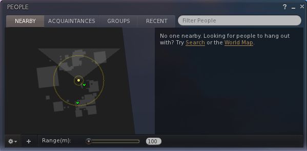
The People floater joins Build in going horizontal – – and this works particularly well with Nearby, wherein the people list and mini-map can be displayed without having to have a long vertical panel opening on-screen.

Revised People floater

Another nice touch with this is that both ONLINE and ALL are displayed side-by-side (although may require extra scrolling if you have an extensive list of friends!).

The Mesh Upload floater has been compressed and the lay-out tided so that it also doesn’t require so much on-screen real estate. The result is a clean, compact approach that is still relatively easy on the eye, although the ability to resize it via dragging might not go amiss for those who would prefer it to be a little bigger.

Mesh upload

The Build floater has been further tweaked and again provides a cleaner display and appears less cluttered than early iterations.

Menus and floaters have also had their transparency adjusted to give a consistent feel right across the Viewer, and to aid in readability.

“Pick a colour, any colour…”

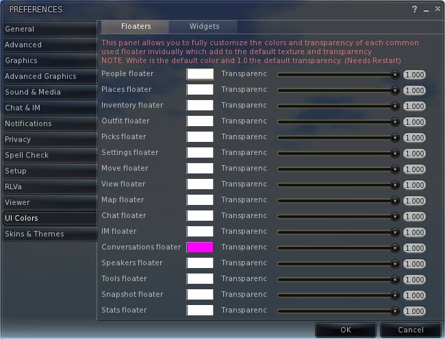
Perhaps the biggest single update in terms of the ability to customise the Viewer is that users can now set the colour and transparency of every common floater in the Viewer and set colours against every common widget.

UI colour and transparency options for floaters

Changes to floaters require a Viewer restart to take effect, while changes to widget colours will be applied immediately.

For those missing KLee’s Viewer, a small nod has been added to Niran’s 1.30: the UI buttons can now by displayed in KLee Viewer style.

And there’s more…

As well as these changes, 1.30 also sees:

  • More work on translating the UI for German and French users
  • Improvements and tweaks to various Preferences panels
  • Fixes to media roll-off and max sliders
  • Incorporation of the latest Shining fixes
  • Text compression (which may help with some crash issues on older cards, but not recommended for ATi systems)

A full list of changes can be found at the end of the blog post on the release.  Gone from this release is the “main menu” option and the SL Kinect2 option. The former is being reworked, the latter may be gone for good due to compiling issues with Linux.

Feedback

I’ve always liked Niran’s Viewer – the “dares to be different” approach has meant that the Viewer has been very innovative and something very different from “standard” 3.x-based offerings. My experience has suffered over the last few releases because my PC has struggled to manage the Viewer, particularly when running some of the more advanced deferred rendering options. Whereas early versions ran very well – frame rates up in the mid-30s sans deferred options, more recent releases have been barely half that.

Release 1.30 goes some way to reversing this trend, allowing me to achieve frame rates of between 28-32 with 3 or 4 others on-sim, and deferred rendering is back on a par with earlier releases (around 8-9fps). This still isn’t as fast my PC can manage with other Viewers, but it’s a lot faster than I’ve enjoyed of late with Niran’s, and as such is very welcome.

In all, the Viewer runs smoothly, exhibits no proclivity towards crashing on me (it rarely has), and I had no lock-ups when taking lots of snapshots with deferred rendering turned on (an issue I tend to get with other viewers, particularly if I move the camera around a lot with the snapshot floater open when running in deferred).

In terms of the UI changes, the ability to make the UI multi-hued may find a lot of appeal among those who like a highly individual look to their Viewer. For me, I like the general tidying done to the Build floater – which is starting to grow on me – and I very much like the new People floater, which really maximises the use of space. The new default camera position is also something that appeals, given I already use something similar, although I’d personally prefer to set my camera back a little further.

Overall, a lot of work continues to go into this Viewer, it’s still one of my two preferred Viewers when it comes to my amateur attempts at photography, and given I’ve got a slight boost in performance with this release, it may well see a lot more use again as I hop around the grid exploring and snapping pictures.

Kudos!

Related Links

Premium Wilderness: a new experience

So, I’m browsing the Destination Guide, looking for a suitable place to cover in my “Virtual Destinations” series, when I come across a new set of premium-only regions labelled “Premium Wilderness”.

First look – the Destination Guide

The regions appear aimed at another Premium membership promotion, and to showcase some of the new pathfinding capabilities coming to SL. At the time I started my explorations, the blog post had yet to appear, so intrigued by what I’d seen in the Destination Guide, I read the byline in the Destination Guide Jump into the adventure that is the Premium Wilderness and set sail for adventure in this new experience – and jumped.

My first stop was Tapir – although as the six regions are all grouped together and have a common theme, you can start in any one of them.

I arrived on a small pier on the edge of a river. A click me sign provided me with the following information:

Welcome to the Jungle! Feel free to explore at your leisure.

Boat Ride:
Take a boat ride and enjoy the scenery. Just click on the boat when it arrives at the dock and enjoy the ride!

Explore:
Follow the paths, you never know where they might lead!

Interact:
Click on the things you see, you never know what you will find!

Sitting on the dock of the jungle: arriving at Tapir

There is a lot to click and play with – touch a multi-hued frog and it will hop around you and then lead you away from the pier…then disappear into the reeds at the edge of the river. There’s a boat that swings by which you can catch for a cruise along the river, or there are inner tubes you can paddle and diving kit for the really adventurous.

How you get about is up to you – walk, ride, swim – and there is plenty to see along the way, with the 6 sims forming a dense jungle-type environment complete with ancient ruins,  brought together in a very atmospheric mix – moreso if you can run with shadows enabled.

Ancient ruins

The experiences within the regions vary widely in content and use. You can, for example, meet a jaguar and play “fetch” with it, or wrestle with a crocodile, or play round-up with a herd of capybaras and corral them. There are also places where you need to watch your step.

Interestingly, when encountering things you can touch, you’ll often get a chat message, such as:

Acoustic Guitar – po: Look in your inventory for Guitar. It should be in your Object folder. Or click on the Recent Items tab at the top to locate it. Right click and select Wear. Right click and select Detatch to take it off.

One assumes this is for the benefit of those new users who have chosen to take the plunge and sign-up directly for Premium membership as a part of the promo offer.

Playing fetch with a jaguar

The regions appear to be intended as a social experience as well – there are numerous places for getting together and chatting / sharing. Some of the experiences are also geared towards sharing – the boat rides through the sims, the  Tahr racing on the beach or Tahr rides through the jungle, using, I assume, the pathfinding capabilities.

Thoughts

While visiting the regions, I was surprised to see comments start popping-up in Group chats that were somewhat negative – including one that suggested the regions are a means for the Lab to “recycle” abandoned land, which strikes me as cynical.

In terms of presentation, the regions are very atmospheric – and I recommend a visit with shadows enabled if you can, especially if you are using Exodus with HDR  / Gamma Correction or Niran’s with its advanced rendering options.

In terms of experience, I have to admit it’s a mixed bag. The regions are immersive, and offer a lot to see and do – but there were some oddities. While accepting that this might be another example of the “publish-test-polish” approach seemingly beloved of Rod Humble – but it does seem odd that other new capabilities coming to SL are seemingly ignored. The game of fetch with the jaguar, for example, requires you accept a stick into your inventory each time you touch the jaguar – and one wonders why the capability to attach the stick to your avatar, bypassing inventory altogether wasn’t used. Particularly as you are repeatedly prompted to accept the stick from the jaguar after each throw, leading to a possible small accumulation of sticks. But this is a minor niggle in the scheme of things.

Overall, the regions offer an interesting diversion for those with a Premium account who might like to spent time exploring something a little different. So why not give it a try?

Parcel encroachment live across the grid

It appears that parcel encroachment is now active across the grid (with thanks to Nalates Urriah).

The feature, which allows objects encroaching on one parcel from another to be returned, has been rolling-out across the grid for a while, and was turned-on last Thursday.

The feature has some guiding parameters to help manage / control the return of objects, which should provide a reasonable level of control, including:

  • For private regions, the feature must be turned on at a per region basis
  • Return is based on an object’s physical shape, not its visible shape, so while an object may appear to encroach on a region boundary, it may not actually be returned orthat it may not appear to encroach, but is still returned. LL currently list the objects most likely to suffer such mismatches as:
    • Trees and grass
    • Sculpt and flexiprims (and, one assumes, mesh)
    • static objects using the llTargetOmega() feature — they appear to be spinning but are not spinning in the physics engine
  • “Estate content” and public works content (Mainland) is protected against return (so, for example, items on a parcel that are owned by an Estate Manager / owner will not be returned)

Phantom and Volume Detect objects will still collide for encroachment. At the time the feature was first documented (January 2011), cross-region encroachment was under development. Whether this is still the case is unclear.

Some of the details as to how the feature works – and how to enable it – may change when the wiki page on the feature is updated.

No blog post / forum post appears to be on the horizon to announce the change. However, those wishing to find out more may want to keep an eye on the wiki page for updates.