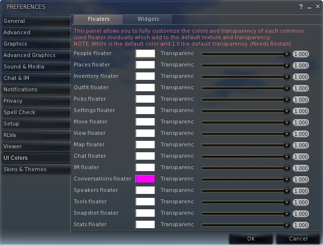
 Firestorm 4.0.1.27000 has rolled-out alongside Phoenix 1.6.1.1691, and brings with it a whole host of changes – including the implementation of the team’s take on the Flexible User Interface (FUI).
As is common for Firestorm, it is recommended that you perform a completely clean install with this release.
The changes to the Viewer are apparent from right off the bat: on logging-in for the very first time, a pop-up is displayed asking you if you wish to have which Viewer you are using displayed in the Phoenix / Firestorm support group chat windows – a requirement resulting from the recent TPV Policy changes. Clicking Yes will append “(FS)” after your name when using Phoenix / Firestorm support group chat sessions, clicking No will not display your Viewer choice in the group chat. This is a one-time only pop-up, and only occurs the very first time you use Firestorm (just check the box above the options). Should you wish to change your mind later, you can enable / disable the option directly through a Phoenix / Firestorm support group chat window.
The FUI
The biggest single change to this release of Firestorm is the adoption of LL’s 3.2 FUI – although with the exception of a single button on the left side of the screen, you’d actually be hard-pressed to know Firestorm is now using the FUI. Quiet and full of cunning is the Firestorm team…!
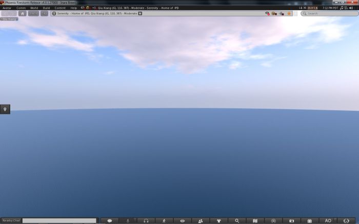
If you do need further proof that this is FUI, simply right-click on the buttons at the bottom of the screen and select TOOLBAR BUTTONS; the familiar button picker toolbox will be displayed – and is filled with a tidy range of additional buttons beyond those offered by LL.

As is common with V3.2-based Viewers, buttons can be placed to the left and/or right of the screen and/or along the bottom of the screen, and can be displayed as text or icons or both. However, in a welcome departure from the norm, buttons on the bottom of the screen can be left / right aligned and those on the left or right aligned to the top or bottom, rather than simply sitting in the middle. Hoorah!
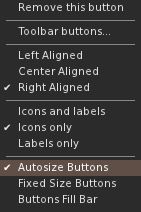
Additionally, and allowing for your screen resolution / size, you can set the buttons along the bottom so that they:
- Fill the available space (as shown above, where they fill the entire space between the chat bar and the right side of the screen), and will dynamically resize according to how the chat bar is sized
- Will auto-size themselves to the smallest possible size (depending on whether you opt to use icons, labels or icons and labels & the number of buttons on the bar, this may cause the buttons to wrap over two or more lines
- Will fix the buttons to a given size (again, depending on the amount of space available, this may wrap the buttons over two or more lines)

In another move away from a weakness in the FUI, the chat bar in Firestorm is, by default, anchored to the lower left corner of the screen – again: hoorah!
Gimme Some Skin(s)!
Firestorm has, for a goodly while, had an appearance option in the log-in splash screen offering a set of default UI skin effects. These were called Phoenix, V3 and Hybrid. The Firestorm team caught a lot of flak over the use of “Phoenix”, because the UI didn’t look like Phoenix when used.
With 4.0.1.27000, the appearance option button is still there – but it now has four buttons, and does a whole lot more. For a start there are now four options:
- Firestorm: which displays the default skinning and look seen so far in the screen shots in this article
- V3: displays a more V3.2-like feel to the viewer (the chat window includes chat headers, etc.) and uses Hitomi Tipomi’s Starlight skins
- Hitomi’s Starlight CUI option is also available from PREFERENCES->SKINS, which allows you to set custom button colours, etc.
- Hybrid: uses the MetaHarper skin and utilises a degree of transparency around various elements of the UI (such as the buttons)
However, it is the final option – currently still called “Phoenix”, but potentially to be re-named “V1” – that should silence critics over the use of the “Phoenix” label. Here’s why:

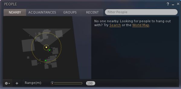
Obviously, the UI isn’t totally V1 – “Radar” is called “People”, the menus are still the V3.x menus, pop-ups may not appear as expected – but various additional options (such as IM notifications appearing in the chat console, bottom left) can be set through Preferences. Given the layout has been built from scratch by Zi Ree, herself a V1-style Viewer user, this should satisfy the requirements of most who prefer that look and feel, offering a more than acceptable compromise.
Snapshot Floater Update
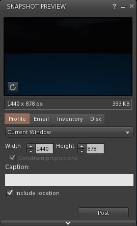
Firestorm 4.0.1.27000 sees the snapshot floater overhauled, with the “slider” effect used on the Build floater being used to open / close the additional snapshot options. PLUS – in a move that will have many cheering – you can now send snapshots to your web profile feed!
Direct Delivery and Other Bits
With Direct Delivery due for roll-out on Wednesday 21st March, this release incorporates the required support for Received Items.
This release also gets the Destination Guide floater (re-worked by Leyla Farazha) and the Avatar Picker floater common to Viewer 3.2 (and their associated buttons).
There are a host of other fixes, tweaks and revisions all of which can be found in the release change log (complete with originator attributions), and which include:
- Growl support for Windows (still a work-in-progress)
- Optional viewer tag colors based on distance (chat, shout, beyond shout range)
- Option to include distance to other avatars in their name tag
- Toolbar buttons for area search, statistics, web browser, debug settings
- “Eject from Group” on the group participant context menu
- RLVa updates
- Ability to hide empty system folders in a dynamic way
- The AO button is now a single button for configuration with an inset button for turning AO functions on / off.
Feedback
Possibly one of the most anticipated Firestorm updates since the Viewer was first launched, this release packs a lot into it, and it is clear the entire team has worked hard to incorporate a lot of features and people’s feedback, and rise to the challenge of producing a Viewer that can meet the needs of a very diverse audience.
And I think they’ve succeeded.
There is much here to please those who still feel frustrated with the V3.2 in terms of buttons and alignment, those who like the existing Firestorm layout and those who prefer a V1-style approach to their Viewer. Equally, there are probably a couple of things that are going to be missed for those who liked them, such as the Sidebar-like sliding of floater from the right side of the screen (although obviously, panels can be moved there and will persist on opening between log-ins). But we should all try and move with the times…
Performance-wise, this release is on a part with other Viewer releases of late, with fps rates around the mid-30s on reasonably busy sims, dropping to mid-teens with shadows enabled. I’ve not run the Viewer fast or hard enough as yet to really consider stability, but in logging between appearance settings I didn’t have any of the “locking up” on log-out I’ve experienced of late with 3.3.0.24880 (in particular) and .24882.
While it may be my eyesight and the lateness of the hour, shadows appear to render somewhat more sharply with this release, and I’m finding myself wishing Firestorm has a gamma correction capability for photography – but we can’t have everything!
I’m particularly enamoured of the button alignment / autosize functions. These have allowed me to retain the look-feel from 3.3.0.24882 and be able to position my custom “multi-HUD” where it is both within reach and nicely tucked out of the way. Coupled with the anchoring of the chat bar, this alone makes this release of Firestorm a winner in my book.
Firestorm Videos
Two videos introducing the Firestorm FUI Beta


