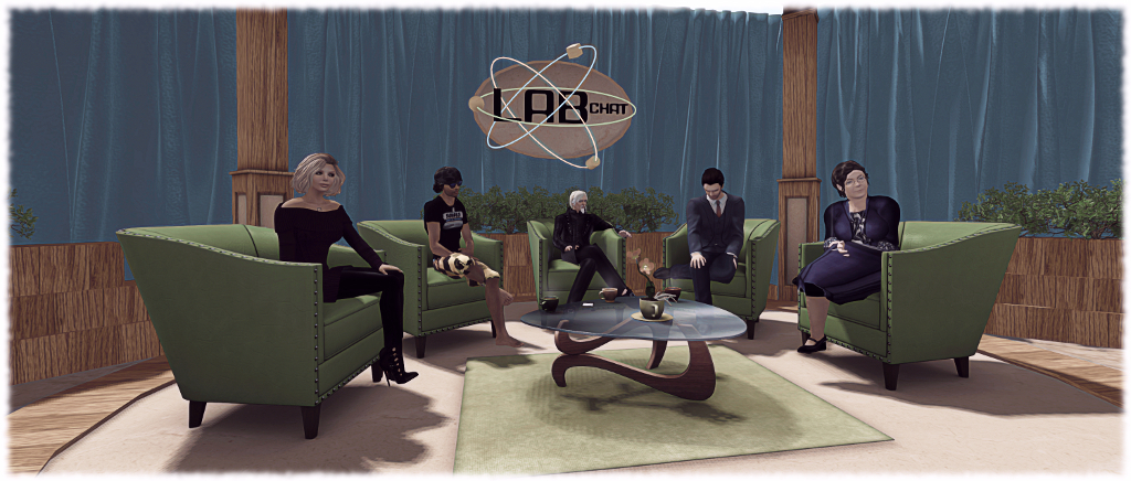
Friday, May 6th saw the third in the Lab Chat series take place in-world, featuring guests Oz Linden, the Director of Second Life Engineering, Troy Linden, a Senior Producer of Second Life and of course, Linden Lab CEO, Ebbe Altberg, in his alter-ego of Ebbe Linden.
You can find the full transcript, with audio extracts, as previously published in these pages by following this link.
However, I’ve been asked by a number of people if I could summarise things, rather than them having to read the entire transcript or just having a list of up–front links. I’ve therefore produced this summary, complete with links to the full answers within the transcript. If this approach proves popular with readers, I’ll adopt it as the lead-in to future transcripts.

Project Bento
- How will creators make poses and animations for the new bones (wings, fingers, facial expressions, etc)? Creators will be able to use existing plug-ins (MayaStar, Avastar) to create animation content for Project Bento as is currently the case. Full answer.
- Will there be any in-world tools for Bento pose and animation creation? At this point, Second Life doesn’t have any in-world animation creation tools, and Bento does not attempt to add them. Instead it leverages existing out-world tools. Full answer.
- Will Bento have the ability to animate (or pose) separately? Yes. Second life does already support isolating animations to certain parts, and Bento is no different. Full answer.
- Will any of the work on the Bento facial bones be incorporated into the default/system avatar for expressions, etc? The default system avatar has not at this point been re-rigged to use the new Bento bones. However, custom mesh heads, when rigged to the bones, will be able to make use of them. Full answer.
- Will there be, or are there any plans to introduce animated mesh into Second Life (e.g. animated pets, etc)? No comment on whether or not animated meshes will be supported in the future. However, Bento bones can be used to provide a level of animation of creatures, objects, attached to an avatar (e.g. bats flying around your head). Full answer.
- Will any attempts be made to have the new bones be scriptable for the use in user-created animation rigs like Anypose? There are no plans to add scripting capabilities that are specific to Bento at this time. Full answer.
- Can some Bento UG meetings be held at an “Asia friendly” time? It will be looked into. Full answer.
Second Life

- Can we have tools inside inventory to help manage it? The Lab is focused on improving inventory operation robustness, and will have a new viewer offering this soon. Better inventory management interfaces and tools are a terrific idea, and something TPVs could even contribute. Full answer.
- Will we see similar edutainment-type experiences as the new social islands, but aimed at more advanced users? Yes, very probably in time. Full answer.
- Why doesn’t Second Life have gift cards which can be purchased in stores like other games? Probably more interesting to think of ways to sort-of refer a friend, maybe, with an associated gift card to get them into the world. But something to examine. Full answer.
- Any plans to provide more robust photography tools similar to Firestorm’s Phototools? Will existing tools be updated? Lab prefers not to comment on things until close to release; photography floater updates an excellent opportunity for TPV / open-source contributions. Full answer.
- Can sound files be increased in length beyond the 10 second limit? Yes, and animation file sizes can be increased. By how much isn’t clear, and the work will be dependent on moving the assets to CDN delivery first. Full answer.
- Will we be able to texture more than 8 faces when editing mesh in-world? The change made in Sept 2015 refers to allowing more than 8 textureable faces as a part of the upload process, not to in-world editing. No further changes planned at present. Full answer.
- Will any similar incentive to the private island buy-down offer be presented to Mainland owners? Not at present. Time is required to analyse the other impact of the buy-down offer and determine its overall benefit (or otherwise). So nothing planned for Mainland at the moment or immediate future. Full answer.
- Will anything be done to address vehicle region crossing issues, particularly with large vehicles, which have become worse over the past year? Lab not aware of any changes that should have made things worse, but will look into matters. However, large vehicles have always been problematic on region crossings, so no promises. Full answer.
- Will RLV functionality be added to the official viewer? Longer-term, Lab will add more capabilities to Experience Keys which will be similar to, but not compatible with, RLV. Full answer.
- Will Experience Keys be opened to Basic members to create Experiences? Experience Keys will remain Premium-only do to potential griefing abuse. Premium helps ensure accountability. Full answer.
- Will Experience Search (and other search) be improved? The current focus is the Marketplace search beta, using Elasticsearch. This will likely become the default MP search engine soon. The Lab may then use Elasticsearch on other search capabilities. Full answer.
- Will the Marketplace Listing Enhancement issues & JIRAs be addressed? The Lab believes they have a fix for a major cause, which is in the process of being implemented and may clear up most issues. Full answer.
- Can the number of Estate Managers be increased? Will be looked at. Full answer.
- What’s the best way to report group spammers? Single or Multiple reports? Via the Abuse Report, Quality of report, not quantity is important. Many reports aren’t actionable as they are incomplete. Full answer.
- Does LL give employees time to use SL? Yes & all staff are encouraged to spend time in SL when first starting. Oz Linden also looks to recruit from SL users where possible. Full answer.
- Any thoughts on Vulkan graphics support for SL? For SL, no. Sansar, yes.
- Can we have an update on Linden Realms and the grid hunt games available through the portal parks? New Linden content is coming, but no details given.