
On Monday, November 22nd, 2021, and following on from comments made by Reed Linden at the November Web User Group meeting, Linden Lab launched the new look for Second Life Search (as seen both via the web and in the viewer). The launch was accompanied by a blog post – New Look for Search – that outlined the update, with several screen shots of various aspects of search return displays, etc., and a resident-launched forum thread discusses the changes.
Before going any further, it is important to note a couple of points, even though in general terms they have been noted:
- This is an update to the web pages / style sheets defining how search and search results are displayed. It does not mark any changes in how the actual search algorithm works – so things like relevancy in search results, etc., will not be altered or improved as a result of this facelift.
- However, a further overhaul of search which does include tightening the algorithm and improving results / relevancy and general performance will be initiated in 2022. This will apparently utilise third-party Search tool development expertise external to LL in an attempt to get a “first class” search implementation.
I’ll admit my first reaction on seeing the new search home page, both in the viewer and on the web page was, “ugh!” It was a shock to see the minimalism of Flat Design, even though this has been common to operating systems for a good while now, and has been something LL has started pushing towards. Frankly, it is not something I personally like as I find it bland and, in some executions, not particularly intuitive. However, if LL do want to make their product more in-line with current aesthetics with operating system and application design, and if they are serious about making SL more accessible through mobile / portable devices as well as modern desktop operating systems, then the move is understandable.
I’m not going to comment too much on functionality here, simply because this is a makeover, not a change in quality of returns of searches, etc. I’ll save such comments until after the complete overhaul of Search has been completed. So here are some fairly basic thoughts on the visuals.

Home Page
Pros:
- Looks clean, options easy to identify, and the colour change when and option is selected is good approach for those who may have visual impairments that make seeing checks in boxes difficult.
- The left-side tabulation for high-level search categories is better than the old drop-downs, with the tailored options for each category are a further good moves.
Cons:
- A terrible waste of space in the banner area, which is particularly noticeable when viewing Search within the viewer. Frankly, the SL logo looks as if it is about to be swallowed by the Great Charcoal Void.
- Do the left sidebar tabs really need to be so broad, given the font size and the depth of each tab?
Results Listings
Pros:
- Much better listing layout and improved readability. The left-side tabs are useful to have, together with Maturity ratings.
- Changes impacting the list of results (such as changing the Maturity rating) are responsive and obvious.
- As a largely legacy search user when it comes to search places, I’m not sure if the linking to Place Pages for additional information is new or not, but if it is, then it’s a good move even if Place Pages are drastically under-utilised and in need of Lab TLC.
- Tucking thumbnails into the result title helps to compress the amount of space taken by individual results.
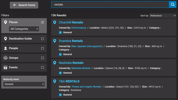
Cons:
- The last point made, the number of results displayed before scrolling is required is an annoyance, and something of a step back. Yes, individual items in a set of returns are a lot more readable, thanks to a larger, cleaner font, but this does come at a price.
- In this, the fixed column width with two sidebars also doesn’t help. Why not make Classified part of the left sidebar below the items already there? Or make them a toggle off / on option so the display area for results could expand sideways and allow for a few more results to be displayed before scrolling becomes necessary?
- There are also some informational elements lacking (such as traffic); should they return, this could further impact the number of returns.
General Thoughts
At the end of the day, any UI change is going to cause consternation of varying degrees and for a variety of reasons: most of us are prone to react negatively to changes we perhaps hadn’t been expecting; plus we all tend to consider ourselves armchair UI experts. Search is a particularly emotive subject as it is a tool that is especially important to some for their business, etc., and thus doubly hard to balance out to satisfy all needs. As a more “casual” user of Search, and spending a good portion of the day playing with it, I can live with the shortfalls and can appreciate the improvements, and will await further changes to see how things fair.


 A Seanchai Library Thanksgiving tradition with Shandon Loring.