2011: “That was the year, that was” (part 2)

Continued from Part 1

September

October

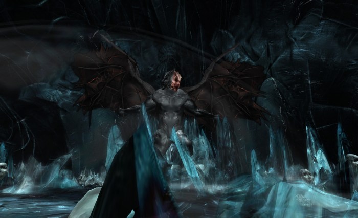
The Ninth Circle – Rebeca Bashly’s “Inferno”
  • Code relating to Direct Delivery started arriving on the Main Grid and Direct Messaging came to Web Profiles and we had some reasonably good economic metrics for Q3; things then went somewhat awry with another grid-wide megaprim removal
  • The Lab somewhat surprisingly launched a private region sale which, while not stopping the weekly losses of sims from the grid, actually did much to reverse losses to date; unsurprisingly, those who had made a big song and dance about revenue losses in September failed to comment on this reversal of their doomometers…
  • The Adult Gateway situation continued to boil when a notecard circulated in-world revealing the winning bid while LL kept quiet in meetings; meanwhile, and in contrast to predictions that LL were trying to “kill” Adult content, the Adult Forum “went public“, joining a number of other moves through the year to make Adult content more visible & accessible
  • Following on from September, Lee Quick announced a Crowdfunder project to try to secure the survival of Kirsten’s Viewer
  • The marvellous Login2Life had its premier at long last, followed by a week-long free streaming on German TV channel ZDF’s website
  • It emerged Will Wright had joined LL’s Board sometime in late summer

November

December

Destinations

2011 also saw me resume my travels around SL, some of which I blogged about over the course of the year. On the high seas I visited Black Spot with its pirate theme, and the 3-sim wonder of the SS Galaxy. Architectural masterpieces such as Alpha and Omega Points, Al Andalus Alhambra  and Mont Saint-Michel were all on my itinerary, as were photographer’s dreams like The Looking Glass, World’s End Garden and !Lost World! I also relaxed in scenic sims such as Calas Galadhon, took time to visit living museums including the International Spaceflight Museum and historical sims like the Duché de Coeur as well as a number of SL historical sites.

A Personal Perspective

Despite code breakages, cock-ups on the Marketplace, the angst and drum-pounding over region losses (Rodvik, if you’re reading this – that’s your Moria Moment, not the new UI 😉 ) and the like, I personally feel that 2011 has for the most part been on the “good” side of the balance.

It hasn’t all been plain sailing, but Rodvik has done much during his tenure over the last 12 months that I believe has been to the good of SL as a whole, and that while there are going to bumps and bouncing to come, the future is actually brighter now than, say, 12 months ago. Certainly, the company continues to report strong revenues ($75 million), and are generating good profits.

Mesh house from Islay Novocaine: 91 prims *fully furnished* (house structure: 27)

Like it or loathe it, there is no denying mesh is something users have been demanding for years and has at last been delivered. While the initial uptake may well be slow, I’ve little doubt it will make its presence felt in 2012. We have new tools for creativity coming on-stream, and unlike some, I don’t have a problem with LL positioning SL as a platform upon which games can be developed. Let’s face it, games are a large part of the SL experience – from role-play through combat to board and table-top games. I also don’t I don’t begrudge LL rolling-out and promoting the tools via Linden Realms or with their statement that access to the tools will be gated – although I do caveat the latter in that we’ve yet to see what the gateway will be, but I doubt it will be as hideous or segregating as some are already predicting.

For 2012 we’ve been promised lots: more efforts on performance and stability, yet more tools, the arrival of Direct Delivery, and so on. However, one thing I really would like to see next year is a resumption of direct, informative and open communications between LL and its users. Communications this year seemed to dry up faster than a puddle of spilled water in the Atacama.

It’s going to be interesting to see exactly what LL are going to present to the world in terms of new products. Of course, the doomsayers have already used LL’s pending diversification as yet another hook on which to hang their end-of-the-world pronouncements. So, here’s my prediction for 2012: All predictions of SL’s forthcoming demise will be comprehensively proven wrong.

Again.

Happy 2012 to one and all!

Refresh your Viewer experience: have a Milkshake!

milk-1Milkshake is the new Viewer from Cinder Roxley, who originally provided the Frontier Viewer. Unlike Frontier, which was a V1 TPV, Milkshake is a V3.2-based Viewer, and offers some very interesting options and additions.

Commenting on the switch, Cinder informed me, “[The] Snowstorm codebases allow much more flexibility to a developer. So it’s a lot more fun to hack on than antique snowglobe.”

The Viewer is currently only available for Windows, and this review covers release 3.2.6(2).

Installation

The installer is pretty compact compared to some Viewers: just 26Mb in size (although the latest 3.2. Development Viewer installer is only 28Mb), and the Viewer requires just 99Mb of disk space, once installed.

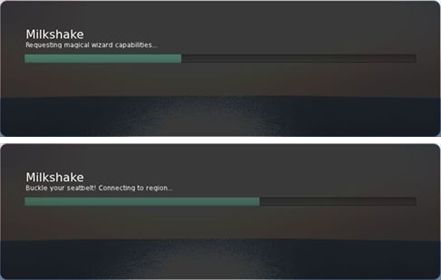
Logging-in reveals a little of Cinder’s sense of humour: forget the MotD, it’s the by-lines as the Viewer loads and connects to the servers that raise a smile. It’s certainly the first time I’ve been told to buckle my seatbelt when connecting to SL – although there have been times in the past when I’ve metaphorically done so!

Milkshake: raising a smile on logging-in

There’s also a little message related to “dressing your avatar” – is this a slight pause in the log-in process to ensure avatar textures get to download before the in-world view loads? If so, nice touch!

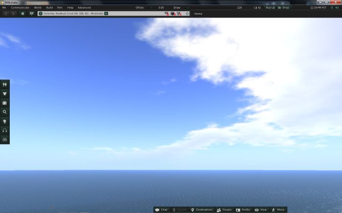
Once running, the UI resembles the standard V3.2 layout; the skin is roughly the same dark tone, but the buttons have a nice green tint to them that makes them look a little less “flat” than those of the official Viewer. The Navigation Bar also includes your location’s co-ordinates by default and incorporates an ABOUT LAND button alongside the HOME button. The menu bar includes an Avatar Offset slider (to adjust your avatar’s position relative to the ground(or prim)) as well as the Draw Distance slider now found in most V3-based TPVs.

Milkshake UI, default appearance

Button-wise, the default load for Milkshake keeps to the V3.2 standard – buttons to the left and bottom of the screen, with only the HOW TO button absent. Most interestingly, the buttons at the bottom of the screen are slightly offset to the right, providing space where the chat bar can be located, for those accustomed to having it V1-like in the lower left side of the screen. It’s still not ideal as the chat bar placement is a little off – but that’s a fault with the V3.2 code, not Milkshake.

Also, if you like to have labels and icons displayed on your buttons and keep all your buttons at the bottom of the screen and have a lot of buttons available, Milkshake will neatly wrap your buttons over two or more lines in the panel without compromising the space “reserved” for the chat bar. This does compromise the chiclet bar, if displayed at the bottom of your screen, but it is a nice touch.

Multiple buttons and the chat bar

Menus

Useful Tools

Milkshake offers a slightly revised Me menu, which includes an additional Useful Tools option. This provides quick access to a range of popular functions and options (right).

The Communicate, World and Build menus are as presented in V3.2, although World includes the option to revert back to Estate Time on the Sun menu, again in keeping with several other TPVs and providing greater convenience to users.

As Milkshake is based on V3.2, it includes the mesh upload option on the Build menu, which works as expected.

Film

Film menu

An interesting addition to the Viewer is the Film menu, which brings together a range of options that should be of assistance to machinima makers. These include avatar and graphics options, so avoiding the need to jump back and forth around Preferences. Changes made to options in this menu are reflected back in their Preferences, where appropriate.

The Advanced menu includes an option to enable RLV for those that use it (on by default); with Help and Develop showing pretty much the same options as V3.2 (with a couple of Admin options absent from Develop).

Buttons, Buttons, Buttons

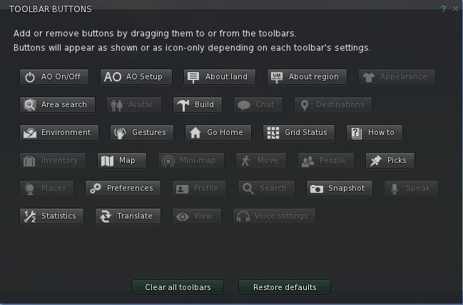
Milkshake provides, to date, the most comprehensive set of buttons yet found in a V3.2-based TPV. Some of these appear to have been pulled-in from other TPVs, most appear to be Cinder’s own work.

Buttons galore!

Joining the LL-supplied buttons, we have: the AO buttons and Area Search button, which I assume have been pulled across from Dolphin; About Region (shortcut to Region/Estate floater – handy for Estate Managers / Sim owners); Go Home (teleport to your home location – useful if you don’t use the Navigation Bar), Grid Status (opens the Grid status page in your designated browser); Statistics (opens the Statistics floater), and Translate (opens the Google Translate web page in your designated browser).

It’s a good selection, although I wonder at the effectiveness of the Translated button. I can understand why it is included; I’m just not sure people are going to want to either cut & paste back & forth between a browser page and the Viewer, or have the built-in Viewer open on their in-world view when chatting.

Preferences

Milkshake sees some changes to Preferences; some of which are long overdue with various options now “built-in” to the Viewer and “on” by default). These include:

  • Flight limit disabled – fly high without the need for either a flight assist system or a bridge mechanism
  • Mu* poses (use “:” instead of “/me” at the start of emotes) on by default
  • Region / Chat range radar notifications are on by default
  • LookAt privacy is enabled by default

Elsewhere in Preferences, Cinder has been hard at work with some interesting tweaks and changes.

General

Has been tidied-up to present just the general settings for the Viewer – items that are tag-specific have been moved as have the typing / WASD options, while the option to run multiple copies of the Viewer has been added (good move; this is all too often buried in other Viewers). Somewhat interestingly, the default language option has been removed.

Graphics

Includes the sub-tabs for Hardware, Rendering, DoF, etc., that can be found in other popular TPVs, but includes some rationalisation of options.

Sound and Media

Presents the V3.2 options with the addition of a checkbox to Display Music Information in Chat. The media filter system currently isn’t implemented, but Cinder informed me that it is very much on her to-do list.

Chat

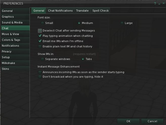
Chat options

The Chat tab includes the following sub-tabs:

  • General: include the majority of the “standard” V3 chat options, although the bubble chat option has been removed (does anyone use that?), and two “IM Enhancement” options added: the first will display “is typing” alongside their name in the IM window, the second will prevent your Viewer broadcasting the fact that you are typing to any Viewer
  • Chat Notifications: presents the chat pop-up check box, together with sliders for setting toast duration times and button flashes
  • Translate: presents the V3.2 translate options
  • Spell Check: presents the spell check options

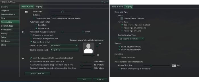
Move and View

Has been overhauled to comprise two sub-tabs, as shown below.

Move / View & Display options

Colours and Tags

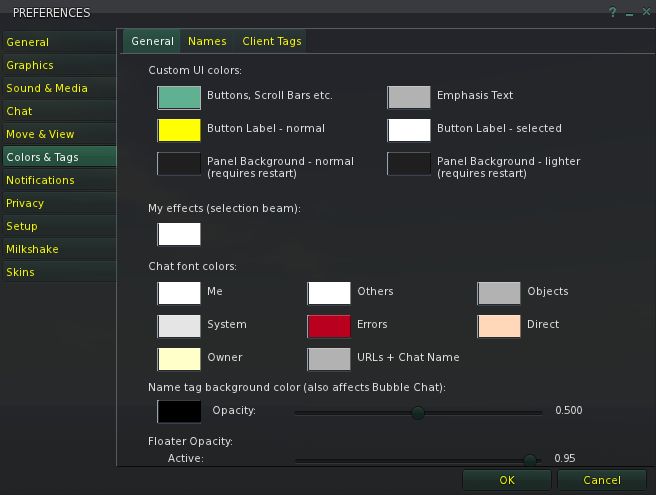
This tab combines (and extends) the colour options for the Viewer and includes sub-tabs for name tags (from the General tab) and their colours, and client tag colours.

The Custom UI Colours in the General sub-tab are an adjunct to the use of skins, drawn from the Starlight FUI. Rather than just applying a pre-defined skin, options are included which allow you to re-colour elements of the UI as well (see the screen capture below, and note the button / tab text colours compared to other screen captures in this article).

Colour tab: note the UI colour options (top)

The system isn’t perfect – button labels can be coloured, but not button icons; floater panels can be recoloured, but not the menu bar, Navigation & Favourites bars, etc. However, the approach does allow for an additional degree of customisation.

Privacy & Setup

Provide access to the V3 options found under Privacy, Setup and Advanced, and adds a number of TPV options as well (options to select history logs, etc., to be cleared under Privacy, for example).

Milkshake

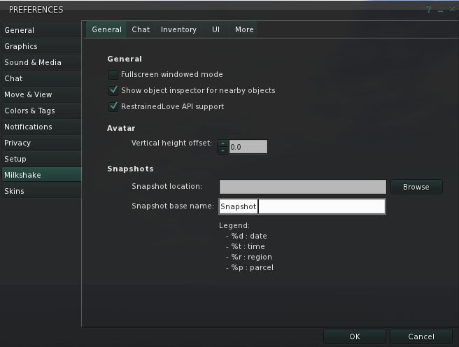
As with many TPVs, Milkshake has its own Preferences tab. This comprises four sub-tabs, all of which contain some nice touches:

Milkshake Preferences tabs
  • The general tab includes fields to set the default SAVE location for snapshots and the ability to pre-define the name of each picture you take (the default being the standard “snapshot”). You can also use a series of short code to add further information to the name: %r will add the region name and %p the parcel, for example
  • Chat includes a range of useful options (multi-line chat bar, dock the chat bar in the Conversations panel (so it is displayed tabbed alongside IM conversations); arrange tabs in the Conversations panel vertically or horizontally; allow IM tabs in the Conversations panel to be rearranged by dragging them; turn the profile icon displayed in IM tabs on/off (will only affect new IM conversations; conversations already open will be unchanged)
  • Inventory: includes options to set what a double-click on an attachment or wearable in your inventory will do (either ADD it to anything already worn at the same point / layer or REPLACE what is already being worn at the same point / layer) and other goodies
  • UI: allows you to set where and how various elements are displayed (e.g. chiclet location, whether profiles are displayed as a floater or as a web profile in Viewer’s browser, etc)
  • More: a range of other options (show muted avatars as a cloud, Mu* poses (for those who would prefer them off), OOC etc.) – together with a warning they may well be moved elsewhere in future releases.

Debug Options

Milkshake includes a range of debug options, all commencing with “Milkshake”, which allow you to toggle a range of features. These include items that are not currently found within Preferences, such as radar notifications (“MilkshakeRadarMessages”). Note that some of these are global actions (so setting MilkshakeRadarMessages to FALSE will disable all radar notifications, for example).

Other Options

Milkshake includes a lot of recent additions to the TPV world, including:

  • The ability to right-click on an object / avatar and REFRESH TEXTURES
  • Right-click on LMs in Notecards to teleport directly to them (no need to open the LM in PLACES and use the TELEPORT button)
  • Mouselook Zoom is included (go to Mouselook, press and hold the right mouse button and use the mouse wheel to zoom in / out on an object / avatar)
  • The Map includes the ability to “hide” the Legend
  • Radar is included, as mentioned above, but is range-limited to 512m, and excludes some of what might be regarded as the more “invasive” options  – such as the ability to teleport directly to someone within range
  • Also as mentioned above, LookAt privacy is enabled by default – your LookAt crosshairs will appear to move no further than a metre or two from in front of your avatar when viewed in any Viewer.

The Inventory panel also grabs a few noteworthy revisions from Catznip:

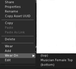
  • Right-clicking on an item of clothing in Inventory that is to be worn on the same layer as another item of clothing already being worn, will display an additional WEAR ON option in the menu. This allows you to select whether the additional items is to be worn “under” or “over” the existing layer
    • For example,suppose you have a jumper and a blouse that are both shirt layers – you can wear the blouse, then right-click on the jumper and use WEAR ON to wear the jumper “over” the blouse
  • Worn clothing items toggle the WEAR button at the bottom of the panel to TAKE OFF
  • Similarly, worn attachments toggle the ATTACH button (displayed in place of WEAR)  to DETACH.

Performance

On my usual test system, Milkshake produced some surprising results compared to other 3.2-based TPVs I’ve run of late – probably a reflection of it appearing to be built on the latest V3.2 development release (3.2.6). When on my own on a sim, I can comfortably hit an average of 50fps; when at home (at 360-ish metres), this climbs to just over 60fps. Even on a sim with several others, frame rates hold at 38-40fps. With shadows enabled this drops to around an average of 22fps – again faster than I’ve achieved with other TPVs of late.

Opinion

I’ve encountered zero crashes in running the Viewer over that past few releases up to this one. In fact, Milkshake is one of the smoothest-running V3 Viewers I’ve used, and is fast on its way to becoming my Viewer of choice.

There are still elements to be refined  / added to the Viewer, and a few more bits and bobs I’d like to see. Autocorrect is, I believe, coming (it was in earlier releases, but has been removed from this one, presumably awaiting a small bug I encountered in testing). The media filters are also on the “TBD” listas mentioned, and I assume additional skins are coming, given there is a Skins tab in Preferences. I’d personally like a couple of Quick Prefs buttons / floaters for things like avatar physics & objects LOD, Windlight settings, etc., and for sound settings (a-la Firestorm), but these aren’t showstoppers for me.

I still find the chat bar within the 3.2 UI cumbersome in terms of its look and how well it can be “fitted” into the bottom of the Viewer window. While not a fault with Milkshake per se, it does put me off 3.2-based Viewers, even with the ability to hide the chat bar when not in use, simply because it is so bloody clunky-looking. It comes across as V3.2’s equivalent of the original Sidebar in Viewer 2.

These niggles aside, Milkshake is, as I said, really growing on me – and is potentially the first Viewer to seriously challenge Firestorm as my Viewer of choice. In fact, it’s very possible that another release or two could very well see me swapping over completely….

Links

Milkshake download page

2011: “That was the year, that was” (part 1)

Well, another year has passed, and with it a lot has happened throughout Second Life and the other bits of the metaverse I poke my nose into. Here the first in a two-part (yes, that much really happened!) highlights of the year as seen through this blog.

January

February

March

April

  • The Direct Delivery system beta cranked up, with little or no info on what it would be involved; merchants wanted to know more before signing-up, but were faced with having to sign-up in order to do so – a classic Catch-22.
  • I wondered about the role Machinima could play in marketing
  • In-world(-ish) we officially gained bouncing bewbs and bums
  • The official SL sign-up pages received an overhaul, and lead to something of a significant increase in initial sign-up in the coming months, with an average of 16,000 per day. Speculation on how many of these were new users (as opposed to multiple alts) and new users who returned to SL ran through most of the rest of the year, as at the same time, it was noted that concurrency was dropping
  • We also had updates to the Web Profiles, and during a period that was increasingly marked with little or no real direct communication from Linden Lab through their own channels (as opposed to Twitter, etc.), FJ Linden finally took the bull by the horns and gave a much-needed update on the subject of local payment methods

May

June

The Coffee Station in InWorldz
Having fun at SL8B: Grace McDunnough, Crap Mariner (handy with a bow), Pete Linden and Rodvik with a hanger-on…

July

August 

The first eight months of the year were pretty amazing for me where this blog is concerned. At the start of the year, month page views were around 1,250 a month. By July this had risen to over 6,000. That so many people were prepared to read my ramblings was genuinely humbling. Little did I know what was to come!

Continued in Part 2

Niran’s Viewer: daring to be different 2

Note: Sometimes running in-depth reviews of Beta Viewers is a risky business, as you can get hoist by your own petard. Niran’s is a good example of this: while I was plunging into the Beta, NiranV was hard at work getting the Viewer ready as release version 1.0 as a Christmas present to SL. So here’s an update drawing on my original Beta review.

In discussing this Viewer, one of the things NiranV asked me to emphasise is that it shouldn’t be regarded as a fork from Kirstens – not so much because the latter has been discontinued, but because so much work has gone into this Viewer which NiranV has worked on from scratch that it stands as a Viewer in its own right.

Note also that this review is based on the 1.01 patch release.

Installation and Appearance

The Installation EXE for Windows is 33.5Mb in size and currently is still a WinRar executable, rather than a full installer – so still no desktop shortcuts, but NiranV notes that this might change in the future. Logging-in reveals the first major change: gone is the blue UI, which several have commented on. As Niran puts it, the blue skin, “Has been stashed into the corner of the room and now Darkness is my default skin, which is aimed at giving a whole new era of Second Life skins.”

The skin certainly is dark, and the blue Azure skin is still available through Preferences for those that like it. The move makes the Viewer look more V3-like,  although it is noticeably darker than the default V3 UI skin, and the yellow / gold elements and an additional depth that is lacking in the V3 skin. Sadly, Darkness does lose the ability to set a level of transparency on the menu bars by stripping away texture layers. There is also a further skin – Ashen Blood (no preview within PREFERENCES->SKINS, but you can activate it OK); this adds something of a red tint to NiranV’s Darkness skin.

Beyond this, the initial appearance on logging-in remains unchanged, with the same default button options displayed to the left, right and top of the screen, with the bottom of the screen remaining clear.

I have to admit, I’m actually less a fan of the top button area than some; and my first act on using this Viewer is always to move the top buttons to the bottom of the screen. Doing so not only puts the buttons in a more familiar location – if the top button bar is empty, it is possible to align items such as the camera controls directly against the bottom edge of the Navigation Bar, rather than having something of a gap between the two. However, in terms of giving people wider choice in button placement, it’s a good addition. Prior to the release, NiranV and I discussed the Viewer, and I asked about making the buttons so they could be aligned to the left/right (for the top & bottom bars), or top / bottom (for the left & right bars), and while NiranV said this could be done, no commitment was given to including it.

Graphics Preferences Changes

One of the key changes between this release and the Beta previously reviewed is with Graphics Preferences. In the Beta, there were two Graphics tabs, which presented the same information in different formats. The GRAPHICS 2 tab has now gone, to be replaced by ADVANCED GRAPHICS, the latter having previously been in a snazzy “slider” within the original GRAPHICS tab.

In my original piece I commented on the use of drop-downs that use terms such as “none”, “less”, “medium”, “more” and “many” when selecting options, commenting that I’m not sure it entirely works. However, NiranV took time out to explain the reasoning behind this move: “The whole new Layout was born when so many people asked in Kirsten´s Group, what does ‘Object Quality 10.0 mean? What happens when I set X Quality to X.X?’ People couldn’t really understand those values. So I came with a better idea, changing the layout to something a lot of games use: simple drop-downs which give you easier to understand options. I mean, everyone can think of what Low, Med , High mean, and that High is obviously higher/better than Medium.” Which is a fair point.

Within GRAPHICS, there is a new button – OPEN OPTIMIZER.This opens a very snazzy and dynamic panel, that NiranV described to me as, “A small Graphics floater that has all really important features packed into a small, fast and nice looking window allowing easier on-screen changes to graphics without FPS loss due to [having] Preferences open.”  It’s a nicely executed idea.

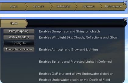
The Optimiser has five button displayed on it, clicking on any one of which will cause a range of options to slide out below the Optimiser bar, while also blanking the remaining buttons to avoid confusion as to which is being used.

Graphics Optimiser

Clicking on the option again will close it, and display all the buttons on the panel once more. This is actually a very neat approach to settings people tend to tweak a lot – and the design of the floater means that it can be left “on” by default without taking up too much screen display.

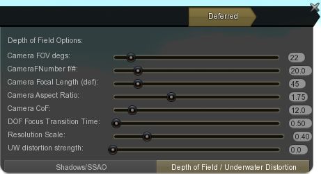
Among the options within the Optimiser lay a comprehensive set of controls relating to Depth of Field and Shadow rendering that should bring joy to th hearts of those who have previously used Kirsten’s Viewer for their photography and machinima.

Shadow and DoF settings, all now easily accessed via the Optimiser

All-in-all, it’s a great approach to fast and easy access to core features, and one I’m sure many would like to see replicated in some degree in other Viewers. Again, if you don’t use the top button bar, the Optimiser can be pushed up neatly to the top of the screen, close to the Navigation Bar, where to doesn’t really hinder the in-world view and provides ready access to core graphics functions.

As NiranV explains in the blog post accompanying the release, a huge amount of work has gone into the graphics side of the Viewer, and those on suitable graphics cards should notice the difference between this and the previous versions. Sadly for me and my Ge9800 GT, little discernible improvement was had; shadows render fine, but the overall performance falls through the floor into the living room in terms of FPS, so I cannot give an accurate testimony as to the overall improvements.

FPS issues aside, rendering on the Viewer remains blisteringly fast – I still can’t get over arriving in my garden to find the sculpted trees rezzing fully formed as rapidly as just about everything else, rather than having to look at a series of blobs and vaned spheres while the Viewer works out what to do with them…

Animated Trees

A while ago, Linden Lab started turning off “classic” elements of Second Life from the newer Viewer code. Two items so affected are the old “classic” clouds at around 300m altitude, which no longer render, and “animated” trees and plants (those tree and plants that would sway in an apparent breeze. I assume both were deactivated to help with performance (although both can still be seen with V1-based Viewers).

I find the removal of both no great loss to SL as a whole, but for those that do like to see the tree animation, then NiranV has included an on/off toggle within the GRAPHICS tab of Preferences, which will re-enable the animated function for Linden trees.

IM Panel Revisions

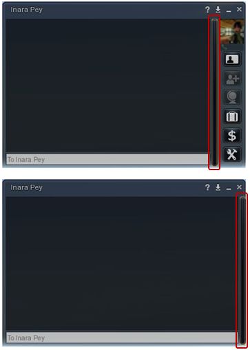
Niran has given the IM panel a substantial overhaul, and come up with a panel that is quite possibly the best in its class. By default, IMs appear in separate windows, but as with other Viewers, they can be nested into the same floater.

Some of the changes to the new IM window are immediately apparent: the range of very clear, easy-to understand icons down the right side. However, if you’d like more space to display IM conversations without spending the window, and don’t want to use the buttons – click the vertical bar between the text display and the buttons – the buttons will slide neatly away to the right. It’s a very slick and tidy approach, which NiranV describes thus, “My goal is to bring a completely new experience in Second Life Viewers, different from everything you’ve seen; take good things and make them even better  or completely redo them. The overhauled IM Panel is only one of those things.”

Now you seen them, now you don’t – IM panel buttons

Map Updates

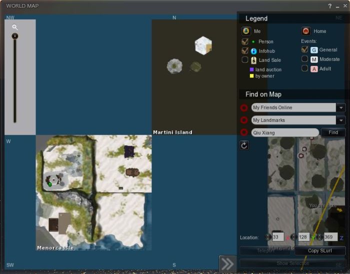
Another of “those things” that have been improved is the World Map. A slide function has been included that allows the Legend / Find section of the map to be hidden, providing a larger display area when Legend / Find aren’t required. Additionally, Legend / Find are semi-transparent, again allowing for more of the map to be visible even when both are open. Finally, and in a wise move, the Zoom function has been moved to the left of the map itself, so it is still possible to zoom in / out while keeping Legend / Find closed.

Map: transparent Legend / Find, which can be hidden (click >>), and the re-positioned zoom option (left) – the grey area behind it is actually a region, not the background to the zoom slider

Patch Updates

The 1.01 patch includes a fix for floaters that might open wider than intended on some screen resolutions – I didn’t have this issue myself with the 1.0 release, but if you find some of the floaters looking somewhat on the large size on your screen, you might want to download and install the patch files, which also add some additional touches to the Darkness skin.

Opinion

In discussing the Viewer, NiranV had this to say to me recently, “I strive to create the most advanced graphics/UI Viewer giving the User full control over nearly everything … I like to say ‘SL is only as good as YOU make it’, [and the] same goes for Graphics. I guess its pretty obvious that there is enough stuff to play with for a long time if you look into Preferences and explore the UI.” That this aim has been achieved is evident from seeing the results on-screen – as the following video from NiranV demonstrates:

Certainly, there are some issues with the Viewer that can be experienced, simply because it is so cutting-edge. NiranV has been aware that people have had a few problems, and passed comment to me prior to this release that, “In final release I will also add option to turn graphics back to normal, as I used the new Shiny and SSAO for a long time now, and people already were complaining about up to extreme performance decreases when enabling SSAO. [So] people will be able to set the LL default SSAO again which will increase FPS drastically again but also decrease visual Quality dramatically.” So if you do have performance issues, try flicking back to the LL defaults.

The key thing about this Viewer is the amount of effort that is going into it to present an exceptionally high quality user experience that capitalizes on things like the FUI and some creative thinking on the part of the creator. Had I a system capable of utilising this Viewer to maximum impact, I’ve little doubt it could become my primary Viewer.

With radar (without those functions people might find to be invasive), the option of Pie Menus, the inclusion of Lance Corrimal’s maths functions within the Build menu, RLV/a and a host of other popular TPV features, Niran’s Viewer brings together a lot in a flexible and effective Viewer that pretty much stands in a league of its own.

Recommended.

Links

Important: Please note that the LINUX version of the Viewer is maintained by Miguael Liamano, and not NiranV Dean. As such, all support issues / requests should be addressed to Miguael not NiranV Dean.

Black Spot : “All I ask is a tall ship….”

There’s ship lies rigged and ready in the harbour
Tomorrow, for old England she sails.
Fair away from your land of endless sunshine
To my land of rainy skies and gales.
And I shall be aboard that ship tomorrow,
Though my heart is full of tears at this farewell.

-The Last Farewell – Whittaker & Webster

Since starting writing pieces on some of the places in SL I particularly like, I’ve had numerous suggestions and requests relating to places I might enjoy visiting. One such suggestion came from Ayesha Askham-Ezvalt, who pointed me towards Black Spot. As a lover of tall ships (albeit the clipper variety, admittedly), it was a place I had to visit.

Black Spot is one of three sims devoted to tall ships of the pirate / buccaneer type, the other two being Dead Man’s Chest and Ace of Spades. Black Spot and Dead Man’s Chest have been developed by Lia Woodget, with Ace of Spades developed by Giacobetta Oliva. All three form a common theme that showcases Lia’s tall ships and Gia’s tour systems, and you can wander around the ships, take a rowing boat between the various islands and explore Lia’s shipbuilding hideaway.

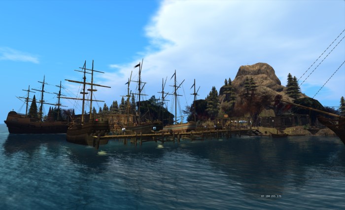
Black Spot harbour: “All I ask is a tall ship…”

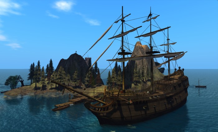
There really is a lot to explore and enjoy here; and Black Spot also makes for a quiet retreat set in the wide ocean. Lia has put a lot of attention on breathing life into the sims, with vessels anchored in the lee of the isles, tied-up alongside wooden quays, or sailing in on the tide.

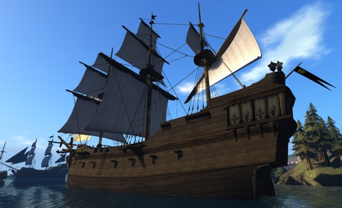
The ships themselves are magnificent, the hulls and fittings beautifully detailed, and you can explore their decks in turn, decide if the sails should be furled or not, and – if you’re so minded – purchase a copy of any that are for sale. There is enough room below deck on the larger vessels to make them into a highly original home…

“And the wheel’s kick and the wind’s song and the white sail’s shaking…”

At the quayside on Black Spot island itself, you can explore the smaller vessels Lia builds, or walk around her slip, where another is under construction. You can also wander into the shipwright’s hideaway under the hill of the island, and explore the secrets it hides….

It is here that you can take a boat across the water to Ace of Spades, or you can walk through vaulted chambers, passing stacks of kegs full of rum…or are they full of gunpowder for the cannons outside? There are chests with gold coin scattered around them that leave you wondering whether this is a simple shipwright’s hideway and yard, or whether it really is the secret lair of buccaneers who roam the high seas, looking for unwary prey.

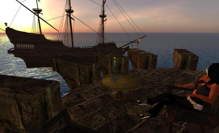
Walk on through dust-laden sunbeams as they fall through hidden windows and climb the stairs to discover books and charts, then up higher to stone turret overlooking the sea, and another ship as she sits at anchor – or is perhaps sailing on around the headland. Here you can sit alone or with a friend, watching as the sun sets out over the ocean, silhouetting the ship and carrying you back to bygone days.

“And all I ask is a merry yarn from a laughing fellow-rover, And quiet sleep and a sweet dream when the long trick’s over.”

Back in the cavernous hideaway, as I mentioned, you can find a skiff waiting to carry you across the water to Ace of Spades, and Gia’s island. Take a seat and enjoy a smooth journey as you slip out from under the protection of cavern and cove and across the sim boundary. Here stands and old fort, home to Gia’s tour systems – of which the row boats used to get around the islands are a part. Here, as well, you can take a larger skiff out under sail and tour the waters of the regions – but be wary of the sim boundary when you start out…and don’t spend too long on the water…you might find out how risky sailing can be!

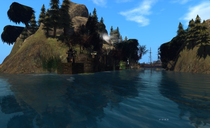
The narrows

If you prefer, you can use another of Gia’s rowboats to reach Dead Man’s Chest – or for the very daring take a ride around all three sims on a witch’s broomstick! However, this also may have its perils…particularly if someone has “parked” a ship along your line of flight…

Dead Man’s Chest is less tamed than Black Spot, the wooded isle offering natural vantage points to admire the harbour or look out over Captain Albus Weka’s fort and store. You can also board the mighty Elysium and wander her decks.

All-in-all there is a lot to see and enjoy when visiting Black Spot, and in some respects, I’ve just scratched the surface – so why not take a look yourself?

Related Links