The small but noticeable update to the secondlife.com splash screen menu that appears to have been recently rolled out
Update May 17th: It appears LL may either have released a change to the splash screen and have rolled it back, or are experimenting with ideas. On Monday, May 17th, the splash screen had reverted back to the April update.
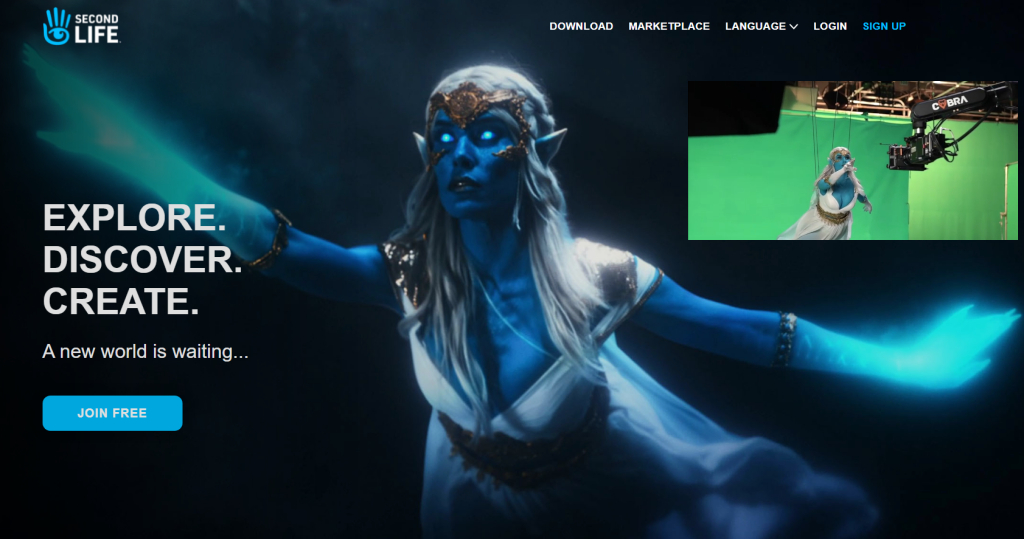
Back in April Linden Lab slipped out a revamp to the secondlife.com home page.
At the time, it came in for a very mixed response, featuring as it does an actress in elven-like make-up rather than the more usual avatar.
The image used was actually a still from the broadcast quality advert Levitate Media produced on behalf of Linden Lab in August 2020, and which was previewed in December 2020, a point that seemed lost on at least some of those who responded negatively to splash screen re-vamp.
The re-vamp also brought the secondlife.com property more into line with other Second Life properties such as the enterprise micro-site, in that scrolling down the page reveals further information on Second Life under a trio of headings.
The secondlife.com splash screen image as seen with the April re-vamp, inset, the scene of the Second Life advert from which the image was taken, being filmed by Levitate Media in August 2020.
The latest update – seen at the top of this article – was quietly rolled-out during the week. It now features an enlarged version of the still from the Levitate Media video and a re-worked menu. Gone are the options found in the top right corner of the screen, to be replaced by the more “modern” three-bar menu icon favoured by website designers and which offers a mobile device friendly solution to accessing menus. The rest of the page remains unchanged from the April 2021 update.
To be honest, I liked the April update, and the upset over the use of a live model seemed a little overblown to me; as I’ve said elsewhere, Second Life is supposedly “your world, your imagination”, so why not someone dreaming about being Galadriel or somesuch? That said, the image in this latest version is – to me – a little too large and in-you-face and as a result looses a lot of the mystery / enticement it presented in the April version of the page; better, perhaps to have left it untouched and simply re-work the menu access.
As it is, the latest update is a small tweak, and presumably part of the Lab’s preparations for the deployment of revamped new user on-boarding process and new user experience. It also makes the secondlife.com splash screen a little more mobile device friendly (although the rest of the web pages have a long way to in that respect).
Note:you need need to be logged-out of secondlife.com in order to see these changes.
As has been indicated in various discussions and statements from the Lab – such as the Above the Book sessions with Grumpity, Brett and Patch linden at this year’s VWBPE event, one element of Second Life that the Lab is focused on is the new user experience.
This work involves various projects, including the on-boarding process and changes to the viewer to help new users get to grip with things, and on Monday, May 3rd, Alexa Linden announced the release of the Project UI viewer which includes a range up updates specifically aimed at new users.
According the Alexa’s forum post, the new viewer includes three core areas of update:
A new menu option called Avatar, and streamlined / revised right-click avatar context menus.
Improvements to the Inventory panel.
An updated Places floater.
However, there’s actually more to this viewer than the forum post reveals, so here’s a run-down of some of the documented changes and some of those that are missed out from the forum post – but which could actually be of greater interest to established users.
The Avatar Menu and Right-Click Avatar Context Menus
This is perhaps the most significant update to in the viewer. To quote from Alexa’s post:
Making SL easier for newcomers to learn can improve the chances that they will become long-term Residents. Growing the Resident community benefits everyone — more people to meet, more participation in events, and more commerce. The changes described below are the first batch of what we hope will be an ongoing series of usability improvements.
Avatar menus
With this release we introduce the Avatar top-level menu which brings together all avatar tools in one place. One of SL’s most important features is now more visible to newcomers. You’ll notice the avatar right-click menu has been streamlined as well.
Have you ever struggled to select an avatar attachment? It’s inside your avatar, it’s transparent, or it’s a mesh attachment that you just can’t grab. You can now touch, edit or remove an attachment using right-click from all Avatar windows and Inventory.
The Avatar menu and the revised right-click context menus are show below:
The new Avatar menu sits between the Me and Communicate menus brings together all of the frequently used avatar tools (l). Centre: the revised avatar right-click context menus seen when touching your avatar (top) or an attachment (bottom), and how they compare to the current versions of the menus (r)
Inventory and Places Updates
I’ve not a lot to say on the Inventory floater updates, so will leave that to Alexa’s forum post. The changes to Places and how landmarks are handled, again as specified in the blog post, are also straightforward, although there are a few additional points to note:
The new panel also sees the gear button moved to the top of the panel, and provides a new set of fairly self-explanatory options:
Teleport.
View.
Show on Map.
Copy SLurl.
The original Expand and Collapse options from the gear button have been moved to a separate drop-down menu button, with the delete option moved to a its own Trash button.
The Project UI viewer’s updated Places panel (l) and the release version
Other Menu Updates
The new Avatar Menus means there have been revisions to the Me and communicate menus as well, with avatar-related options (such as the Choose and Avatar option moving from Me to Avatar (and renamed Complete Avatars).
The revised Me and Communicate menus (with the blue bands) compared to the current release viewer – click for full size, if required
As well as these, there are other small tweaks – World Menu now has a My Linden Home … option. Clicking this will open up the in-viewer browser and take the user to the Linden Homes page:
Premium members with a Linden Home will see the page relating to their home.
Premium members who do not have a Linden Home and Basic Members will see the Linden Home selection page (and Basic members will go forward to the Premium sign-up page).
Note also, that using this menu option (as with others in the viewer that use the built-in browser to access Second Life web pages) may trigger single sign-on, and require you log-in to the SL web properties.
EEP Updates
One of the biggest complaints with the Environment Enhancement Project (EEP) has been use use of trackball options to position the Sun and Moon, with many voicing their preference for “a slider like Windlight”. To address this, the UI Project viewer implements two sliders for positioning the Sun and two for the Moon across all of the EEP settings floaters. These are:
Azimuth – which might be thought of as the east / west position of the Sun or Moon (technically, azimuth is more than this, but it’ll do for these notes).
Elevation – the position of the Sun or Moon over or under) the horizon, relative to azimuth.
These sliders are tied to the Sun / Moon movement using the trackball systems, allowing both to be used as preferred.
The Sun & Moon tabs on Fixed Sky and the Day Cycle floaters now include Azimuth and and Elevation sliders for positioning the Sun / Moon, and similar sliders can be found on Personal Lighting
Rapid-Fire Feedback
Overall, this is a reasonable set of changes; they do enough to streamline things in places without being a potential source of confusion for established users; the changes are for the most part logical – although I do have a couple of reservations.
On the plus side, bringing together the majority of avatar tools into a single menu makes a lot of sense. But I do wonder if having menus called “Me” and “Avatar” side-by-side might not be a little confusing for new users (e.g. “Huh? Wassa difference? Why two menus for my avatar?”). The use of the “avatar” menu name is liable to cause a small amount of consternation with Firestorm, as that viewer already use it in place of “me”, but c’est la vie.
I was also surprised to see that the Linden homes page has yet to be updated for Basic members – it still features photos and a video of the old 512 sq m Linden Homes. Given the newer Homes are more attractive (and have now been with us for a while), and the aim of this viewer is to help make engagement with SL more attractive to new users, linking to information that is pretty much out-of-date and doesn’t actually reflect the more common Premium offering seems a little disjointed.
Elsewhere, I like the ability to touch / select attachments – particularly worn mesh – made more accessible. Catznip introduced such a capability a few years ago, and I can’t help but wonder if seeing it now in the official viewer might be the result of a code contribution from that viewer.
It’s also good to see the Lab respond to requests with EEP, and hopefully the new sliders will help those who find the trackballs a little confusing – although I don’t doubt the labelling might cause a little confusion (“why not east and north?”).
I understand the updates to the learning / social islands will be coming along in summer – although I’ve no idea if these will see further tweaks to the viewer as well. as well. In the meantime, it’ll be interesting to see how this Project UI viewer develops over the coming months.
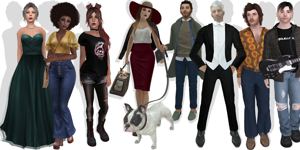
The eight January 2019 start avatars (l to r): Gretchen, Monique, Trixie, Bitsy, Ashton, Leonard, Greg, Monty. Credit: Linden lab
As noted in an official blog post, Linden Lab has issued another set of new Starter avatars.
The eight new avatars are all of the “classic” type, using the basic Second Life system mesh, rather than dedicated mesh body parts (although they have mesh clothing items). Between them, they offer a mix of more “everyday” types – as the official blog post again notes, previous starter avatars heavy leaned more towards the fantasy side of things.
The eight characters are (in the order they appear in the Avatar Picker):
Bitsy (complexity 15,813) and Ashton (17,268): two twenty-somethings(?) with an up-and-coming urban air and style, complete with pet dogs.
Gretchen (complexity 29,332) and Leonard (10,656): two older characters in more formal wear.
Monty (complexity 19,016) and Trixie (14,732): two younger avatars with the look of teens or early twenties, Monty coming with an electric guitar.
Greg (complexity 10,733) and Monique (9,226): two possible ’70s throwbacks.
(Complexity figures include all attachments.)
All are, as per the Lab’s usual procedure, supplied with No Mod elements (although the shapes are Modify). Surprisingly, given recent additions to the starter avatars, no discernible AO are provided (although some have poses that are activated on wearing them), with Gretchen being the notable exception to this approach. This lack of AO leaves the avatars with the horrendous Duck Walk.
I also admit to being a little confused by the promo picture used for the avatars: it shows Ashton with his dog on a leash, but so far as I could tell, the only option supplied with the avatar is a “carry” version of the dog.
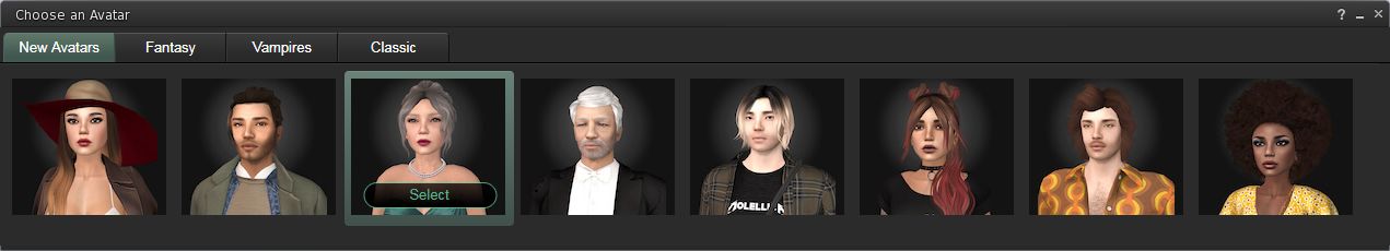
The January 2019 new starter avatars are the default choice on the Second Life sign-up page
As starter avatars, these new looks are directly available to new users accessing the Second Life sign-up page on the web. Those already in-world can take them for a spin from the Me (/ Avatar) menu, and then selecting Choose Avatar. This will bring up the avatar picker (shown expanded, below), which will automatically default to the eight new avatar styles, then simply pick on the one you want to try.
The eight January 2019 “classic” starter avatars in the viewer’s Avatar Picker
Selecting an avatar will see it replace your current look (so if it’s a new look you’ve put together and haven’t saved – be sure to do so first!), and add the avatar to your Clothing folder. Or, if you prefer, you can open Inventory and navigate to Library > Clothing > Initial Outfits > then right-click on the relevant folder name and select Replace Current Outfit. This will also cause the look to be worn and copied to your own Clothing folder.
Having a broad choice of starter avatars is a good thing; I’m just a little surprised these come largely sans an AO; in this respect they seem a little at odds to previous classic and mesh starter avatar updates.
The first of the new sign-up pages. Courtesy of Linden Lab
Linden Lab has deployed a new format sign-up process for those joining Second Life.
Using a simpler, more unified page design, the new sign-up process brings together the previously separate avatar picker and sign-up form into a single page, effectively reducing the number of individual steps a new user must take from initial sign-up through to downloading the viewer.
Picking a starter avatar is now a case of selecting one of two galleries from a drop-down menu in the left-hand panel in the initial page (shown below): Classic Avatars (the default) or Fantasy Avatars. Clicking the portrait of an avatar will display a full body animated thumbnail of the avatar, while personal information can be entered into the form on the right-hand panel.
The avatar selection panel, showing the Fantasy Avatar, complete with the thumbnail of the highlighted avatar
The options for selecting Basic or Premium membership follow the same page format, although the Premium button takes a user to the more familiar Premium upgrade page, allowing them to choose their preferred payment option: monthly, quarterly or annual. The Basic option button will complete the sign-up process and allow present the download option for the viewer.
The revised Basic and Premium options display
The new sign-up process also gave me the opportunity to try the latest iteration of the Learning Island new users are delivered to the first time they log-in to Second Life using the official viewer.
As I reported in 2015 and 2016, the Lab have been using experience keys to help guide new users in gaining familiarity with the basic movement controls in the viewer. The most recent version of the Learning Islands continues this approach, offering incoming new users a basic set of tasks – walking, jumping, flying – using the camera – they are asked to complete, before moving through a set of portals that deliver them to the Second Life Social Islands.
On arriving at the updated Learning Island, the guidance HUD automatically attaches, guiding users through the initial exercises. It detaches on leaving the island through the main portal
The new island design is a route through a series of broad halls built around a central terrace that might be suitable for socialising with other newcomers, and which is reached via a portal at the end of the final lesson (using the camera), and which contains the portal that delivers users to the Social Islands.
The lessons themselves and are indicated both on the HUD (seen in the image above) and via instruction tablets within the halls. Animated arrows (again seen in the image above) and on the floor help direct users around the halls.
The lessons are simple enough, and have been used before. however the environment is a marked improvement over the last iterations of the Learning Islands I’ve visited
Overall, the new sign-up process is a lot cleaner and – perhaps more importantly – a lot more modern-looking than the last iteration, which always felt cumbersome to me. It is concise enough to hopefully prevent a new user from bailing out before getting as far as downloading, installing and running the viewer.
Similarly, the updated Learning Island – which may well have been in use for a while, I’ve not been keeping an eye on the generic islands of late, only the themed islands, – offer a much more straightforward approach to getting started with the basics of the viewer. It might be argued that as this particular iteration doesn’t include information on inventory, Linden Dollars, etc., it might be a little too light on details; but keep in mind this may be one of a number of Learning Island variants the Lab might periodically rotate into use.
Over the past few months, several mentions on the idea of themed Learning Islands have cropped up in various public discussions featuring staff from Linden Lab – notably CEO Ebbe Altberg.
The idea is that rather than a user signing-up for Second Life via an advert and / or landing page that delivers them to a “generic” learning island and then leaving them to discover things for themselves, incoming users will have a “path of interest” as it were, that leads them from an advert through the sign-up process and then delivers them in-world to a location in keeping with the theme of the ad that originally appealed to them.
The Lab runs a web advertising campaign featuring a specific theme – such as “science fiction”.
Those clicking on an ad are taken to a Second Life landing page that matches the ad’s theme (example shown below).
A Play Now button allows people to sign-up to SL and which, when they log-in for the first time with the viewer, will deliver them to a Learning Island in keeping with the theme of the advert and landing page, where they can get started with using the viewer, etc.
As well as lessons / opportunities to learn, this themed Learning Island includes one (or more) portals which allow incoming users to reach the destinations appearing on the landing pages (and others like them).
Part of the Sci-Fi landing page, an example of the themed landing pages used in conjunction with the themed Learning Islands
The first of these campaigns / themed Learning Islands has been in testing for the last couple of months, and the next is about to be rotated into testing, as Brett Linden, head of Marketing for Second Life, informed me.
Linden Lab is still in the early weeks of testing the concept of Themed Learning Islands. The initiative began quietly a month or so ago with a Romance-themed island test that is not currently active. Next up is a Sci-Fi-themed learning island that we’ll begin testing very soon. We’re also looking at several other themes for future tests, [and] it is also possible that we’ll revise the Romance and Sci-Fi themes as we gather more data on them.
– Brett Linden, head of Second Life Marketing, Linden Lab,
discussing the new themed Learning Islands
The Romance Learning Island presents a wooded island with trails and climbs, with a central “quick learn” starting point covering the essentials of movement
Of course, putting an ad campaign backed by a sign-up process, etc., is only part of the story. There needs to be some means of assessing just how well (or otherwise) it is performing. Such assessment is very much core to all of the Lab’s user acquisition and retention efforts, with A/B testing being one of the primary methodologies they employ. This is the case with these themed campaigns / islands as well, which will be tested from a number of perspectives.
Firstly, the themed campaigns and themed islands are operating alongside the Lab’s various other user acquisition campaigns and in-world learning islands. This allows the Lab to assess the overall effectiveness of each themed campaign compared to existing methods of acquisition / retention that take a more “non-themed” approach. Secondly, the themed Landing Islands within each campaign are being directly compared with their non-themed counterparts to assess their effectiveness in retaining a specific target audience, again as Brett informed me.
There is indeed an A/B test happening — where there are two equal themed landing pages with everything being identical in design/content — except for the Join URL. On the “A” version of the landing page, a click on Play Now will takeyou [via the sign-up process] to the non-themed learning island (currently used for most new users outside this test). The “B” version of this page contains the Join link that will direct [again via the sign-up process] the new user to the Themed Learning Island as their first login destination. In our paid ads that accompany this campaign, we’re distributing both the A and B versions of the landing page equally so that volume to each location will be equal.
– Brett Linden, head of Second Life Marketing, Linden Lab
on some of the Learning Island A/B testing
The Romance Learning Island presents core information on using the viewer to move, communicate and interact, and provides more general information on using Second Life
As a third level of testing, the Lab is using different approaches to the information provided within each type of Learning Island, again to assess what might be more or less effective in encouraging engagement and retention.
For example, the “Romance” themed Learning Island included what might be termed minimal user guidance beyond the basics of using the viewer to walk, jump, fly, communicate and interact. By contrast, the Sci-Fi island is far more hands-on with the user, with “main” and “advanced” tutorial areas, far more ways to impart information: info boards, local chat, links to external SL resources, etc. In the future, other means of providing incoming users with information and to help them understand to basics of the viewer, etc., will be tested in specific theme types.
Thus it is possible for the Lab to investigate what works and what doesn’t in terms of information presented to an incoming user: is it too little or too much? Where might the balance between the two lie? Does a relaxed approach that lets the user learn on their own as the explore work, or is something more “formal” in layout better? Is it better to employ one approach to passing on information, or multiple means – text, boards, videos, web links?
The Sci-Fi themed Island provides a much broader learning experience, covering many more aspects of viewer use, with subject matter split between “Main” and “Advanced” tutorial areas
When not being tested, some of the themed Learning Islands may be opened to broader access from within Second Life. However, during testing, the islands are not publicly offered up for general access. The reasons for this are fairly clear if you stop to think about them, and Patch Linden summed them up succinctly.
We actually want to discourage public access to the islands while in testing so that our statistics, measuring and data-gathering don’t get influenced by having the islands inundated with established users coming into them and possibly preventing new users from naturally proceeding through the anticipated test flow. That way, we can gather as accurate information as possible on what’s happening in terms of acquisition and retention against everything else.
Patch Linden, Senior Director of Product Operations, on why information
on the themed islands isn’t being generally announced
Also, once initial core testing with a specific themed island has finished, the Lab plan to add it to the broader Learning Island rotation. This allows a further level of comparison: does a themed Learning Island perform better with retention of users delivered to it outside of any related advertising campaign than is the case with non-themed islands, or does it not perform as well? Is there a difference? And so on.
Elements common to the “non-themed” learning islands can also be found in some of the themed islands, such as this guide to the SL viewer’s default toolbar buttons, again allowing for wider testing of approaches
One thing that struck me in talking to Keira, Brett and Patch about this programme is just what is going into user acquisition and attempts to improve user retention, when it is perhaps a little to easy to assume the Lab is just “tinkering without understanding”. Considerable thought is being put into trying to increase new user engagement and retention, and it does involve a lot of number crunching, analysis, and trying to build on what is shown to work, as well as trying entirely new approaches.
Overall, this themed approach to advertising / new user experience comes across as a good idea to try. Whether it actually works or not, and how well it works and with which themes, will only become clear over time; I do admit to being a little edgy around the Sci-Fi Island, which is very different in looks to the “hard sci-fi” images presented in the landing page – leading me to wonder if the contrast might have an impact on the new users who come through it.
But, concerns like that aside, it’s clear from talking to Brett, Keira and Patch that the Lab is pouring a lot of effort into this approach, as well as looking at other avenues of user acquisition and retention. Certainly, as this particular programme evolves I hope to be able to return to it in the future and offer updates and perhaps insights. In the meantime, I’d like to extend my thanks to Keira Linden, Patch Linden and Brett Linden for extending their time and input to this article.
As a community gateway, Ajuda SL Brasil (“Help SL Brazil”) has a long history. Original founded in 2009, it celebrated its ninth anniversary in May 2018, and primarily – but not exclusively – serves Portuguese speaking users. Located on a single region, the gateway has been through several different variations over the years, including a major make-over in 2011, and then acceptance into the new Community Gateway Programme beta in 2016, prior to becoming a full member of the Programme following its official relaunch.
“We are entirely self-funded as a non-profit group,” Roth Grut, the gateway’s founder,informed me. “Which, given the value of the real against the dollar, hasn’t been easy” (at the time of writing 1 BRL = 0.268 USD). He continued, “Since joining the new Community Gateway Programme, we’ve had a lot of practical support from Linden Lab in transforming our work into an official gateway programme partner.”
I can personally attest to the warmth of the greeting on arriving at Ajuda SL Brasil, with the team there both friendly and inviting, encouraging me to explore and find out more. They were also quick to guide genuine newbies to the learning centre and to help them refine / customise their look.
The region itself is informally laid out in a design that works well in encouraging exploration. From the landing point on the south side, it’s a short, clearly marked route to the learning centrally located on the region. This presents a series of familiar self-learn lessons about the viewer and getting around in Second Life and essentials such as inventory use, etc. This area also features an auditorium, providing weekly lessons. In addition, there is an information broad displaying the Caledon Oxbridge two-week class schedule for SL-related lessons and events presented in English. Alongside this is a board offering information on other gateways and resident help groups.
Around the learning centre on the remaining three sides of the region sit, the aforementioned freebie centre, a sandbox where people can learn about building in prims and practice their skills, an events area for music and dancing, changing rooms, table-top games and various interactive elements – such as a “hydro-bike” for pedalling around on the water, a rezzing platform where people can learn to fly a helicopter. There are also some humorous little touches – such as a dollar bill innocently stuck on a manhole cover, inviting people to click on it – the result both demonstrates object / object interactions and how objects can be used to animate avatars.
“There is also a photo studio up in the sky,” Kon Magic, a gateway volunteer told me. Set out like a New York street scene, it offer people the opportunity to experiment with the viewer’s snapshot floater, using the provided poses or their own animations from inventory.
“We get an average of about 500 visitors a day,” Emma Floresby, another volunteer informed me. “Sometimes it might be 350 a day, others about 1,000.” I wondered how many of these were new arrivals as opposed to returning users. “A lot of people come for the freebie store,” Emma told me candidly. “They account for some of the higher numbers.”
Emma continued, “While we are Brazilian and Portuguese based, we also cater for all languages, and get many non-Portuguese speakers. We try to provide a good place to welcome people and help them at basics, and also provide help and support to established users as well.”
Support is offered in a number of ways – in-world at the region itself (obviously!) and via the in-world group, Amigos Ajudam Group. There’s also the gateway’s supporting website,. This is a rich source of information for incoming new users: hints and tips, information on features and capabilities – such as Bento and mesh bodies / heads -, notes on viewers translations of SL documents such as the SL Terms and Conditions, can all be found, and those interested in joining the team can discover more about being a volunteer.
In particular, the website includes a link to a Portuguese-specific sign-up process, which will deliver incoming new users directly to the Ajuda region. While this is a capability offered to all the of the Community Gateway Programme partners, the language-specific nature of Ajuda SL Brazil’s approach helps maintain a contextual feel for incoming new users, starting in Portuguese and them delivering them (post viewer installation) to a Portuguese-speaking region.
Now into its tenth year of operation, staffed by dedicated, enthusiastic team and providing a service not just to one of SL’s larger ESL communities, but SL users in general, Ajuda SL Brasil continues to provide a valuable service to new and established users alike.
Are you running a new Community Gateway? Want it featured in this series? Contact me in-world, or use the Contact Me form on this blog and drop me a line.