Niran’s – the Viewer that dares to be different!

Note Dec 24th: The release version of this Viewer is now available. As such I have an update / continuation of this review, and have closed comments on this article (comments on the second are open).

Niran’s Viewer is an intriguing hybrid; forked from Kirsten’s Viewer, it includes everything that made Kirsten’s unique, as well as adding some very individual flavours from NiranV Dean and, in the most recent builds, the V3.2 FUI. The result is a Viewer that steps out of the box somewhat from what we’ve seen to date, offering some amazing capabilities – although you may find you need a high-end system to get the most out of it.

In Brief

  • Currently Windows only
  • Forked from Kirsten’s Viewer
  • Lots of graphics updates (including completely revamped graphics preferences)
  • New and unique menu layout
  • Viewer 3.2 Flexible User Interface (FUI)
  • Fast rendering on suitable machines
  • Additional ATi support
  • RLV/a
  • Mesh rendering and uploads
  • Lots more (did I mention fast rendering?)
Installer with default location

Installation and Logging-in

The installation is straightforward – and other than the installer being partially in German, offered no surprises per se

Like Marine’s RLV standalone installation, no desktop shortcut or icon is produced, so once installed, you’ll have to go play hunt the EXE in C:\Windows\Program Files\Nirans Viewer (assuming you use the default installer path).

This is no biggie, but I hope (as I’m a lazy cow) that NiranV will provide a defacto desktop icon in the future – that way my VistaMenu utilities for Win7 can grab what’s needed and I can keep my desktop nice and tidy with the minimum of fuss on my part :).

On start-up the Viewer pulls no punches letting you know you’re entering new territory, as the log-in splash screen demonstrates.

Log-in screen

Top left of the screen are the familiar Me and Help menu options – the former providing access to the Viewer’s Preferences. Over to the right of the screen is the log-in area, neatly laid-out and with three options in bold white text sitting under it:

  • Select Other Grids: the Viewer appears primarily aimed at SL, so this option provides access to the Beta grid
  • Settings: open the Preferences floater
  • Help: opens a set of additional options:
    • Sign-up: takes you to the official SL sign-up pages via your web browser
    • Forgot password…: opens the official password reset page in your web browser
    • Grid Status: opens the Grid Status page
    • About Niran’s Viewer: opens the HELP ->About Viewer pop-up.

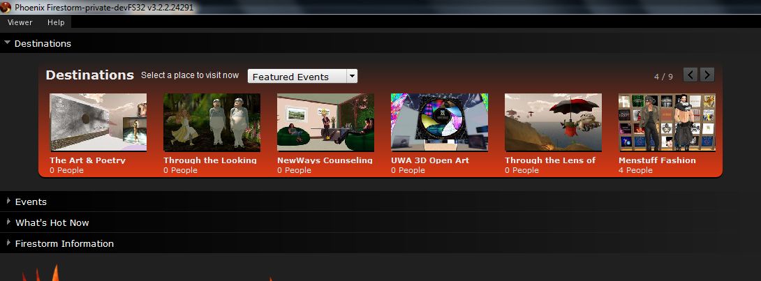
It’s a nice arrangement, although my personal preference would be to see some take on the official V3 log-in screen  – the Destination Guide, etc. – make an appearance. Perhaps that’s scheduled for a future build…

To actually log-in, you need to click on the LOGIN option after entering your username and password – tapping Enter doesn’t appear to work on this release.

The UI

Once logged-in, you’re again immediately aware that you’re in a Viewer that dares to break all the established rules.

Wot’s that? Buttons on the TOP? No menus?! (click to enlarge)

The Viewer clearly uses the V3.2 FUI, but NiranV has added the option to place buttons at the top of the screen as well as the sides / bottom – thus being the first to respond to requests for this capability. I’d still like to see VWR-27455 implemented for the FUI by someone, but just having the additional top area for use might make it easier for people to group buttons.

By default, the following buttons are available on first starting the Viewer:

  • Top: Snapshot, Build, Map, Mini-map, Search, Inventory
  • Left: Speak and Voice Settings
  • Right: Profile, Picks, People, Places, Appearance

Buttons can be removed, added or relabeled simply by right-clicking on an existing button and selecting the required menu from the displayed menu  – CHOOSE BUTTONS opening the Toolbar Button floater. In a further step away from V3.2, CTRL-ALT-B will also open the floater, rather than CTRL-T, the use of which in V3.2 has caused some consternation amongst users, given that key combination has had a previous use.

The top of the screen is also conspicuous as it apparently doesn’t have a menu bar – no Me, Comm, World, etc. Instead we have the Navigation / Favourites Bar.

The Navigation Bar contains a wealth of information, looking at it from left-to-right: the familiar (to V2/V3 users) FORWARD / BACK buttons; then a panel of five buttons: HOME, WINDLIGHT FLOATER, SKY SETTINGS, WATER SETTINGS, and ABOUT LAND; the address bar area (as with V2/V3, right-clickable for additional options); Draw distance slider; Search option; account balance & BUY L$  button, and, at the right end, the media options with the time under them.

As with V3, you can switch between Navigation & Favourites or the Mini-location bars by right-clicking on the blank area of the Navigation / Favourites Bar and selecting your preference, but NiranV has extended this drop down menu to include the ability to configure which options are visible on the Navigation Bar, complete with additional options not displayed by default. In addition, the entire Navigation Bar / Favourites Bar has further configuration options within Preferences – something I’ll return to shortly.

But Wait! No Menus, You Say?!

Well, not exactly; I fibbed a bit :).

The menus are there, but are tucked away as Niran’s takes another innovative approach to the Viewer UI presentation. At the left-hand end of the Navigation Bar (or Mini-location Bar, if you display that), is the label “NV”. Clicking on this opens a vertical  menu system which V1.x users should find somewhat familiar, despite the orientation, but those already familiar with V2/V3 might initially find a tad confusing, given the options listed are predominantly V1 menu labels.

Niran’s Menus

Having the menus displayed in this manner brings with it certain advantages; for one thing, the impact on your in-world view is minimised to the left side of the screen. There is also something more intuitive about this approach that makes using the menus somewhat faster and more intuitive: the action to select just about any option is a simple down-and-right action, making moving from menu to menu faster and easily than across-down, across-down, across-down…

NiranV has done a sterling job trying to align options with the first few menu headings (File, Edit, View) to reflect V1, which should help some with transitioning from V1 to the world of V3. However, the approach does have its own risk: V1 and V2/V3 are radically different in their menu offerings, so using similar menu titles could lure people into thinking they’ll find all the familiar options in the same sub-menus and locations – which isn’t quite the case. Similarly, as an established V2/V3 TPV user, I have to say I was initially thrown by the menu system when I first encountered it – although I quickly adapted to it and have to admit to preferring it.

A very nice touch in the menu system is the inclusion of an option to call-up the Grid Status page. This is particularly handy if you find you’re having problems, as it saves playing hunt-the-page through the SL website – and if you use the Viewer’s internal browser, the info is there without having to switch windows.

There is also a menu option called MY USEFUL FEATURES, which includes the STOP ALL ANIMATIONS option and REBAKE TEXTURES (for those unfamiliar with the keyboard shortcuts.
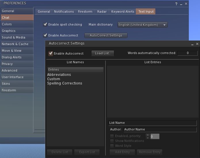
Preferences

This is another element of the Viewer that has been extensively revised, and nicely so. For a start, buttons are given a 3D polish and are clearly coloured: blue / tick = on; red / cross = off; grey = inactive / unavailable. Where buttons represent either/or options (e.g. name tags on/off), clicking one will turn it on and the other off.

Preferences – 3D buttons and a full revamp

Most of the main tabs also dispense with additional horizontal tabs. Instead, a “slider” action is used. Take chat as an example: open it, and you have the primary chat options, with a bar at the bottom labelled IM OPTIONS – click on that, and the IM options duly slide up into view. To swap back, simply click on the CHAT OPTIONS bar. It’s neat and tidy – although you need to keep your eye on things, as it’s easy to overlook a slider when looking for a specific option you’re used to seeing in a dedicated tab.

However, it is in the graphics tabs that the biggest changes are most readily apparent. There are two tabs – GRAPHICS and GRAPHICS 2, but they actually toggle between different presentations of the same settings.

Preferences -> Graphics

To the uninitiated, both can be something of a shock – the combination of options builds on Kirsten’s rendering pipe and offer enormous flexibility for setting the Viewer’s graphics capabilities. If you want, there are enough options here to take your world view right back to the earliest days of Second Life as well as bringing you cutting-edge in-world rendering – just take a look at NiranV’s blog post on the subject to see some of the results.

However, I’m not entirely sure that replacing the traditional sliders for some options with a button that toggles between “none”, “less”, “medium”, “more” and “many” entirely works; what is the scale of reference? How many is “many”? How few is “less”? There’s also the fact that the sheer number of options could be somewhat bewildering to many, and may, as a result, be ignored. But, for those into photography, etc., it’s worth taking a good look at what’s on offer.

Obviously, the two tabs are supposed to be used independently of one another, rather than together, and it is intended for people to use the one they find more intuitive. In this I was initially drawn to GRAPHICS, which is closer to what I’ve been used to seeing in other Viewers, but then I quickly swapped over the GRAPHICS 2.

Graphics 2

Shadow rendering appears to be linked to “glow” in this Viewer. This means that with shadows enabled, you can end up with a very bright sky, with the Windlight clouds glowing oddly.

Camera tutorial

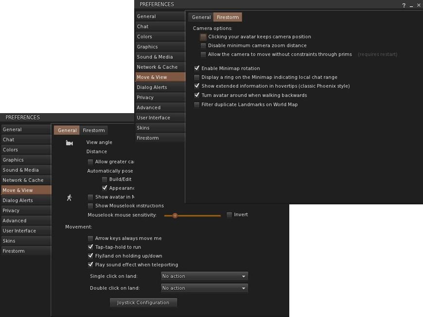
Away from this, it’s worth going through the Preferences tabs and sliders carefully – there are other cool bits and pieces. For example, for those unfamiliar with the degree with which the camera position can be customised to give a much improved world view, NiranV has included a tutorial on the subject with some practical examples of options. This is something that other Viewers should have, as whether you’re tall or short, the default camera position for SL is far from ideal, yet most people live with it, simply because they’re not aware of how to modify things beyond fiddling with the default Preferences sliders. Huge kudos from me for this (friends know I’m a constant nag on the subject…!).

New snapshot floater (click to enlarge)

On the subject of cameras as well, NiranV has made a very subtle alteration to the camera smoothing, setting it to a default of 10 – and the difference in camera movement is stunning (allowing for differences in graphics capabilities on individual systems); panning is wonderfully smooth, as is zooming, with both exhibiting a gentle inertial effect as you stop the movement: rather than coming to an abrupt stop, the camera glides to a halt.  Wonderful!

The snapshot option also includes the updated floater with the option to post snapshots directly to your web profile feed.

Nor does it end there: those that like their pie (menu) can have it (on by default), while those who like things in context (menus) and have their way as well.

Within PREFERENCES->VIEWER-> UI SETTINGS are a host of goodies, including:

  • The ability to increase / decrease the transparency of the Navigation / Favourites bars by disabling layers
  • Turn off the Favourites Bar independently of Navigation
  • Select which of the buttons Windlight Settings, etc.) should be display in the right-click drop-down menu
  • One-click teleport to SLurls displayed in chat
  • An ATi tweak
  • A collection of useful debug features that can be toggled  on or off.

There is even an ability to enable  / disable the new Direct Delivery “inbox” and “outbox” in your Inventory (although these can currently only be used with ease on the Beta grid) – but it gives you an idea of what it coming.

Performance

This Viewer is a fork of Kirsten’s Viewer, so one expects it to be resource demanding – and it is that, as soon as you start turning on the more advanced graphics features.

But to dismiss Niran’s as a KV clone with a tweaked front end would be a grossly unfair oversimplification. There has been a lot of under-the-bonnet work carried out, and I gather that NiranV went so far as to re-write OpenGL elements while waiting for LL’s fixes – and used an OpenGL release  that is a lot more recent than that used by LL for their fix. This means that while the Viewer is resource-hungry, it is also blisteringly fast. Rendering is some of the fastest I’ve witnessed on my PC; I’m simply not used to arriving home and having sculptie items immediately pop out at me (no waiting several seconds), fully formed, as if going “Boo!” It’s really impressive.

Frame rates are equally stunning on my PC. At home, (370m above ground), with draw up at 360m, five others on-sm, and with settings comparable to those I use on Firestorm and Exodus, Niran’s screams past them at a rocketing 57-60 fps. At ground level, this drops to some 45-48 fps, which is still very credible.

Unfortunately for me, enabling shadows does slaughter my system: frame rates collapse to the low-end of single figures, and the Viewer demonstrates a notable stutter in camera movement. However, I got much the same with the last of Kirsten’s builds as well, so this is likely to be as much down to my graphics system and CPU getting a little long in the tooth as anything else.

Opinion

This is still very much a Beta Viewer, but even so, if you’re not into running shadows (or have a very high-end system), it tends to blow most others out of the water performance-wise. Obviously, as a Beta, there are rough edges; I’ve been running the Viewer on both the Main and Beta grids for a total of about 6 hours over the last few days, and crashes haven’t been infrequent; therefore, you should use it with caution. Also, as it is a Beta, don’t expect absolutely everything to be implemented – there is still a number of items listed as “to do” on NiranV’s website, and some options in Preferences are greyed-out.

That said, this Viewer is a serious contender in the usability stakes. For those who do want to try something that offers a different and flexible approach to the V3.2 UI, Niran’s Viewer is definitely one to watch. For those into photography and machinima and who have used Kirsten’s Viewer in the past, will find just about everything here they need. As it is, and even though there are a number of elements I’d like to see included in it, this Viewer has already moved comfortably into my top 3 “Viewers of choice”.

So, if you are looking around for a Viewer and feel like you can dare to be different, why not give Niran’s Viewer a try?

Links

Phoenix goes mesh

Yesterday, the much-anticipated release of Phoenix was made. Version 1.6.0 1591 brings with it the ability to render mesh objects.

This means that the majority of users in SL are able to see mesh objects rendered correctly in-world, if not import them. However, the release announcement from Jessica Lyon is liable to make difficult reading for some:

“We stated some time ago our active development commitment is now focused on the Firestorm viewer and that continues today. We still feel strongly that the end of V1 functionality is an inevitability, so it is more important to develop an alternative viewer for our users they will enjoy for when that time comes than to spend our efforts on a dying viewer and then leave our users with no alternative once it’s gone. However, we also promised we would try to keep the phoenix viewer alive for you until it is no longer feasible to do so. As you can see, we are not walking away from that promise, but it is important to understand that Phoenix is no longer our top priority. When necessary we will continue to keep it up to date with advances/fixes from other third-party viewers and provide them the credit they deserve for that work. But ‘we’ are no longer actively developing Phoenix on our own steam.

“Any future releases of Phoenix will be sparse and only if needed. I will not commit to saying this is the last Phoenix Viewer Release, but I will also not commit to saying it isn’t the last either. I will say… this is one of our last. As time passes we will determine if another release is absolutely necessary and/or sensible and make a decision then on whether another update is mandatory in order to keep our promise to you.”

While it may not be a popular move, one can hardly blame Jessica and the team for taking this position: maintaining an aging code base which itself is built on something LL no longer maintain (Snowglobe) is liable to become harder and harder as time goes on, and for a Viewer to remain functional and relevant, it needs to keep pace with the evolution of the grid and as the Phoenix / Firestorm project has made the step of producing a V2/V3 hybrid, it makes sense for them to focus on that work in order to do so, rather than splitting efforts (and doubling the workload) to try and maintain two sets of code.

As well as mesh rendering, this release also brings with it:

  • The Firestorm 3.2 log-in / splash screen options
  • Contact Sets
  • Removal of the Google chat translation API options from Preferences
  • A host of “small” fixes and changes

A signficant element not updated was that of RLVa – it was decided that Kitty’s time and focus is better spent on the numerous projects with which she is already fully engaged: her own Viewer (Catznip, reviewed here), working on bringing the spell checker to Viewer 3.x, her continuing support of RLVa for other V2/V3 TPVs, and so on). In the release blog, Jessica suggest that those wishing to update to the latest RLVa implementations should give either Firestorm or Catznip a try.

In the meantime, and if you haven’t already, you can grab Phoenix 1.6.0 1591 directly, or go to the Phoenix home page and use the Quick Download links.

Kirsten’s Viewer: final 10 days for funding

Today, the attempt to get Kirsten’s Viewer crowdsourced has just about 10 days left in which to achieve its goal.

So far, some £6,150 ($9663) has been put into the project, representing 25% of the required total of £25,000 ($39279). Whichever way one looks at this, it is a remarkable achievement. However, the fact remains that in order for Kirsten’s Viewer to survive, it’s not enough.

Kirsten, and her rl “avatar” Lee Quick, together with partner Dawny Daviau have been caught-up in moving from Europe back to the UK, and so haven’t been able to maintain full internet access. Nevertheless, I did manage to catch up with Dawny this evening, and asked her if there were any chances of the fundraising effort being rolled forward another 60 days (assuming Crowdfunder allows this – it is something sites like Indiegogo support). Her reply was very clear and very understandable:

Hey Inara, No we won’t. If the target isn’t met the viewer will not return.

So if the Viewer is to be saved, there’s a lot to be done.

Participating in the project can bring with it certain benefits, as defined on the right, making it even more worthwhile for people to get involved.

Over the years, Kirsten’s Viewer has been leading-edge in terms of capabilities and usability, renowned for its ground-breaking support for photographers and machinema makers throughout SL. Many of the innovations found in the official Viewer(s) owe their heritage to Kirsten’s Viewer.

In its more recent developments, the Viewer was the first TPV to offer full mesh upload capability within Second Life (and other grids) and also introduced 3D Viewing to the grid.

For KirstenLee, the Viewer has been a labour of love for more than three years of his life, and only recent and unavoidable changes to his and Dawny’s personal circumstances forced them into shelving the Viewer – while a huge response to the news that development work on the viewer would be indefinitely suspended, coupled with the response to an idea put to the community by Hamlet Au, encouraged them to try the crowdsourcing route.

We’re entering the season of miracles and giving, so if you are a Kirsten’s Viewer user, and you’ve not contributed to the project and are in a position to do so – why not visit the project page (click the image above right, or click here). £18,000 sounds a lot to raise in just 10 days, but if people do pull together, who knows what might be achieved.

And if there is anyone out there with especially deep pockets, a love for virtual environments and who enjoys technology – KirstenLee and Dawny would love to hear from you as well!

Firestorm 3.2 Release: In-depth

Note: thie version reviewed here is 3.2.2.24336 with the openGL fixes. If you continue to have issues with Firestorm, try 3.2.1.24179

firestorm-logoIt’s here, and it has the OpenGL fixes. And it is quite simply superb.

Firestorm 3 is everything a Second Life Viewer should be – and so much more. So much, in fact, that putting together a review has been something of a headache for me – where do I start, how do I order things?

One thing I will say right off the bat – and that is to give a very personal thank you to Jessica Lyon in particular for giving me the means to get started on this review ahead of the official release.

The Log-in Screen

The first of the big changes hit you right from the start: the log-in / splash screen has been significantly revised, incorporating much of the Viewer 3 log-in screen capabilities and, in some areas, extending them.

FS3-1
Making a Splash: the Firestorm log-in screen

At the top of the screen are four headers. The first three of these, Destinations, Events and What’s Hot Now, pull information directly from the Viewer 3 log-in screen I reviewed back in August 2011.  For those who have not encountered this up until now:

  • Clicking on any of the drop-downs will display a sliding panel of Destinations, Upcoming Events, and “hot” places to visit (the latter determined by the number of people currently visiting it)
Finding a place to go has never been so easy
  • Opening any one of those drop-down will, very tidily, close the previously-open drop-down
  • Hovering the mouse over the middle of any of the images in a panel will display a SELECT button; clicking on this will open a pop-up of further information, together with a notice that your start location on logging-in has been set to the selected location

FS3-3

  • You can still switch back to your Home or Last Location via the START AT option at the bottom of the log-in screen.

The last option is that of Firestorm Information, which is open by default. This provides links to the Firestorm download page, the wiki pages and the JIRA; the Firestorm Blog; and information on the Viewer version currently under development. most significantly of all, it includes links to the SL Grid Status Page, allowing users to immediately see if there are any known problems of which they need to be aware.

I am an unabashed fan of the Viewer 3 log-in screen; that Firestorm has adopted it is a major plus in my book. That they are further willing to go where Linden Lab apparently refuse, despite repeated cajoling through the likes of Twitter by a lot of people, gains it another huge tick in the Pey Book of Viewer Satisfaction. Would that LL understood the need to put this information front-and-centre, especially given that with the best will in the world, the grid dows tend to go Swedish Chef every so often and bork, bork, bork. But then, the Firestorm developers are all regular users of the platform…

At the bottom of the log-in screen are the familiar log-in credentials boxes. As is common for TPVs (and previous versions of Firestorm), the Viewer can store log-in information for different accounts, making logging-in with an Alt, etc, a matter of simply selecting a name (or indeed, name / grid combination) from a drop-down list. A DELETE THIS ENTRY button allows for the removal of any selected account from the Viewer’s records.

Default Settings (Viewer Modes)

Choose your desired mode

The log-in area also includes a DEFAULT SETTINGS drop-down. This allows you to chose from one of three operating modes for the Viewer. These are: Phoenix, Hybrid, and V3.

I’ve already outlined the three UI looks, and this version doesn’t change them that much, so I won’t spend time on them here per se; however, for the curious of mind, the default settings for each mode can be found in the table below (from the Firestorm wiki).

Defaults for the three Viewer modes

Note: Phoenix does not mean the Viewer will present a Phoenix / Viewer 1.x-style interface.

Preferences

Firestorm’s preferences have had a major overhaul, with many options being more pragmatically grouped and thus hopefully easier to find. I’ve tried out outline the key changes below. You can also find a quick reference table to the changes in the Firestorm wiki.

General

Move or type: you choose

The general tab now includes and EXTRAS panel that allows you to:

  • Select whether the Viewer display your own or other people’s in-world profile or your / their web profile
  • Whether the WASD keys will move your avatar or focus the cursor on the chat bar (also found in the Chat tab).

Note: By default, Pressing Letter Keys is set to START LOCAL CHAT for the Phoenix mode, but set to AFFECTS MOVEMENT for the Hybrid / V3 modes.

Chat

The Chat tab rationalises the majority of options associated with setting chat preferences. As well as presenting the expected Chat options, the tabs originally located in Preferences->Firestorm->Chat (General (renamed “Firestorm”), Radar and Keyword Alerts). This tab also includes:

  • Popular chat log options also found in Preferences->Privacy
  • The option to auto-hide the main Chat Bar
  • The new Viewer translation tool options
  • A Notifications tab, allowing you to define how IM and Group Chat notifications are handled using either the Viewer 3 pop-ups an/or in the chat console (i.e. lower left-hand corner of your screen, as per Phoenix / Viewer 1.x)
  • A Text Input tab comprising the Spell Check and AutoCorrect functions
AutoCorrect and Spell Check - together under Preferences->Chat
AutoCorrect and Spell Check – together under Preferences->Chat

Graphics

The graphics tab see the arrival of a FULLSCREEN mode for Firestorm. The option requires a restart to take effect, but renders the Viewer beautifully on screen without the usual application window.

Sound & Media

The Sound & Media tab has been refreshed, splitting media and Voice functions into two sub-tabs: General and Voice Settings. The General tab now includes the Media Audio Rolloff Distance settings originally located in Preferences->Advanced.

Sound & Media: new Voice tab and the Media Audio Rolloff sliders

Move & View

The Move & View tab includes the Viewer 3.2 “click-to-move” functionality (which will reverse avatar mouse steering if you use it!), and moves the Firestorm Camera options originally found under PREFERENCES->FIRSTORM->VIEW to a new sub-tab called Firestorm.

Move & View: incorporate click-to-move and Firestorm's camera options
Move & View: incorporate click-to-move and Firestorm’s camera options

Privacy and Advanced

The Privacy tab is rationalised so that LookAt options are now located on their own sub-tab, including the LookAt Target option originally found in Preferences->Firestorm-General.

The Advanced tab has been reduced to the Viewer / grid / Advance / Developer Menu options.

User Interface

Originally called UI Extras, this tab now:

  • Includes the UI Scaling slider (originally in Preferences->Advanced)
  • Includes the lag meter check box (originally in Preferences->Firestorm->General)
  • Includes the Avatar Head movement options ( originally in Preferences->Firestorm–>Avatar)
  • Allows both script dialogue and Group notices to be displayed in the top right of the screen a-la Phoenix / Viewer 1.x.

The Font tab has been expanded to include options to adjust chat line spacing and folder item height.

Firestorm

The Firestorm tab has undergone significant changes

  • The General sub-tab has been rationalised as a result of options being either moved elsewhere or dropped
  • The Protection tab now include the Phoenix Spam Protection options
  • The Avatar tab replaces the View tab and combines the Avatar Head movement options with Selection Beam Particle options
Preferences->Firestorm->Avatar
  • The Windlight tab includes additional options for accepting region settings and cross-fading changes.

Chat Bar and Chat

The Chat Bar now includes two buttons: the first opens / closes the Nearby Chat floater, while the second opens the Conversations floater. However:

  • If the Nearby Chat floater is docked with Conversations (as it is by default), then both will appear to perform the same function.
  • With Nearby Chat undocked, Conversations opens to display your Contacts.

New Feature: Hiding the Chat Bar

Like Phoenix, the Firestorm Chat Bar can now be hidden:

  • Go to Avatar->Preferences->Chat->Firestorm and check AUTOHIDE MAIN CHAT BAR
  • The Chat Bar is now hidden.
  • To access it, tap ENTER – the Chat Bar will open at full window width
  • Type your text and press ENTER – the text is sent and displayed in the chat console or Nearby Chat (if open)
  • If you open the Chat in error, simply tap ENTER or ESC to close it without typing anything.

If you prefer, you can set the Chat Bar to open as soon as you start typing:

  • Go to Preferences->General->Extras or Preferences->Chat->General and make sure PRESSING LETTER KEYS is set to STARTS LOCAL CHAT
  • Pressing any letter, number or character key will now open the Chat Bar and capture your typing
  • As above, pressing ENTER will both display the test and close the Chat Bar

Note: setting this behaviour will disable the WASD keys as avatar movement keys.

To disable Chat Bar hide, the feature, go to Go to Avatar->Preferences->Chat->Firestorm and uncheck AUTOHIDE MAIN CHAT BAR. Remember to reset your the WASD functions, if required.

Additional New Chat Features

There are two further new chat options in this release:

  • Visible hint for when someone is typing: go to Preferences->Chat-> and check SHOW TYPING INDICATOR IN BUBBLES… tags will update to show if someone is typing, even if they have the typing animation turned off
  • You can display an optional channel selection box in Nearby Chat. Go to: Preferences->Chat-> and check SHOW CHANNEL SELECTION IN CHAT BAR
Channel display in chat

Chat Echo Fix

In previous versions of Firestorm, both the chat bar and Nearby Chat would echo whatever was typed into the other. This has been fixed so that text can be typed separately into each.

Camera Floater

FS3-13The Camera floater used within the Phoenix /Hybrid modes has been refined, with the view buttons (rear, front, 3/4s, zoom & Mouselook) now along the top of the floater. This makes the floater more compact, by some may find it harder to reposition once undocked from the toolbar as a result.

Quick Preferences

The Quick Preferences button now includes options to turn name tags over avatars off / on, and a time-of day slider for altering the region daylight in your own Viewer.

Mesh Uploads

One of the most eagerly-awaited capabilities within both Firestorm and Phoenix is that of mesh object uploads.

This release sees Firestorm gain the capability, thanks to Nicky Dasmijn. The upload process uses the latest Viewer 3 upload window, and while I am no mesh expert, it appears to match the official Viewer in terms of smoothness of operation.

FS3-20

Note that the upload feature includes the fix for CTS-627 (Mesh upload crashes Linux).

Viewer 3.x to get a speling cheker

Spelling checkers are something TPV users tend to take for granted; or if you’re a Guardian reader, quite possibly for grunted (sorry, a little English humour….). We’ve been able to bask in the glory of having our misspellings highlighted ready for us to correct (or in some instances, had them auto-corrected, depending on the sophistication of the checker code itself). Those using the official Viewer, however, haven’t been so lucky.

But that is about to change. Enter Storm 83. A year plus old, barely watched or voted upon, and now a coming soon feature. So as Oz comments on the JIRA, “Everyone thank Kitty for volunteering to contribute this feature!” Kitty being Kitty Barnett, who is the assignee for the project, and who has been a prolific contributor to TPV code, including RLV/a.

It’s not clear exactly how the feature will be integrated – different TPVs have added it in various tabs within Preferences. However, if we take Kitty’s own Catznip Viewer as a lead (given it is based on Viewer 3), one might hazard a guess and say that rather than being hidden away inside Preferences, as is the case with come TPVs, the Spell Check option will get a tab of its own.

With Catznip the spelling checker is very straightforward: simply tick the check box to enable. American English is the default, but other options are available from a drop-down menu. Spelling errors are then underlined in red in chat, and right-clicking on them will display a nice little menu listing alternatives as well as an option to add the word to a custom dictionary, should you prefer. One suspects the Viewer 3 functionality will be similar.

I’ve no idea whether the dictionary will include the ability to download other language dictionaries, a-la the likes of Phoenix and (shortly) Firestorm. I’ll hopefully take a closer look once the code reaches a Development Viewer or enters the Beta code base.


Text Clients 5: Mobile Grid Client

Over the weekend, and being an impulsive fool, I decided to upgrade my mobile phone. Well, actually I blame my service provider for playing games with my tariff & offering me a more competitive deal if I upgraded… but I digress.

So, here I am with a Samsung Galaxy S2 I9100. It’s a very nice phone – although after 5 years with my purse-and-pocket friendly Sony Ericsson W810i Walkman, it’s taking a little getting used to size-wise. It does have lots of whizzy on it I’ll probably never use (just give me my music when I’m on the go, and I’m happy) but it has allowed me to take a look at another SL text client that is out there – the Mobile Grid Client for Android.

The app itself is free via the Android Market, although you can only use it for 14 days prior to being asked to pay a minimum of L$250 a month to continue to access SL. Not a steep price by any means, but a little unusual in the client stakes. Once installed the app appears in your application listing / grid, and tapping it takes you directly to the local chat screen (if using it for the first time) or the last screen you were using when you logged out, with the message Not logged in.

Login screen – 14-day trial expired (click to enlarge)

Tapping your ‘phone’s menu button should display the application’s About and Login buttons, together with the phone’s Settings option. Tapping Login unsurprisingly pops-up the login overlay.

You’ll need to enter your avatar name entirely in lower case, although the password field is case sensitive. Note that if your initial 14-day trial period has expired, you will see the payment option (left). The minimum amount for continued use of the application is L$250 for a month’s usage, although you can optionally pay more.

The charge itself is non-recurring, so there is no danger of your SL account being repeatedly billed whether or not you continue to use the app; the payment prompt will simply appear once more when your month’s use is up, and you can then make a further payment and continue using the application or simply stop using the app – the choice is yours.

Also on the login screen there is a CHANGE option that you can use to access any OpenSim grid. Tapping this will display a series of options (below left) which in turn allow you to set your login location, and choose from a list of pre-defined grids (below centre).

MGC login options

There is also an option to set-up a custom grid URI, but slightly confusingingly, this is initially greyed-out and unavailable – you have to go into the pre-defined list first, scroll to the end, click on an option to enable custom URIs there, which takes you back to the initial screen with the Custom option now enabled. Tapping on it then takes you to a screen where you can enter the required URI (above right).

The logging-in process takes a long as you’d expect a Viewer to take – no surprises, given the same steps are being taken – and chat will display things like the MotD as things progress, followed by a confirmation that you are logged-in.

The layout of the app is crisp and clear and highly intuitive: at the top are four primary buttons: Chat, IMs, People and Map – all of which are self-explanatory, although some detail on each is provided below. There is also a status icon that appears in the ‘phones icon bar, which indicates the following:

Client Status icons
  • White: the client is connected to the server and you’re logged in
  • Yellow: the client is connecting or reconnecting to the server
  • Red: the connection to the server was lost and couldn’t be reestablished or you were disconnected by the server or Linden Lab
  • Green: you received a new IM, group IM (group chat message) friendship offer or teleport offer.

As well as displaying your chat history (below left), Chat has a MORE button which displays a menu to further chat-related options (below centre), while pressing and holding the SAY button brings-up a menu alloing you to switch between Say, Shout and Whisper for your own chat.

Chat (left and centre) and IM list (right)

The IMs button displays a list of you current IM conversations (above right), allowing you to quickly swap back and forth between them. When you are in an IM with somone, a MORE button is displayed, providing you with all the actions you’ve expect to be able to use: view their profile, offer a teleport, invite into a Group, pay them, give inventory, and so on.

People combines the functions of Nearby People, Friends and Groups, again allowing you to carry out a range of actions – IMing an individual, viewing their profile, offering friendship / teleport, teleporting to them, paying them, giving inventory, etc – simply tap on a name to display a menu of options.

The profile view is interesting – selecting it take you to an initial screen that asks you to select Personals – personal information; Groups – group information or Picks. Once in any of the three options, you can swap between them easily by scrolling down / up and tapping the relevant heading.

The personal view combines SL information with any available RL info a person has added to their profile. Making full use of Android, any links are enabled and tapping them will launch your phone’s browser and seemlessly display the relevant webpage. Tapping the phone’s RETURN key drops you neatly back into the profile view. The Picks option doesn’t actually display any images associated with a person’s Picks, but when tapped, will offer to teleport you to that location.

People button options and viewing a profile

Map brings up the map of your current location, with an option to call up additional information (region name, parcel details, your exact position, music stream URL, etc., with items such as the region SLurl being clickable).

Map – easy to see (click to enlarge)

The map itself displays cleanly and is easy to read – the screen capture doesn’t really do it justice compared to seeing it on the screen of an S2.

Tapping your ‘phone’s menu button will bring up additional buttons at the bottom of the display for:

  • People search
  • Your profile
  • Creating a Landmark
  • Inventory
  • Logging out

A MORE button calls up an additional menu which has opens to teleport yourself home and to open SLurl.com.

Inventory functions are very well represented, allowing you to carry out a wide range of tasks associated with your inventory – browse, search, create folders, move and / or rename items, read notecards. trash items, and so on.

Inventory is accessed by tapping you phone’s menu button and then selecting the Inventory option from the pop-up menu. Your inventory is displayed much as it appears in a Viewer (below left), and tapping on a folder will open it (together with a BACK open at the top), tapping on an item in a folder will bring up a context-sensitive menu (below centre). Sadly, when it comes to clothing and attachments there are no WEAR or ADD otpions, but you can view properties, give items, deleted them, move them, etc., and in the case of notecards, biew the contents.

Inventory options

You can also create new folders and sub-folders in your inventory (above right) using your ‘phone’s menu button and tapping Create Folder from the displayed options. You can also access an inventory sort option via your ‘phone’s menu button as well.

Opinion

This is a fast, effective text client that offers an excellent means of rapid-fire access to SL should you need it when out roaming. Data fees being what they are, unless you have an inordinate download allowance on your tariff, however, this is not the application for casual use over 3G or similar; SL eats bandwidth as we all know – even when running a text-based application.

However, where wifi is concerned, the Android’s networking makes accessing SL when you can’t get to your computer a very clean and easy task – I actually grabbed some of the screen captures used in this article while in the kitchen and watching over the cat / preparing dinner via my household wifi…

The UI is highly intuitive, uncluttered and a joy to use; it’s quite possibly the most intuitive text client I’ve used to date, requiring little in the way of documentation assistance to help guide the novice user (would that some other Android applications were this easy to get to grips with!). All-in-all a great little package, well thought-out and nicely delivered.

Related Links