I’ve been tweaking the blog a lot of late; some of it may have been noticeable (particularly for those on the RSS feed, which seems to pop out a “new post” notification every time I sneeze when tweaking bits of the blog – my apologies for that), other changes hopefully not so blatant!
Today I’m launching the new theme and updates, and would welcome constructive feedback on the revised look and feel of the place. Key changes are:
-

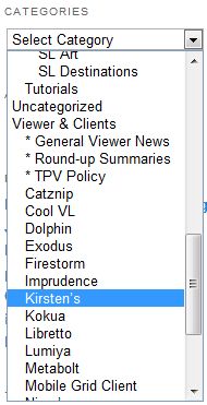
New Categories menu (sidebar) A new theme with greater white space within the text and an updated font, both of which I hope will improve readability
- Inclusion of the sidebar on every page, rather than just the home page, which I hope will assist in better navigation
- New hierarchical Categories menu, with additional sub-categories to improve topic selection (e.g. Viewer and Clients has been updated to allow you to pull-up all reviews on a specific viewer, rather than relying on tags, plus three new sub-categories added for viewer round-up summaries, general news on viewers of any flavour (rather than reviews) and news and updates relating to the TPV Policy)
- New sidebar DESTINATIONS REVIEWS category for accessing reviews of SL destinations and other virtual worlds / immersive environments I’ve visited.
Hopefully, these changes will help make the blog more readable and more effective as a resource / reference tool for those who use it that way.
I’ve retained the menus as well, but the new theme allows me to move them to the top of the page. Hopefully this will make those items which include drop-down lists and sub-menus (e.g. Reviews) to be more usable than the older layout, which sometimes required page scrolling in order to properly display a sub-menu.
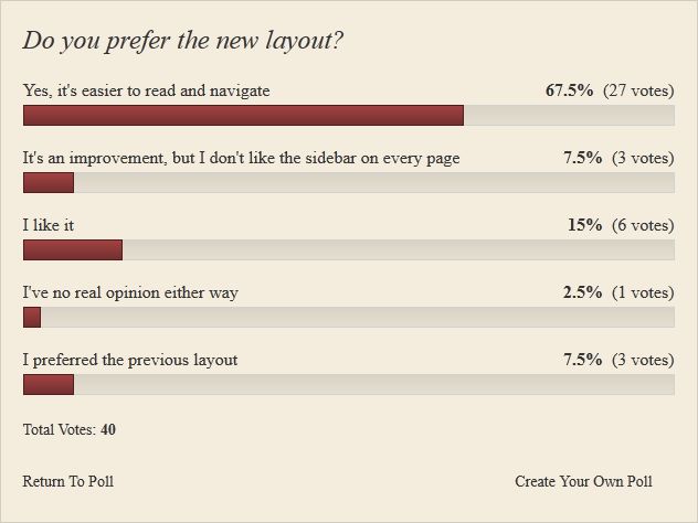
I’ve included a little poll here, please feel free to use it as an indicator of how well you like the new layout.
The poll is now closed. Results are shown below.

It’s looking great, Inara 🙂 I’m looking forward to do a redesign on my own blog as well; but it has to wait, I still have two other sites to finish first hehe…
LikeLike
Thanks.
I nearly did a Lab and simply changed things, then thought I should practice what I preach and engage with my readers for feedback :).
I’m still debating the self-host route as WP.com is so every limiting in many respects (such as people unable to edit their own comments & correct their own typos). The only thing that puts me off self-hosting is the idea of banging-in adverts, etc., to help offset the costs.
LikeLike
The font is very small on a 1920×1080 screen, around a 10-11 point font it looks like, and making it even slightly bigger screws up the structure. Massive empty area’s on both sides when it’s at default size though It’s not unbearable, but random things being bolded is a little visually jolting. Bigger pictures could work, or something to fill in all the empty space surrounding the content. Otherwise, still good.
LikeLike
Forgot to add picture of font problems ~> http://i46.tinypic.com/7167ft.png
Using Firefox, Chrome, and Win7
LikeLike
Yes, it’s a better look, the extra white space is especially welcome, makes skimming easier. For that reason alone go with the sidebar on every page, since it’s the element that is holding the place open. I think the typeface is good size and readable font, but looks like the whole body copy is in bold (?). Maybe there is something with a slightly thinner weight?
Now you just need a refurbish on your header design (I mean yellow cursive on black, really?)
I’m available, and for you, free 🙂
LikeLike
Thanks :). No bold used on the body font; the WP.com template give me limited control over the typeface itself. Gald the greater whitespace is working; it’s what attracted me to this format.
Am working on a new header for the blog at the moment, but unable to settle on a design. Small steps as they say.
LikeLike
Is there a font you can use that doesn’t break up the text with random bolded letters?
LikeLike