Visual Auto-mute: a farewell to ARC/ADW upsets?

A new set of functions has been released by LL as a changeset, and is starting to find its way into SL Viewers.

Essentially, this functionality allows you to set thresholds above which avatars with a very heavy load (high-res textures, complex attachments (multiple prims, flexi prims, sculpts, and what have you), etc., – but not scripts, which are a completely different kettle of fish) will not be rendered by your Viewer. Instead, such avatars will appear as “grey ghosts”, similar to when they’ve been muted; however, IMs and chat can still be exchanged. This should theoretically reduce the load placed on the Viewer and a your system in terms of rendering, and lead to an improved SL experience.

It’s important to note that the functions only affect how such avatars are rendered in your world-view; they will still render normally in their own view, and for anyone who hasn’t set thresholds / has higher thresholds than you. Also, your avatar will remain visible in your view, no matter how you set the limits.

The thresholds are governed by two functions, initially released by LL as a set of debug settings:

  • RenderAutoMuteByteLimit – Maximum bytes of attachments before an avatar is automatically visually muted (0 for no limit)
  • RenderAutoMuteSurfaceAreaLimit – Maximum surface area of attachments before an avatar is automatically visually muted (0 for no limit)

These currently require numerical values to be entered. However, it is possible that they’ll find their way into at least some Viewers as Preferences options, possibly using sliders. Zena Juran has already opted for this approach with the latest release of the Zen Viewer (below).
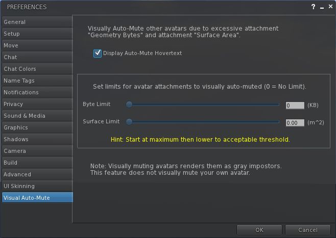
Visual Auto-mute as presented in the Zen Viewer

The functions are supported by a new addition to the Develop menu: Render MetaData->Attachment Bytes. When active, This displays a set of figures over / near avatars, which can be used to help you to determine the byte and area thresholds you should set.
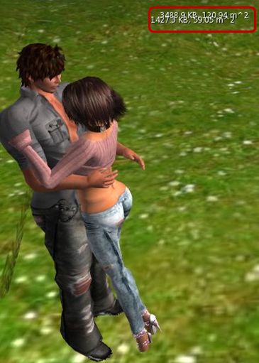
Rendering Metadata->Attachment Bytes display enabled

The approach has already come in for considerable discussion on the SLU forum, where opinion seems to be weighted towards the favourable.

Certainly, it can’t be denied that avatars can impact Viewer performance enormously, so any moves that enable the user to have a greater degree of control over what is hurting their SL experience is potentially a good thing. But lag is a very sensitive subject – as anyone who has encountered upsets in the past due to people using ARC as a Big Stick can testify.

This approach would appear to be a lot more beneficial than something like ARC and its successor, Avatar Draw Weight (or ADW) are concerned, as it should hopefully reduce the amount of finger-pointing and hostility that goes on when people have arbitrary figures in red floating over their heads like a glaring accusation of wrong-doing.

It’s also somewhat friendlier than the other alternative to “blocking” “overloaded” avatars: that of audio mute, which denies any communications capabilities where some might be preferred and which can, if done on a group basis, leave a poor soul ostracised in silence with no idea why.

There are, however, some drawbacks. On the minor side, it is possible that setting the options when entering a popular venue may well result in you finding one or more friends around you turn into grey ghosts  – or that you end-up greyed-out in their view. This might in turn result in strained relations, but shouldn’t really be anything reasonable people can get past – and even joke about privately.

This isn’t necessarily a “one size fits all” solution as well; it is possible that, depending on the type of venues a person visits (in terms of popularity popularity, nature of the activities carried out, etc.), the thresholds may need adjusting from time-to-time in order to gain the best benefits / compromise in terms of performance benefits and visual appeal. This may limit the scope to which the new functions are used, as people are not always willing to fiddle around with sliders as they teleport around SL.

It also needs to be remembered that avatars aren’t the only load placed on the Viewer, and using functions like these might not help tremendously when moving around an environment that has dozens upon dozens of high-resolution textures all over the place (such as a store or mall). In this regard, the effectiveness of the system needs to be balanced against alternative approaches (such as the use of avatar imposters, or by simply turning-down your draw distance and turning down / off various options within the Viewer Preferences) in order to improve one’s in-world experience.

The biggest question-mark over the new controls, however, is that of effectiveness. If the results of playing with the new options is an improvement of a couple of fps in overall performance and/or a very slight improvement in rendering time, then it is unlikely that they are going to gain a lot of traction. But if people see a demonstrable improvement in their overall experience, then it is liable that the functions are going to prove more popular.

That said, anything tha moves us further away from the finger-pointing extremism that has been the plague of ARC /ADW, has to be a step in the right direction, doesn’t it? One possible benefit from this approach is a greater awareness and consideration of just how one’s own avatar might be impacting other people’s experience within SL, simply by seeing that it exceeds the thresholds one is setting against other avatars.

Well, one can hope, can’t one?
Taking stock of Inventory: LL ask for feedback

ProductTeam Linden (who he/she? is it Rhett in disguise?) has posted to the Technology Forum about a new option for presenting Inventory within the Viewer. Apparently, when the Viewer was split between the Basic and Advanced modes, moves were made to try to improve / simplify inventory presentation, but they never made it to a final cut of the Viewer.

Now they have, and Linden Lab is asking for feedback. The announcement reads in part:

For new users, managing and understanding inventory is often challenging. Drag and drop over large inventories can be problematic and daunting. New users are often confused about the meaning of certain system folders.

Today we have released a Project Viewer beta that includes this simplified presentation of inventory as an option. Before we consider any widespread changes to inventory, we want to know what you think about the Simple Inventory UI, noting that the target user is someone just starting out.  

The Simple Inventory UI offers new users:

  • A simple display presenting only one folder at a time
  • Improved wayfinding and findability
  • Faster load of inventory items

The article then invites users to download a Project Viewer which includes the new Inventory presentation, and to provide feedback (via the SL forum), with any bugs that are found logged in the SINV Project JIRA. In doing to, the article notes:

It’s important to note that Simple Inventory was intended for Basic mode before Basic and Advanced modes were merged. It is still experimental and so it is unclear how it will function with extremely large Inventories, so if you have a large Inventory we don’t recommend using Simple Inventory as your only view. 

There are also some incomplete features and some known issues, again as LL note.

So, what is it like? As I have a fairly extensive inventory that (if I say so myself) is well-managed and ordered that I’m in no mood to mess with, I tapped my CTA (Crash Test Alt) on the shoulder and took the Project Viewer for a spin.

Quick Tour

The Viewer has an initial release number of 3.2.8 (248008), and installs into is own folder but shares the standard cache and user folder locations as all other SL installations. Once started, the Viewer has the same funky blue/teal UI as the DD Project Viewer – so I assume this is to provide a simple means of recognising that you’re running a Project Viewer. Otherwise, the Viewer looks and behaves like a “normal” release.

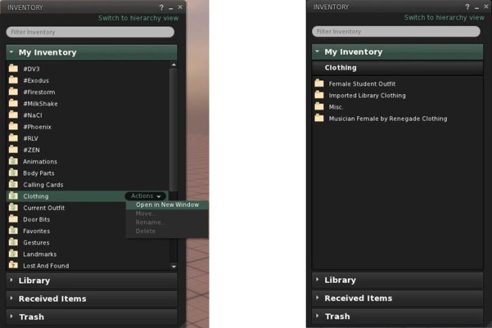
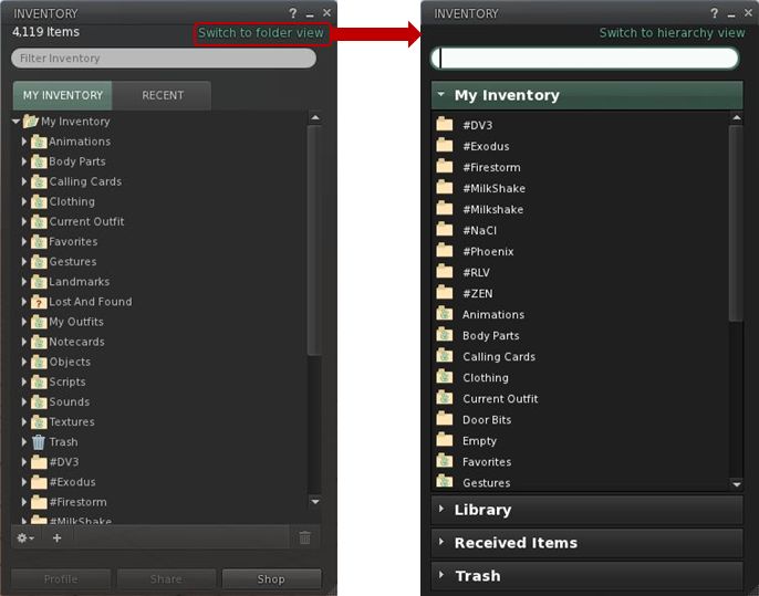
Opening Inventory initially reveals a familiar panel (for those that use the official Viewer), but one with a new SWITCH TO FOLDER VIEW link in the top right corner (below left). Clicking this brings-up the revised layout (below, right).

Inventory: from hierarchical view to folder view

Key points of the new layout:

  • Inventory is divided into clear sections: MY INVENTORY, LIBRARY, RECEIVED ITEMS (for the forthcoming Direct Delivery) and TRASH
  • You can have more than one section open at a time
  • Sections can be resized by hovering the mouse at the bottom of an open section so the cursor changes to a double-headed arrow. Click and hold the left mouse button to drag the sections beneath the open section up/down
  • Within a section, folders and contents are listed alphabetically (so system folders do not appear at the top of MY INVENTORY by default, and folders are not sorted to the top when mixed with objects)

As the view is not intended to be hierarchical, there are no arrowheads to the left of folders or any ability to open them within the displayed panel. Instead, opening a folder is now achieved in one of two ways:

  • You can hover the mouse over a folder to highlight it with an ACTIONS option. Clicking this will displays context menu from which you can select OPEN IN NEW WINDOW (below, left)
  • You can double-click on the folder and have a new view of the contents slide neatly into the existing panel, replacing what was already there.

Note that to prevent accidents, system folders automatically have the options to move, rename or delete them disabled.

Whether you opt to open folders in a new window, or display them in the existing panel, the end result is the same in terms of what you see (below, right).

Opening folders: either hover the mouse over the folder and Click ACTIONS for a menu (l) or double-click a folder. The contacts will be displayed (r)
Inventory breadcrumbs

If you opt to drill down through your folders by opening each in a new window, then navigating back and forth is a relatively simple matter of swapping between windows and closing those you’ve finished with.

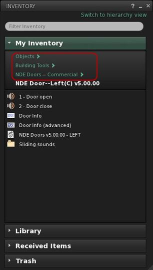
However, the system also makes it possible you to navigate up / down a set of nested folders within a single panel by adding breadcrumbs to the top of the panel (right) as you open each successive folder, allowing you to navigate back up the tree. At the same time, hovering the mouse over MY INVENTORY will reveal another ACTIONS option from which you can elect to go BACK TO TOP FOLDER.

Once in a folder, items can be highlighted and the ACTIONS menu used to manipulate them (e.g. wear, move, rename, delete) – again displayed options are context-sensitive (so if you are wearing an item, that option is not displayed, for example).

You can move items around your inventory in several ways:

  • Use the ACTION menu to select MOVE for an item / folder. This opens an additional window in which you can navigate to your desired destination (double-click through the required folders), before clicking MOVE TO SELECTED FOLDER to finish the task
  • You can also simply drag-and-drop items / folders within a panel
  • You can drag-and-drop between inventory windows
  • You can drag-and-drop between sections (between RECEIVED ITEMS and MY INVENTORY, for example) – the destination section does not have to be expanded in order to do so.

A couple of things I did notice during testing were that a) worn items are not highlighted / indicated in any way and b) there is no option to remove / detach a worn item. There also appears to be a bug, as selecting WEAR appears to ADD the selected item to your avatar, rather than replacing anything already worn – my CTA ended up clumping around in two pairs of boots….

Feedback and Thoughts

I don’t really have any issues with the functionality presented here per se. It works OK, the overall layout within a panel is fine, and (known issues and bugs notwithstanding), it all works pretty much as expected. There do appear to be some issues that do need addressing, however, and as LL asked for feedback on the system as presented (and allowing for the fact it is only an initial iteration, here’s mine:

  • Add the ability to see what is actually being worn or is attached to the avatar within the Folder View
  • As most people are likely to be moving folders from RECEIVED ITEMS to MY INVENTORY, it would make sense to move RECEIVED ITEMS above LIBRARY, to reduce the chances of a mis-click dropping items into the Library section
  • As currently supplied, the functionality is perhaps a little too limited – no ability to create sub-folders, for example, so the ability to organise one’s inventory is  restricted to drag-and-drop into whatever is already there
  • Don’t be afraid of using menu options at the top of the inventory panel (File, Create, Sort, etc.) – they are lot more intuitive for users new or established than having options buried behind obscure “+” symbols and cog-wheel icons.

Also, if it is intended provide both views (Hierarchy and Folder) within the inventory panel of the a release Viewer at some point in the future, then I’d also suggesting ensuring that the top-level folder presentation is consistent between them (i.e. scrap the “system folders to top” default in favour of an alphabetical listing for the Hierarchy View), as this will assist familiarity in switching between views.

Thoughts

Candidly speaking, this alternative presentation comes across as yet another Linden curate’s egg. On the one hand, it cannot be denied that there are issues around how the inventory panel functions (the “high-speed scrolling” that can occur when trying to move an item from one folder to another, for example), and that things could be improved in terms of presentation. On the other, this approach is perhaps a little too simplistic to make a valid judgement at this point; too much functionality has been stripped away. Looking at it in the form presented, it’s hard to see the direction in which it’s liable to grow (if any) – which I think may be the issue LL are having, hence the low-key call for assistance.

I also cannot help but think LL “misunderestimate” new users here. While people are new to SL, it’s doubtful they are new to computers and things such as file management tools like Windows Explorer and the Mac Finder. After all, they’ve managed to find their way online, navigated the web to the SL website, found the Viewer download link, downloaded the Viewer, found the installer on their computer and installed it… As such, is understanding the nuances of inventory management that big an issue for them? I’m not convinced.

That said, there are undoubted benefits in some aspects of what is presented here: a “flat file” view may well be more to some people’s liking (providing it is better integrated with a hierarchical view as well), and the use of a pop-up “move” window could be preferable to some than relying on drag-and-drop – and it’s good to provide alternatives. I just can’t escape the feeling the perhaps LL are missing an opportunity. Given most people are liable to be familiar with the likes of Explorer and Finder, why not grab the bull by the horns and make inventory more approachable by presenting it in a similar manner to those tools – perhaps a two-panel display, with scrollable hierarchical view to the left, open folder view to the right with the associated drag-and-drop capabilities?

I’m not saying it would be easy to do (or even necessarily a short-term development). but were it possible to achieve, I’d venture to suggest it would meet with significant approach from established and new users alike.

I’ll certainly be keeping my eye on this to see how things develop. In the meantime, and given feedback is being sought, if you’ve not already taken a look at the Project Viewer, I’d encourage you to do so & pass your thoughts / suggests to LL via the forum.

Lab fails to align itself

Update 16th January: Charlar has added a comment to the JIRA that clarifies LL’s position on the alignment tool and puts concerns into perspective. The comment further makes it clear that from LL’s position, the opportunity to see the tool included in the official Viewer is far from closed, and Oz indicated in his comment from yesterday.

Update 15th January: The JIRA mentioned below has been re-opened, and Oz has requested any developers willing to take the alignment tool further to contact him directly. This clearly shows that the Lab is aware of feelings on the matter and are trying to meet people half-way, and full kudos to them on this. Qarl (Karl) has declined to update the code, but has stated it’s in the public domain, and others are welcome to do so.

Earlier in the month, Karl Stiefvater (do I still need to introduce him as the creator of the parametric deformer?) submitted an earlier piece of code he’d created – the prim alignment tool – to Linden Lab under a code contribution agreement.

I didn’t cover the contribution at the time, as Tateru had it very well covered. However to recap: Karl, formerly Qarl Linden, now Qarl Fizz, submitted the code to LL by way of a “Thank you” for a generous donation someone made towards the deformer project, as you can read on his website as well as Tateru’s blog (Tateru having steered the donation in the right direction).

The alignment tool does precisely what it says on the box: it aligns prims, as Karl’s own video demonstrates:

No fuss, no bother. It’s not a one-size-fits-all solution that is designed to fit every possible situation where prims (or linksets or objects)  may need to be aligned, and it is not intended to be. However, it does provides a major benefit for builders in dealing with a specific set of issues that can  otherwise be time-consuming to overcome. As such, it has been adopted by a number of TPVs, where it has proven to be highly popular.

But it has been rejected by Linden Lab under the original JIRA raised on it some 2 years ago by Nalates Urriah. As Lance Corrimal (himself the developer of the Dolphin TPV which uses the tool) and Tateru on her blog point out, the reason for the rejection appears to be primarily because the tool doesn’t perform tasks it was not designed to do and is thus “incomplete”.

The rejection notice as posted on the JIRA reads:

Thanks for making this effort. Alignment and snapping are an area where there are useful enhancements to be made.

However, we are not able to accept this contribution as it is.

These are the primary issues we found which resulted in that decision:

  • The feature should support the same modes as the other manipulation modes.
    • It does not work for non-mod permission objects. This functionality should work for all objects that the user can manipulate in-world.
    • It only supports World snap mode, not Reference and Local modes, unlike all our other manipulation modes
  • It packs and aligns to the face of the object bounding box. If objects are not cubes and do not share the same alignment, or aren’t aligned with the world coordinates (see above), the result of the operation is unexpected. Ideally the operations would use the actual shape of the object for aligning and packing.
  • There are also some coding implementation style issues that would need to be addressed. These can be covered in more depth after the functionality is dealt with.

In it’s current form, this is usable for purely prim-based builders under specific circumstances. It’s less useful for building with non-cube prims, mesh, sculpties. It’s minimally useful for building when the structure is not facing a global direction (ex: North, South, East, West). It’s not usable by non-building residents who need to place and organize purchased items.

LL obviously have the right to reject code that they feel is not in their best interests, or in the interests of the Viewer or their users. That’s a given and is fair enough. As such, and being of a generous nature, I have to say that there might be some mileage in some of the reasons given for the rejection (Jonathan Yap actually raises a couple of points within the JIRA). But, and again being fair to all, the rejection equally comes across as little more than nit-picking.

Take, for example, the remark that, “It’s minimally useful for building when the structure is not facing a global direction (ex: North, South, East, West).” On the surface, this might appear reasonable – until one remembers that the same is pretty much true for building as a whole in the Viewer at present – as anyone who has encountered prim drift can ably testify.

Then there is the comment, “There are also some coding implementation style issues that would need to be addressed. These can be covered in more depth after the functionality is dealt with.” This reads as not only nit-picking, but also to be putting the cart before the horse.

If Karl is in fact committing some basic errors in his approach to coding for the official Viewer, surely these should be addressed before embarking on any major functionality changes (were they to be agreed upon), in order to circumvent the risk that such “style issues” don’t lead to yet another rejection down the road?

Some have commented that the entire rejection smacks of a “not invented here” mentality. That may be the case, equally, there may be issues within the code as submitted we’re not privy to and which the note in the JIRA isn’t really helping to make clear. Even so, seeing this rejection I have to confess to being left with an uneasy feeling as to how the deformer tool is to be judged by the wider audience within LL. Time will tell on that, however.

As far as the alignment tool is concerned, I’m with Tateru on the matter and calling “time” on any hope of seeing it incorporated into the official Viewer, for precisely the reasons she states.

With thanks to Tateru Nino

Direct Delivery beta

Direct Delivery (DD) – the mechanism that will replace Magic Boxes for merchants using the SL Marketplace and which should bring improvements to the overall delivery of items purchased on the Marketplace – is in open beta for people to try on the Beta (Aditi) grid.

Direct Delivery has been subject to many ups and down over the last twelve months, but this beta should bring it a step closer to reality. Given LL’s overall track record on the delivery of new Marketplace services, this is something that has merchants understandably nervous and concerned.

Documentation relating to the new system has also been updated, including the release notes and a set of getting started instructions – both of which are worth a read, although the latter are somewhat irritating (see below), and will be rationalised and clarified prior to DD going live.

For those (merchants especially – although it would seem those curious as to how purchasing goods using the new system can also have a bit of a go) wishing to try-out the system:

  • You’ll need to have the Direct Delivery Project Viewer (version 3.2.7.247349/dated 10th Jan or later), complete with its funky blur-tinted UI elements (new to this Project Viewer, or sign of another change coming to the UI?)
  • You’ll need to have an active account on Aditi and should log into that first if you’ve not done so in a while (indeed, you might want to change your password as per the linked instructions & force an account update if you haven’t)
  • You’ll need to be able to log-in to the Aditi Marketplace (this may throw up a security certificate warning, depending upon your web browser settings).

Testing Purchases

For those simply curious as to how they’ll be affected when purchasing goods, it’s very straightforward:

  1. When logged into the Beta Marketplace, simply purchase any item commencing with “DD”.
  2. Open your Inventory panel and click on the RECEIVED ITEMS tab at the bottom of the Inventory panel to expand it – and your purchased items should be in a folder, ready to be moved into the location of your choice in your Inventory.

Note: Items purchased on the Beta grid will only be available in your Beta grid inventory and purchasing them will not impact your Main grid L$ account balance. If your Beta grid account does not have a L$ balance, you can raise a support ticket. Funds cannot be transferred between the Beta and Main grids.

Direct Delivery: from the Marketplace to you (some Marketplace steps omitted) – click to enlarge

Testing Uploads (Merchants)

Items using Direct Delivery no longer need to be boxed-up – part of the idea being that people receiving goods will no longer need to rez a package in-world and unpack it (although if you wish to box items still (and some of the limitations of the system actually mean you may still need to), you can.). Nor do they require a Magic Box; instead they use a new addition to the Viewer – the Merchant Outbox – to upload goods to the Marketplace.

You can organise your items either in your inventory itself, or within the new Merchant Outbox panel (located in the ME menu on the Project Viewer) prior to uploading. Of the two options, the former is probably the preferred, given that anything organised solely in the Merchant Outbox will vanish as soon as it has been uploaded.

The basic steps are:

  1. Open your Inventory and the Merchant Outbox (ME->MERCHANT OUTBOX).
  2. Drag the items from your Inventory panel to the Merchant Outbox panel.
  3. If required, organise items by folders in the Merchant Outbox (individual items dropped into the Merchant Outbox will automatically be placed in their own folders).
  4. Click the SEND TO MARKETPLACE button.
  5. You should get an on-screen confirmation when all items have been sent.
  6. Log into your Marketplace account on ADITI.
  7. When logged into the Marketplace:
    1. Click on My Marketplace (top right) and select MERCHANT HOME.
    2. On the MERCHANT HOME page, click on MANAGE LISTINGS on the left (or click on INVENTORY at the top and then select MANAGE LISTINGS from the drop-down).
    3. Your listings are displayed, with unassociated items at the top.
    4. Use the ACTIONS option to the right of each item to create a new Marketplace listing in the usual way.

Obviously, multiple items can be uploaded via the Merchant Outbox, I’m using a single item purely for demo purposes.

From you to your Marketplace store & ready to be listed: Direct Delivery (click to enlarge)

Irritating

The tests themselves are easy to carry out. What is irritating is the lack of attention paid to the “getting started” instructions. Vis:

  • The instructions wibble on about downloading a Magic Box (this is testing Direct Delivery, right?) – a Magic box isn’t required for a basic test of the DD functions – either when purchasing goods or uploading them
  • They direct you to place the Magic box at one of two locations on the Beta grid  – one of which is – or was during my testing – (wait for it) NO REZ (virtuatrade Campus S).

If mention of Magic Boxes is included for those who wish to carry out more involved testing (such as comparing what happens on uploading, how the system handles  / differentiates items uploaded via either mechanism, etc.), then this should really be made clear in the instructions. Also, and as a minor quibble, why isn’t the Magic Box itself set-up as a DD item? That would kill two birds with one stone (get a Magic Box for more involved testing and test the receipt of DD items in a single pass).

There is also an error in the Selling in the Marketplace instructions which might lead some to get a little confused. These direct people to their MERCHANT HOME page, and then to click on MANAGE INVENTORY, when in actual fact the required link is MANAGE LISTINGS, which is located under the INVENTORY heading.

Feedback

I’m not entirely sure why this level of testing is now required, as it all seems very basic. But then, I wasn’t involved in the closed beta testing and I haven’t been keeping up with discussions on DD via the Merchant’s forum. As it stands – and leaving aside the inevitable amount of work required to shunt stuff from Magic boxes to the DD system, this process seems straightforward and easy to understand for merchants and consumers alike (“getting started” instructions for the Beta notwithstanding).

My tests here are, of course, pretty basic. It’ll be worth keeping an eye on the Merchants’ forum and the Beta thread to see if any major issues come out of the beta process, as well taking a read through the documentation listed below.

Links to Documentation

“Strewth! There’s a bloke down there with no strides on!”

Oz Linden has announced that due to a change to the inventory transfer protocol, a new inventory patch has been issued by LL.

Commenting on the patch, Oz states: ““We’re going to be deploying changes to the inventory backend soon that improve robustness and performance, but in testing those changes we found that existing viewers relied on certain things being strictly ordered.  With the new backend, that assumption does not always hold true.

“Changeset d327dcc8ae51 from viewer-development implements the viewer change needed to avoid race conditions.  It should be straightforward to apply to any viewer, and is safe to release before the changes are deployed (it is compatible with the services as they are now).”

The exact deployment date for the actual change to the inventory transfer protocol is unclear – longer than days, but less than a month. However, TPV developers are being encouraged to implement the patch sooner rather than later.

Commenting on the impact of not implementing the patch, Oz says, “I believe that there is no known risk of inventory loss or damage without the patch, but it is true that some operations can result in accidental nudity, which some users might be unhappy about.”

One side effect of this is that the patch will not be applied to the official 1.23.5 Viewer code by LL, and so that Viewer has been removed from the Viewer download page of the wiki. However, developers supplying Viewers based on the V1 code base will be able to port and apply the patch to their own code.

With thanks to Tateru Nino.

Comparative Viewer frame rates

Last week, Pserendipity Daniels left a comment on comparing Viewer performances which got me thnking. As I said in my reply, coming up with an objective means of comparing the performance of various Viewers is a little difficult, as so much as client-side dependent (hardware) while some is also down to your network connection.

However, I decided to take those Viewers I’ve actively used over the last 12 months (as opposed to reviewed and put to one side), and see what I could come up with by way of a very basic and simple means of comparing Viewer performance that might address Pep’s question without me getting bogged down in anything complex (which would probably go right over my head anyway…).

So, the two tables below represent my findings based on Viewer frame rates – which I appreciate aren’t the only measure of a Viewer’s performance (but they are the one most looked at). There are further notes below the tables on how I set-up and ran my “tests”.

Jan 6th: Tables updated to reflect the fact that Niran’s Viewer has been using the 3.2.6 code base since release 1.01. Also, Nalates Urriah has carried out further analysis on these figures.

370m altitude – click to enlarge

Average ping rate for sim: 167ms (averaged across all eight Viewers)

22m altitude – click to enlarge

Average ping rate for sim: 174ms (averaged across all eight Viewers)

Key

  • “High” = graphics set to the SL “High” setting (Ultra in the case of Phoenix), shaders ON, all Deferred Rendering options for lighting & shadows and ambient occulsion (or equivs) OFF
  • Deferred  = deferred render ON, but ambient occulsion / shadows OFF
  • Ambient = deferred render ON, ambient occulsion ON, shadows OFF
  • Shadows = deferred render ON, ambient occulsion OFF shadows ON
  • Ambient + Shadows = deferred render on, but ambient occulsion / shadows ON
  • Numbers in brackets refer to the official Viewer release I believe each TPV is based upon.

Test Environment

To try and give as level a playing field as possible for the tests, I attempted to create a “test environment”, namely:

  • Tests were run after a completely clean reinstall of the listed Viewers (original installation and all associated files / folders uninstalled / deleted)
  • All Viewers were configured alongside my nVidia Control Panel in accordance with this tutorial from the Shopping Cart Disco blog (with thanks to Innula Zenovka for pointing it out)
  • All other major graphics and network settings within the Viewers were set to the same criteria (e.g. Draw Distance set to 300m; network bandwidth set to 1500kbps, etc.)
  • Where possible (and with the exception of Firestorm and Phoenix) the UI was set-up the same: same buttons, same locations, and not other floaters / panels were open, and any group chat sessions active on logging-in were terminated
  • The same avatar with the same attachments was used with each test (with a Draw Weight of 112,986), with the same camera defaults
  • I used the same regions for all Viewers tested, each with 4 other avatars in the regions during the tests. One region was a skymall shopping area, the other a residential sim at ground level (which actually had the same 4 other avatars present in it for all tests!)
  • The same test was used for each case: Teleport to an arrival point; allow rez time, then walk a set route for around 3 minutes, monitoring fps rates
  • Recorded frame rates are based on a roughly-calculated average, rounded up or down to the nearest whole number, as appropriate.

Hardware and network connection

The hardware used for the tests comprise my usual PC and nework connection:

  • Windows 7 32-bit with SP1; Intel Q6600 CPU 2.4Ghz; 3Gb RAM; ASUS motherboard (no idea of the model); nVidia Ge9800GT with 1Gb on-board RAM (driver: 8.17.12.8562 15-10-2011); Viewers running on 320Gb SATA drive @ 7200rpm
  • Netgear DGN2200 (wireless between PC and router)
  • Internet connection averaging a ping of 43ms to the preferred test server, with a download speed of 9.55Mbps and 1.02Mbps upload (speedtest verified).

Notes

  • I don’t pretend that either the methodology or the results are particularly scientific, and underline that they are at best indicative – and even that’s strongly caveated
  • Frame rates varied somewhat from those recorded in my reviews (obtained using a basic alt avatar & on a variety of sims)
  • On my home sim, when alone, SL 3.2.6, Exodus and Milkshake all exceed 60fps in “High” mode at altitudes above 300m; on the ground all achieve rates in the high 40s
  • Niran’s Viewer has achieved higher rates in Beta then with release 1.03, which Niran notes as being a “test” release. Unfortunately, the 1.02 release will not run on my PC at all, so I’ve been unable to test it
  • SL 3.2.6, Exodus, Milkshake and Niran’s all demonstrate considerably faster sculptie rendering than the other Viewers on my PC (sculpties rarely initially rez as a sphere or disk, but simply “pop-out” fully formed a few seconds after other prims).

Obviously, there are other factors that weigh-in on Viewer choice, and it is actually possible to have a worthwhile in-world experience with what might be regarded as low frame rates (I’ve been running Firestorm with shadows enabled since before Christmas, with an average frame rate probably around 12fps (allowing for averages between locations) for example). In the case of Niran’s Viewer and Exodus, the graphics enhancements may well provide more of an incentive for use than straightforward frame rates. Certainly, the quality of rendering on Niran’s Viewer is signifcantly better when optimised than the majority of other Viewers (although it really hits my GPU hard!).

So, in conclusion, you’re free to interpret these results as you see fit; how much value they represent is questionable. As always, individual experences may vary wildly from my own (particularly those of you fortunate enough to run a higher-specfication CPU / GPU combination). However, as a finger-in-the-air reference point for my own reviews, the tables may have value, and I may maintain them…

Again, to be clear: I’m not claiming the test is designed to be either empirical or scientific – please do not take it as such.