Niran’s 1.33: super smooth and totally flexible

Update, April 30th: Niran has released a fix for the pink texture issue affecting those using ATi graphics systems. Details are on his website, with a download link.

Earlier this month I took a quick look at the Preview Release of Niran’s Viewer 1.33, focusing on the UI work NiranV Dean has been carrying out within the release – part of an ongoing project to provide a more efficient Viewer front-end. Today sees the launch for the final version of 1.33, and in NiranV’s own words, this is a “major, major release” for a wide range of reasons. As promised in my last report on the Viewer, I’ve taken time to have a nice, long play with the Windows version.

TPVD Listing

First and foremost, after a long and incredible development curve, Niran’s Viewer has been accepted for listing in the Third-party Viewer Directory and should appear there in the next week or so – congratulations to Niran on all the work that has gone into the Viewer, and to Tarnix for the development of the Linux version.

Two Versions

The 1.33 release comes in two flavours: without and with the Mesh Parametric Deformer. The reason for this is simple, the code doesn’t set well with the Viewer – which might be, as NiranV acknowledges, due to issues with the Deformer working on his development hardware, but which could also be related to conflicts between the code and the Viewer’s rendering pipe. However, as NiranV notes in his blog: “You should be able to experience the Deformer mostly normal if you activate Deferred, Shadows and Ambient Occlusion, meaning that the separate release is only for those who can run [in this mode] and [who] want to test it to give Qarl Feedback.”

Installation

The Windows installer package weighs-in at 40Mb, and now creates a desktop shortcut icon (yay! no more hunting through Explorer and shunting bits around). Installation itself is, as always, fast and smooth, with the change log displayed in the opening window for those who are curious but who haven’t actually delved into Niran’s blog to read the information there.

On start-up, and for the first time with Niran’s Viewer, I did encounter a virus threat warning from AVG. This is something that is not uncommon among Viewers, with a number of TPVs (and the odd release of the Official Viewer) throwing up warnings on occasion. It certainly be taken to mean the Viewer is up to mischief. LL themselves provide some guidance on avoiding false threats. As the alert was related to the slplugin.exe file (a common cause of false virus alerts), I felt confident in marking the alert as a false flag and continuing.

The UI

As mentioned above, the User Interface is very much one of the focal points of NiranV’s work on the Viewer, and I took a look at some of the upcoming features in my overview of the initial Preview release. As such this is the logical place to start with this look.

The first noticeable thing with this release is the on logging-in the UI is extremely clean and minimal. with both bars and buttons only appearing at the top of the window, rather than the top and left, as with earlier versions.

UI: functionally minimalist

The buttons displayed by default are Speak, Voice, People, Picks, Places, View, Inventory and Appearance, which represent an interesting mix and which, in a nod to Kirsten’s Viewer, are initially displayed in “S19” format. There’s still no option to left/right align buttons either at the top or the bottom of the window (or to the top/bottom of the window if you place buttons on either side of your world view), so I’ll keep pestering NiranV on this :).

If I’m totally honest, the top button bar is something I’m personally not overly keen on: when active, it actually blocks the uppermost section of the screen from use, so you can’t “dock” (or more correctly in the case of the 3.2 FUI align) floaters with the top bars: there will always be a gap. But this is just a personal niggle on my part.

A nice touch with Niran’s Viewer, for those who don’t use the top of the window for anything at all, is the ability to hide the Navigation Bar, etc., at the top of the screen completely when not in use (the mini-Location bar is automatically displayed in its place) by setting Preferences->User Interface Options->UI Customisation->HIDE TOPBAR AUTOMATICALLY. Introduced a couple of releases ago, this is still something I like rather a lot, given I don’t use the top button bar.

In terms of the button options, Niran’s Viewer presents pretty much the standard set of buttons that come with the Official Viewer, so there is not the massive range of buttons that are displayed by other TPVs – which itself isn’t really a problem. One Button that does make its debut with this release is the SCRIPT button, which opens the Script Information floater.

Colours

When it comes to colours, Niran’s Viewer presents the most customisable UI of any Viewer, something I’ve again covered in the past. With this release, NiranV adds a new tweak to the use of colour: to denote options in both menus and Preferences tabs which may result in Viewer issues and  / or crashes, or which should be used with caution on the part of users unfamiliar with them. Those options where caution is advised are coloured orange with this release, with the more experimental / specialised options coloured red (see right). NiranV indicates that these colours may change with a future release, but the idea is certainly a good one in terms of being a visual indicator (although there is a risk colouring an option will encourage people to “click and see”).

In a slightly tongue-in-cheek move, NiranV has coloured the option to Exit the Viewer red because after all, as he says, it does close down the Viewer and logs you out of Second Life!

Fix it!

A new addition to UI floaters comes in the form a pin icon in the top right corner of most (not all) floaters. Called “Fix it!”, this locks a given panel in the position in which it is currently displayed on-screen.  Once active, the floater cannot be accidentally dragged elsewhere on the screen. For those involved in activities such as photography, machinima and combat, I imagine this could prove a useful option. The option is also likely to appeal to those who like to have certain core panels (such as inventory) function in a similar manner to when the Sidebar was available (i.e. always appearing on the right of the screen), as they can “lock-in” the floaters to do so – although in the latter case, it should be noted that the functionality currently isn’t persistent between re-logs, although this should be fixed in a future update.

Frame Rates

All Viewers include the option to include a “lag meter” in the top right corner of the menu bar, which shows the Viewer’s performance in terms of a colour-coded graphics bar. NiranV has improved this by allowing you to toggle between the bar and a numeric frame rate display.

Again, this is only a subjective measure of performance, but for those puzzled as to whether the traditional bar is indicative of good or bad performance, the numeric display should help clarify matters.

Super Smooth

The bet way to describe using the Niran’s Viewer UI is smooth. That you’re in something very different to other Viewers is evident the first time you move your camera view – everything pans and slides very smoothly, almost as if you’re on a cushion of air, with motion gliding to a gentle halt. Of course, you can achieve the same in other Viewers by altering your camera movement options, but NiranV has done it for you, making the entire experience a lot .. well … smoother.

This approach can be seen elsewhere in the Viewer, particularly the way options and sub-panels in floaters slide gracefully in or out of view. Take a look at one of Niran’s excellent videos for a practical demonstration:

Preferences

Preferences are the clearest instance of significant changes to the UI. NiranV has done a considerable amount of work in this area to try to rationalise both the way in which Preferences presents options to us, and how we interact with it. A lot of this I covered last time around, but NiranV has continued to refine and improve.

Preferences: overhauls and rationalised

The first noticeable thing on the redesign – at least for those who used the Preview 1 release of 1.33, is that the Preferences panel now auto-sizes itself correctly according to your screen resolution; there are no more scroll options to the left / right of the panel as described in my look at the initial Preview release.

Those coming to Niran’s Viewer for the first time are liable to find the Preferences panel something of a “?!” moment when first opening it; who wouldn’t after the basic layout of the panel having remained pretty much unchanged (other than for custom tabs) almost since the dawn of time? However, I have to say that, with a couple of very minor reservations, NiranV has produced an alternative Preferences panel that makes a heck of a lot of sense and encourages fast, easy use.

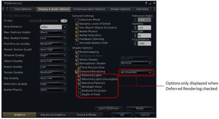
At the top are five major category tabs, most of which are pretty self-explanatory. Each of these has up to three sub-tabs (displayed at the bottom of the floater) which help rationalise and order functions and options. Additionally, some tabs may have context-specific options that are only display when certain options are enabled (such as with advanced rendering in the Display and Audio tab, or many have additional toggle buttons on the right to shift between sub-groups of options.

Continue reading “Niran’s 1.33: super smooth and totally flexible”

Niran’s 1.33 Preview: pathfinding the UI

One of the things that has always attracted me to Niran’s Viewer – and is drawing back to it now that performance has once again improved on my hardware – is the fact that NiranV Dean is constantly looking at the UI as a seasoned user of SL and other immersive software and trying to find ways to reorganise things within the UI – particularly menus and floaters. This has led to Niran’s Viewer being highly innovative in both look and feel.

In recent releases, this has been reflected in the fact that right from the moment you load the Viewer, you know you’re using something very unique: The log-in / splash screen has been markedly different from other Viewer for a while, and recently gained a video element to replace static images. The video – shot in the Insilico region – demonstrates the power of Niran’s Viewer as a Machinimatographer’s tool, and is beautifully overlaid with the log-in options without the latter intruding on the video itself.

I’d still link to see some kind of link to the Grid Status page (indeed, given LL won’t step-up to the plate on this one and provide a Viewer-based means for users to be aware of SL issues prior to logging in (not everyone uses the Dashboard). I’d like to see all TPV take a leaf from Firestorm’s book in this regard), but other than that Niran’s approach to the log-in splash screen is enticing. Once you’ve entered your credentials, the screen reverts to the familiar images, progress bar, mandelbrot-like animation and Niran’s famous (and amusing) tips.

Of Floaters and Preferences

Given this is a Preview of an upcoming release, I don’t intend to cover everything that NiranV is doing with the Viewer – I’ll take a broader look once a former release is made. Instead, I’d like to focus on the massive amount of work he’s been putting into the various UI floater panels – which, with this release – reaches the Preferences floater itself.

Now, I’ll be the first to admit that when NiranV first started to work on redesigning the floaters (the Build floater in fact, after revising the World Map), I wasn’t entirely convinced as to the result. Since that time, he’s continued to refine and improve his layouts and I have no hesitation in saying that they are reaching a point where my early concerns have been completely invalidated.

And evolutionary process: the redesigned Build floater as it first appeared in Niran’s viewer (top) and how it looks today

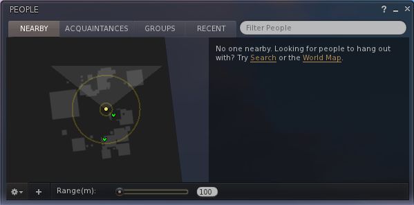
More recently, the work has extended to the People floater, allowing information of friends and groups to be presented in a way that easily scans on the eye and doesn’t require floater resizing or other messing around with each update that comes out.

The People floater showing the Nearby tab with mini-map enabled, and the Groups tab (edited for privacy)

Other examples of Niran’s work can be found in elements such as the Mesh Upload floater, which I looked at recently and which presents the necessary information and options without putting a size 14 footprint all over the in-world view.

Preferences: a Complete Overhaul

Version 1.33 of Niran’s Viewer brings with it something we’ve never really seen in the entire history of the SL Viewer: a radical redesign of the Preferences floater.

That you’re into new territory when accessing Niran’s Preferences is immediately obvious: there are no left-side tabs. Instead, primary options are accessed from a left / right scrollable tab list at the top of the floater, with additional sub-categories for a given option are displayed in sub-tabs access at the bottom of the current Preferences page being viewed.

Options have also been renamed in an attempt to make the tabs more reflective of the options they contain. By default, Preferences will open on the Communications Options tab (above). However, and in a move long overdue in Viewers: the floater will actually re-open to display the last tab actually in use / displayed when OK was pressed / X was clicked on to close the floater.

The tabs as currently displayed in Preferences comprise (from left to right across the top scroll area):

User Options: includes three sub-tabs:

  • General: analogous to the General tab in the official Viewer and containing the familiar language, content access (General, Mature, Adult), name tag display options and busy response, together with options to set name tag colours
  • Advanced: provides access to all popular camera, movement and mouselook options found within the official Viewer and TPVs
  • Privacy: displays the Privacy tab options (clear history, log file options, options for setting who can see you are on-line, etc.

Display and Audio Options: Combines the Graphics and Sound & Media tabs and comprises three sub-tubs:

  • Graphics: displays a re-ordered and improved graphics settings option list as shown below, with advanced options for deferred rendering only displayed when the deferred rendering option is checked. This tab also includes a button for accessing Niran’s own Optimiser floater
Re-ordered and clearer graphics settings
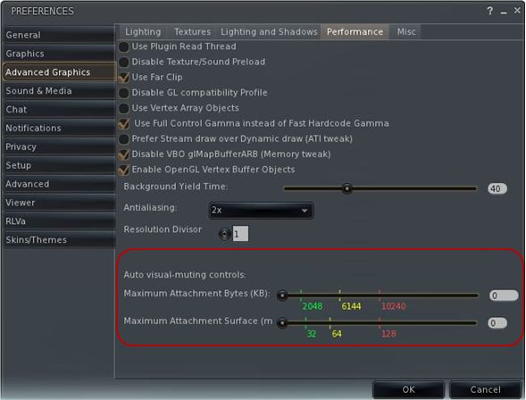
  • Advanced Graphics: displays all major advanced graphics options (glow definition, lighting, performance options (including visual auto-mute), etc., all logically grouped and accessed via dedicated buttons
  • Sound and Media: includes the volume controls, media playback options, Voice settings, etc., as found in Sound & Media in other Viewers

Communications Options: brings together the communications options variously found under Chat, Notifications and Colors, and presents them in three sub-tabs which also include the relevant popular TPV options such as MU* poses, OOC auto-complete, etc.

Viewer Options:  presents those options usually associated with setting-up the Viewer, including the Setup tab, the Advanced tab and also include a dedicated sub-tab for RLV/a options, all in their own dedicated sub-tabs.

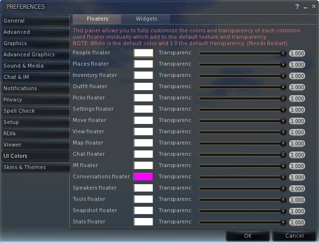
User Interface Options: includes all of Niran’s Viewer’s comprehensive UI customisation options, including the ability to set the colour and transparency of all commonly used floaters in the UI. Includes three sub-tabs: UI Colors, Skins & Themes and UI customisation.

Feedback and Thoughts

NiranV Dean continues to push the envelope in terms of re-working the Viewer UI. In terms of the changes to Preferences, I think the approach taken has a lot of merit and actually provides a much faster means for one to locate options (after traversing the initial learning curve). The layout is easy to use and options have been brought together with considerable thought. Obviously, there is a degree of re-training one must go through to use the Preferences with ease, but this isn’t exactly mountainous and shouldn’t be cause for complaint.

Were I to critique it at all, it would be in that the User Options and Viewer Options contain some degree of cross-over in terms of what they do. As such, even after spending a good deal of time using the Viewer it can still be confusing as to where a given set-up function might be – do I go to User or Viewer (or even the Viewer sub-tab under User Options?). I’m not sure how this could be avoided without having something of a mess in terms of one page displayed a multitude of sub-tabs, but I do feel that these are areas where further work may be required – and is probably being considered, given this is only a preview.

Now, if Niran provides a means to left / right align buttons (I’m not so much fussed by top / bottom alignment on the left/ right, if I’m honest, as I don’t place buttons to the side of the screen) and gets the chat bar so it can be “docked” to (or at least aligned with) the bottom of the Viewer window, I’ll be one very happy bunny!

Performance-wise, 1.33 is perhaps the best release of Niran’s Viewer I’ve run on my PC recently, with respectable frame rates at my standard settings in the high 20s / low 30s. Enabling deferred and shadows does still crash this – and rather more so than recently LL Viewer releases, with an average frame rate of just 7-9fps with shadows on running my normal defaults (see the Review System panel on the right of the main page of this blog). However, Niran’s seriously kicks bottoms when it comes to the sheer quality of the world-view generated when running deferred with shadows: the lattice-work of the roof of my house casts beautifully crisp shadows that suffer none of the “greying” or blocky fuzziness I’ve experienced with other Viewers.

Crisp shadows

I’ll have a further look at updates and changes to 1.33 when it reaches a full release status.

Related Links

Niran’s Viewer 1.30: pushing the envelope

Note: Niran subsequently released versions 1.31 and 1.32 following this review. Both contain tweaks and additions to 1.30, including further floater layout alignments (most notably the People floater (1.31) and the Merchant Outbox is translated and functional in German (1.32). You can catch these updates on Niran’s blog

NiranV Dean has released version 1.30 of Niran’s Viewer, which is described as “a complete overhaul” – and there is enough that has gone into it to justify that comment.

The Viewer has been something of a differentiator in the TPV world on a number of fronts: elements of UI presentation are markedly different (such as the menu presentation and things like the Build floater), the Viewer also offers a huge amount of nips, tucks, tweaks and changes to the graphic end of things which, while geared towards higher-specification machines, offer much that is of benefit to machinimatographers and photographers. Finally, and as the Viewer has developed, NiranV has not been afraid to seek to incorporate more of a game-like approach to things.

The changes in this release are extensive – and some are not always obvious (such as localisation in the log-in and log-in progress screens),, which doesn’t make them any less time-intensive to produce. I’ve aimed this piece at covering the more visible changes.

Over-the-Shoulder

The first noticeable difference between 1.30 and earlier versions is that the camera default position has been moved to an over-the-shoulder view. This may not be to everyone’s liking, but it does offer an improved world-view in many respects. As someone already using Penny Patton’s camera offsets to achieve a similar result, I found the look very familiar and comfortable when I logged-in, although the camera position is a little closer than I’m accustomed to seeing. This isn’t a problem until one uses the DOWN ARROW / S-key for moving backwards; while this now turns your avatar around, it also tend to have your avatar well over to the left on-screen, making navigation even over a short distance a little harder. For those that aren’t keen on these views, it’s obviously possible to reset to a more “traditional” view.

Staying with the camera for a moment, mouselook also gains the ability to use the SHIFT key in combination with mouse movements to smooth the motion of the latter on-screen and provide precise tracking. Handy for those in combat / shooting situations.

Floating Away

NiranV’s work on redesigning various floaters continues. With this release, People and Mesh Upload come in for attention.

The People floater joins Build in going horizontal – – and this works particularly well with Nearby, wherein the people list and mini-map can be displayed without having to have a long vertical panel opening on-screen.

Revised People floater

Another nice touch with this is that both ONLINE and ALL are displayed side-by-side (although may require extra scrolling if you have an extensive list of friends!).

The Mesh Upload floater has been compressed and the lay-out tided so that it also doesn’t require so much on-screen real estate. The result is a clean, compact approach that is still relatively easy on the eye, although the ability to resize it via dragging might not go amiss for those who would prefer it to be a little bigger.

Mesh upload

The Build floater has been further tweaked and again provides a cleaner display and appears less cluttered than early iterations.

Menus and floaters have also had their transparency adjusted to give a consistent feel right across the Viewer, and to aid in readability.

“Pick a colour, any colour…”

Perhaps the biggest single update in terms of the ability to customise the Viewer is that users can now set the colour and transparency of every common floater in the Viewer and set colours against every common widget.

UI colour and transparency options for floaters

Changes to floaters require a Viewer restart to take effect, while changes to widget colours will be applied immediately.

For those missing KLee’s Viewer, a small nod has been added to Niran’s 1.30: the UI buttons can now by displayed in KLee Viewer style.

And there’s more…

As well as these changes, 1.30 also sees:

  • More work on translating the UI for German and French users
  • Improvements and tweaks to various Preferences panels
  • Fixes to media roll-off and max sliders
  • Incorporation of the latest Shining fixes
  • Text compression (which may help with some crash issues on older cards, but not recommended for ATi systems)

A full list of changes can be found at the end of the blog post on the release.  Gone from this release is the “main menu” option and the SL Kinect2 option. The former is being reworked, the latter may be gone for good due to compiling issues with Linux.

Feedback

I’ve always liked Niran’s Viewer – the “dares to be different” approach has meant that the Viewer has been very innovative and something very different from “standard” 3.x-based offerings. My experience has suffered over the last few releases because my PC has struggled to manage the Viewer, particularly when running some of the more advanced deferred rendering options. Whereas early versions ran very well – frame rates up in the mid-30s sans deferred options, more recent releases have been barely half that.

Release 1.30 goes some way to reversing this trend, allowing me to achieve frame rates of between 28-32 with 3 or 4 others on-sim, and deferred rendering is back on a par with earlier releases (around 8-9fps). This still isn’t as fast my PC can manage with other Viewers, but it’s a lot faster than I’ve enjoyed of late with Niran’s, and as such is very welcome.

In all, the Viewer runs smoothly, exhibits no proclivity towards crashing on me (it rarely has), and I had no lock-ups when taking lots of snapshots with deferred rendering turned on (an issue I tend to get with other viewers, particularly if I move the camera around a lot with the snapshot floater open when running in deferred).

In terms of the UI changes, the ability to make the UI multi-hued may find a lot of appeal among those who like a highly individual look to their Viewer. For me, I like the general tidying done to the Build floater – which is starting to grow on me – and I very much like the new People floater, which really maximises the use of space. The new default camera position is also something that appeals, given I already use something similar, although I’d personally prefer to set my camera back a little further.

Overall, a lot of work continues to go into this Viewer, it’s still one of my two preferred Viewers when it comes to my amateur attempts at photography, and given I’ve got a slight boost in performance with this release, it may well see a lot more use again as I hop around the grid exploring and snapping pictures.

Kudos!

Related Links

Niran’s Viewer 1.23.5 and more: daring to be experimental

NrianV Dean has been putting in a lot of work on Niran’s Viewer over the past couple of months, with new versions rolling-out fairly regularly. Many of these have experimental functions added to them – so much so that NiranV has taken to jokingly referring to the development work as coming from Niran’s Lab. He’s been keeping me appraised of updates and changed almost daily, but in-world projects and real life concerns of late have meant that I’ve not really been able to take Niran’s Viewer for a proper spin since release 1.13.

Releases 1.24 (Feb 14th) and 1.25 (Feb 15th – gives you some idea of the speed of updates!), have given me cause to play a little bit of catch-up. Release 1.24 was itself essentially a series of fixes and tweaks to the 1.23.5 release (also made on the 14th February), while version 1.25 adds version 0.2 of Qarl’s Parametric Deformer to the Viewer and includes some graphics related tweaks. You can therefore take this review as more-or-less a n outline of the key elements from all three of these releases (1.23.5 through 1.25).

If you’ve previously installed Niran’s Viewer – particularly 1.23.5, it’s probably best that you opt for a completely clean install of either 1.24 or 1.25, although I do comment on a couple of pre-1.23.5 updates as well.

There are two flavours of the Viewer EXE on offer – dedicated 32- and 64-bit variants. As Niran’s is compiled Large Array Aware, I’m not entirely clear on the difference, but I gather the 32-bit version of the EXE was a special request.

On start-up, there are no overt changed to the Viewer’s UI: as is common for Niran’s, the buttons are split between the left and right sides of the screen, the Navigation / Favourites bars are on, and the Destination Guide initially opens by default, as is common for most V3.2-based Viewers.Which is not to say the changes aren’t there.

Navigation Bar: Now You See Me, Now You Don’t

For those that both like to use the Navigation / Favourites Bar but at the same time find it slightly intrusive on their world view, Niran’s now includes a nifty auto-hide function. Enabled through PREFERENCES->VIEWER->UI SETTINGS, this will automatically hide the Navigation / Favourites Bar when the mouse isn’t positioned over it, and replace it with the Mini-location Bar. hovering the mouse at the top of the screen automatically displays the Navigation / Favourites Bar once more. Neat!

“Are you lookin’ (down) at me….?” – Camera Updates

On the subject of views, the Camera options have been altered. NiranV is keen to introduce more game-like elements to the Viewer – we’ve seen it with the experimental “Main Menu” (F1 – of which more below). Now with the camera, he’s replaced the traditional Front view with an overhead view. As a slight aside: does anyone actually use the Front View? I always tend to find myself orbiting the camera around myself.

Looking down on oneself

To me, the initial view is somewhat high, so many using the option are liable to find themselves using the Camera View Angle slider (PREFERENCES->ADVANCED-> CAMERA) to close the distance between themselves and their avatar.

Staying with the Camera and Preferences, 1.24 introduces something I’ve been waiting for in Viewers for a goodly while: the ability to alter camera offsets without the need to twiddle about with Debug options. As many know, I’m a firm convert to Penny Patton’s Camera Offsets for SL (if you haven’t tried them, you should), so it’s great to see a Viewer that includes the ability to change offsets on-the-fly through Preferences. Kudos, NiranV!

Camera offsets within Preferences

Staying with Preferences

Regular Niran’s users will noticed as well that the entire Advanced tab has been revamped in this release, with Camera, Movement and Mouselook options separated into their own button-activated sub-tabs. This also marks a departure from the more usual “sliding panel” approach seen to date within Niran’s Viewer with regards to sub-tabs (and which can still be seen within the Viewer tab, for example. Referring to this re-vamp in his blog, NiranV states the new button approach may be added to the Viewer and Advanced Graphics tabs should it prove popular with users.

Also new to the Viewer (from version 1.22 onwards), and found in the Advanced Graphics tab are control from the new Visual Auto-mute function, complete with colour-codes guides to possible settings.

Visual Auto-mute controls

Avatar Animations

Work has been done around avatar animations with this release. Most notably for those developing animations, release 1.24 of Niran’s provides full support for uploading .ANIM files, as supplied by Jonathan Yap (see STORM-1803). Niran also adds his own touches in the form of options to control how your avatar reacts when being rotated. NiranV has included a couple of videos to demonstrate the functions, and I’ve taken the liberty of embedding one of them here.

Build, People and Rendering

Having just completed a vast amount of work on an obsession of mine, which involved working with some relatively small cross-section prims, I found myself constantly annoyed at the way in which the white stretch anchors repeatedly blocked access to the red, green and blue X, Y, Z stretch points on a prim. NiranV offers a solution to this problem: providing WASD is set to movement (rather than starting chat), you can press and hold the X key to eliminate the white “corner” anchors to ease access to the X, Y ands Z stretch points.

NiranV has also revised the People floater with this release, replacing the FRIENDS tab with an ACQUAINTANCES tab, his argument being most people we have on our lists are more like acquaintances than true friends, and one cannot fault his logic on this in many respects. Also with this release, the Acquaintances List will show the full set of permissions you’ve set for friends (ability to map you, etc.).

Finally, and also coming out of Niran’s Viewer Labs, is a new rendering option that may have potential use in the future. NiranV explains it thus on his blog: “One thing big has been done here except Tofu´s new project which has been merged, it’s called worldspace semi-random macro-dappling, which creates random big darkness spots on a SIM and your Avatar depending on the sun position. Later this could be combined with the cloud X and Y movement to create a good but faked cloud shadow effect!” At present only the depth / darkness of the effect can be altered – but it will be interesting to see where this goes.

The Main Menu

Finally, Niran has been working on his Main Menu idea for the last few releases. I first covered this in my review of release 1.13. Back then I commented on the fact that using ESC to invoke the menu wasn’t perhaps the best choice, given that key is traditionally associated with the Camera. NiranV took this on-board, and the menu has, for the last few releases, been accessed by pressing F1. The style of the menu has also been changed, as shown below.

Main Menu – “compass”

The look is apparently borrowed from a popular video game. I’ll be honest and stay that while I have no idea how well it has gone down with regular Niran’s users, I actually find it jarring and incongruous compared to the rest of the Viewer, factors that tend to make me shy away from using it.

Performance

Niran’s Viewer is intended for high-end machines and continues to get tweaked in that direct and further releases come out. As such, it’s a little unfair of me to comment on performance in some respects, because my hardware is well below the recommended hardware specifications for the Viewer (the closest I get to meeting them is that I’m running a quad-core CPU). My graphics card in particular now struggles mightily with Niran’s if I attempt to use deferred rendering & shadows, a factor that has, sadly, prevented me from using the Viewer quite as much as I might otherwise like.

That said, I’ve put the Viewer to several hours of reasonable use, bouncing around the grid, trying different environments, playing with the settings (as some of the screen caps here will show!) and generally poking and prodding, and the Viewer has taken it all in its stride (albeit without deferred rendering). The changes NiranV is introducing to the Viewer are both novel and leading-edge. There are some that are very practical – for me, the camera offsets in Preferences are a great addition, and those wishing to make use of the Visual Auto-mute option will find the inclusion of both that as a set of sliders and the annotation for settings that goes with it as being of benefit. Other additions – such as the top-down camera view are potentially more specialised, and it’ll be interesting to see how popular these prove to be for a wider audience of user.

Related Links

Niran’s Viewer: release 1.13

Update Jan 24th:  Version 1.14 is now available which fixes the snapshot floater iessue meantioned in the article, and which also see the Main Menu moved to F1 from ESC, thus resolving the camera / Mouselook reset issue also mentioned here. The download location remains the same.

Nirans-logoGood grief! I turn my back on SL for 1/2 a day to go shopping and take care of that “real life” thing, and what happens? Another Viewer update pops up! :).

NiranV Dean has been busy scribing away (do coders scribe, I wonder?) on Niran’s Viewer of late, with 1.12 appearing earlier in the week and now we have 1.13 arriving. NiranV’s aim with the Viewer is not to come up with the fastest (in terms of frame rates) or the most features and functions – but rather to focus on developing better graphics and a more flexible user interface. This combination has made Niran’s Viewer daringly different  – and release 1.13 continues with this.

Main Menu

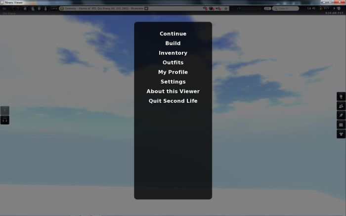
On starting the Viewer there is also little sign of any changes within the release. However, tap ESC and you’ll receive an interesting surprise: the Viewer has a “main menu”!

Niran’s: Main menu

The options on the menu are self-explanatory, and NiranV clearly states this is only an initial pass at the menu – the style and layout will be subject to change, and constructive feedback on the idea is welcomed via his blog.

I have to admit that when the idea was first explained to me, I was sceptical as to its use – but I’m not sure I fully understood what NiranV was proposing. On seeing the menu, I can see that there is potential here. However, I’m not sure that using ESC is the right key function. While I understand it may be a common approach in “traditional” games (I’m genuinely not qualified to comment either way on computer games), it has to be said that ESC has long had a “traditional” use in SL: for resetting your camera view or popping out of ML. Ergo, there is a risk here that putting ESC to another use is going to cause frowns among some users, other options for getting into / out of ML notwithstanding.

I did have problems with the My Profile and Outfits options on the menu (neither worked for me), but again, this is an experimental feature.

Snapshot Floater

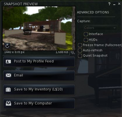
The revised snapshot floater in V3.x has always struck me as being a tad on the large size. Niran’s addresses this by offering a more compact floater, although it needs a couple of tweaks to finish things off – the “expand” chevron and image resolution information is somewhat squeezed by the image preview pane, and the expanded Advanced Options slider could do with being just a little wider (the closing bracket of “(fullscreen)” seems to “fall off” the edge of the panel a little. However, this is, to me at least, an improvement over the default floater in terms of size.

Snapshot floater: a trifle squeezed?

Looking at Snapshot actually reminds me to comment on the top-to-bottom fade found in the floaters on Niran’s Viewer. I’m not sure how recent a change this is – I first noticed it on the 1.12 release – but it is really rather smart and I find it adds a little something to the Viewer as a whole.

Gestures Enhanced and Other Bits

This release sees gestures enhanced with additional trigger options, as NiranV explains, “You can now use additional trigger keys for gestures, which are E Q R F I T Y Z G C V M O P and Space, you can set them in the Shortcut key combo NOT MODIFIER!”

Also in this release as an experimental option is the ability to bulk upload .anim files via NV->FILES->UPLOAD->BULK UPLOAD.

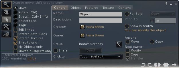
The revised Build floater, introduced in 1.12 has gained popular feedback from the core Niran’s Viewer users and has received some nips and tucks as a result.

Build floater: nips and tucks

Version 1.12 also suffered from locking issues that appeared to be related to Shining fixes. However, following investigations, NiranV found the problem seems to actually be connected to inventory loading, and has this to say on the issue and Shining fixes in general within 1.13:

“Well with 1.12 I added some Shining fixes that seemed to cause initial freezes on login, but no ….its your Inventory! IF you freeze several times on login before [the] World turns smooth, then your Inventory has been fetched … If you want, I can do an option to disable initial fetching.

“Apart from that, I´ve added a few other Shining fixes which fixed the Underwater Crash I´ve noticed when you look into the “void” (the blue water fog at the end of a sim) and transparent meshes -> meshes should now render correctly when setting them to 1% transparency or having a transparent texture on them … instead of vanishing completely. [Be aware that] the bump map on mesh crash is still present; don’t set bump maps on meshes unless you want to crash. The bump map will be set after your relog.”

Feedback

Niran’s Viewer doesn’t have everything I like to see in a Viewer – but then again, if it and every other Viewer did have everything we all wanted, they’d all likely be exactly the same. However, it is still very much a Viewer I enjoy using. However, recent releases have suffered where I’m concerned, as they have tended to push my system to its limits when I’ve wanted to use the bells and whistles.

While Niran isn’t focused on the “traditional” elements of performance (and remembering that they are always subjective and subject to a myriad of factors that cannot always be managed in everyday use of the Viewer), I have to say the 1.13 has so far reversed performance issues for me somewhat, and has been more amenable to me running with shadows, occlusion and so on switched on. This has been a pleasant surprise, as alongside Exodus, Niran’s is my Viewer of choice for what passed for photography in my hands.

Outside of this, I think the main menu idea could well have more traction than I’d given previous credit. The inclusion of such a menu may seem out-of-step with Viewer development to date, but I have to admit that were it to be used in a Viewer specifically aimed at new users, for example, it could have considerable positive impact. As it is, it’ll be interesting to see how the idea develops within Niran’s Viewer, and whether any other TPVs adopt the approach.

All-in-all, an interesting update, with more to come in the future, going on NiranV’s blog comments!

Links

Restrained Love, Dolphin 3 and Niran’s updated

This week has seen a number of TPVs updated. Rather than dwell interminably on each of them, here’s a rapid rundown, based on the individual blog entries for the three Viewers.

Restrained Love Viewer

Release 2.8.3 brings with it many bug fixes and:

Added

  • New keyboard shortcuts for builders (they are also added to the Build > Options sub-menu):
    • – Alt+W to edit linked parts
    • – Alt+T to set to stretch textures
    • – Alt+B to set to stretch both sides
    • – Alt+R to set to set grid mode to World
    • – Alt+F to set to set grid mode to Local
    • – Alt+V to set to set grid mode to Reference
    • – Alt+G to set to set current selected object as Reference and set grid mode to Reference
  • Debug setting “RenderMeshDeformed” to switch Qarl’s parametric alpha mesh deformer on and off (it is off by default
  • LL’s patch for the new inventory features (i.e. no accidental nudity)
  • Allow to click in-world while in Mouselook mode, even when your controls are taken, but only while pressing Alt

Fixed

  • Inventory offers were unreadable (the Show button used to overwrite the URL), same for teleport offers
  • Shift+Right-click on an object in world failed to open it
  • In Mouselook mode, we could only click on something or fire with a gun once
  • RLV_50: Fix to the alignment tool in the Build floater is broken (thanks given to Lance Corrimal and Jonathan Yap)
  • RLV_52: another avatar sitting down while in ML resets my camera (with thanks to Lance Corrimal)

Changed

  • Unable to be force TPed when in Busy mode.

Links

Dolphin Viewer

Version 3.2.4.22939 brings with it:

  • The main inventory tab can now show or hide links, or show only links (the recent and worn tabs always hide links). Switch it on via the Inventory gear icon
  • The use of private memory pools has been switched off. If you notice more crashes than before, switch it back on with the Debug setting “MemoryPrivatePoolEnabled” and let Lance know (via a post on the forum)
  • This version of the Dolphin Viewer 3 does not send “LookAt” data anymore, if you switch on “Do not point at objects” (Preferences->Dolphin Viewer 3->Miscellaneous). Lance notes that, “The options to have the LookAt / PointAt crosshairs on-screen will be gone in the next release, unless someone points out good use cases for having them that are not based on drama or paranoia.”
  • The inventory patch recommended by Oz Linden has been implemented – no “accidental nudity” for Dolphin Viewer 3 users
  • Updated to RLV 2.8.2.1
  • When you take a Snapshot to disk using the keyboard shortcut CTRL-SHIFT-D, it uses the file format that you selected for your last “snapshot to disk” from the snapshot floater
  • The check boxes for switching AutoCloseOOC and AllowMUpose are back in Preferences->Dolphin Viewer 3->Miscellaneous
  • The linux version of the Dolphin Viewer 3 now uses dbus calls in the secondlife: handler script to send SLurl to whichever viewer is running at the time. Lance comments, “This is not available on 64-bit Windows, so please vote for VWR-28073 and VWR-28074. Thanks.”
  • The Windows installer should not use the term “Second Life” anymore anywhere in any language. It should read “The Dolphin Viewer 3″
  • Some Windows build issues have been addressed.
  • Fixes:
    • The tips of the handles of the Align tool in the Build toolbox point in the right directions
    • Sharing inventory items with more than one inventory window is open is now working correctly
    • The hovertip on the local chat bar mentions whispering as well
    • Previews of textures show the checkerboard pattern again under transparent areas. Lance notes: “This version still does this with the old deprecated OpenGL calls. The next version of Dolphin Viewer 3 will do it “right”, thanks to Shyotl from Singularity”
    • Fixed: the “Preview As” dropdown in the texture upload preview is not covered by the texture anymore.

Links

Niran’s Viewer

Release 1.12 brings with it:

  • New Build floater
  • Ability to select the use of your right arm when selecting / pointing / building
  • Revised pie menu
  • Ability to see UI when in Mouselook
  •  Shining updates.
Niran’s: UI visible in Mouselook (note ML crosshairs in the centre of the image)

The UI-in-Mouselook is interesting – NiranV mentions it as coming via Dolphin, but I’ve failed to notice it in that Viewer (or any other V3-based TPV) – not that I’m a major user of ML at the best of times and so may well have missed it if it is a debug setting (or I managed to skip the option in Preferences). It’s an interesting addition to direct 1st person use of the Viewer, especially given UI options can be accessed using the Alt key. For those who prefer a more traditional Mouselook view, the UI can currently be hidden using a debug command: AllowUIHidingInML.

As a semi-regular user of Niran’s Viewer, I have to say, I’m not totally convinced with the build floater changes (which need a small amount of tidying-up) on two counts. Firstly, because Niran’s is one of three Viewers I routinely use, and so the layout cuts against the other two – this is admittedly more *my* problem than the Viewer’s.

Secondly – and more importantly – while the “traditional” builder floater is getting increasingly crowded (and one could argue it does need a bit of a re-think), it does have a certain logical flow in the way information is presented – and scanned by the user. This is something that appears to have been lost in this initial presentation within Niran’s Viewer.

Links