
It’s a bit hard to miss, but yes, I’ve made a change to the theme underpinning this blog. It’s by no means a permanent change – that depends on the feedback I get. However, there are a number of reasons why I wanted to change things a little, so I’m hoping readers will prefer the new layout.
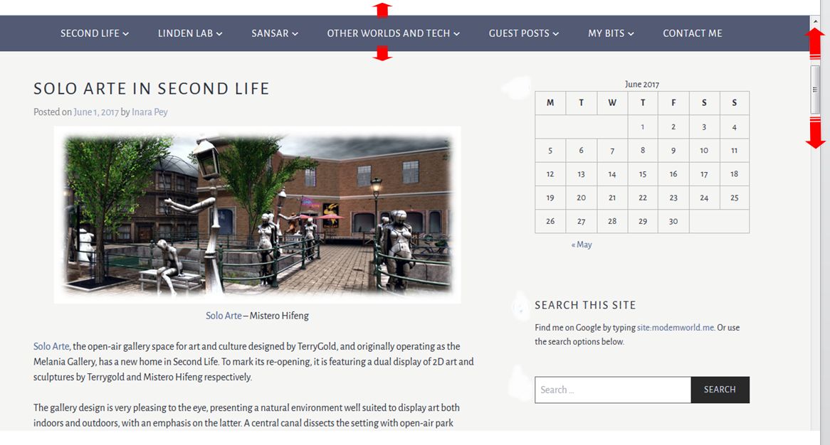
- A lot of effort has gone into the menu system, but it was always a pain to use with the “old” layout, as it was locked to the top of a page – scroll down too far and it would vanish off the top of the browser tab
- Some readers stated they found the old layout difficult to follow, with the sidebar on the right seeming to “run into” the body text
- It didn’t loan itself to viewing on mobile devices that well
- I wanted to tweak the text a little and (hopefully) make it easier on the eye.
As the changes are template-based, it is possible some pages / images in this blog have gone a little sideways in places. I’m working through everything to double-check (unfortunately, the preview option in WordPress doesn’t entirely match the actual page layout, so I could only start checking things once I’d made the change to the new format. Ho hum). Please make allowances if you come across something that looks awkwardly formatted on a page in the meantime 🙂 .
The thing I’m hoping will prove most useful is the menu, which will now following you down a page as you scroll. Given I’ve put a fair amount of time in trying to categorise and track articles and pages in the blog via the menu, this will hopefully make it far more reader-friendly than has been the case in the past.
I’ve also revised the default body and headings text font – again, my hope is this improves readability and comfort when browsing. Unfortunately, one thing WordPress won’t let me change is the use of block caps for headings; this is locked into a CSS I can’t access, but I how the use of caps in titles and headings isn’t overpowering.
Finally, this theme had a better set of style sheets for mobile devices. I’ve no idea how many people read this blog from the tablet, etc, but (with the possible exception of the menu, which is a bit “ugh!” on tablets, etc.), it should make for easier reading if you do.
As with the last major restructure to this blog – in 2012, can you believe?!), I’m offering a little feedback poll for those interested in letting me know quick thoughts on the layout
Poll closed – see the update here.
 Inara Pey: Living in a Modemworld
For those of us with vision issues the modern design low contrast text can be more difficult to read. The beige(?) background is not much of a problem by itself, but the combination with grey type is. I’d ask that you return to black font color for the main text and a much darker blue for sidebar. I read your blog before any others and I *really* appreciate all the work you put into creating it so I care about the readability of yours far more than any of the others. Thank you and please keep up the great work!
LikeLiked by 2 people
Thank Richard. I’ve tweaked a couple of elements – the body text should be darker now on the background. This had meant a heading colour change, thanks to my having to rely in WordPress pre-sets, but please let me know if this helps.
LikeLiked by 1 person
The darker text helps and, while it doesn’t look much darker, the red color for sidebar/highlight text is also more readable, at least for me. The new header is fine for my eyes (as was the old one).
Thanks for responding! If it’s any comfort, I currently use a different web site creator and I also don’t have edit access to all the style sheets which is truly annoying!
LikeLike
Thank you for giving me the the feedback 🙂 – it is greatly appreciated. My aim has always been to make this blog as much a resource as possible, so getting responses from reader when making changes like this are genuinely important to me, even if there is only so far I can go in changing things, and yours helped a lot.
I’m still not sold on the massive banner picture appearing on the article pages myself, but I think I’ve reached the limits of what can be done without abandoning this format altogether. So I’m going to leave the rest to the poll, unless something huge comes up.
LikeLike
I find it quite hard to read and the right hand side bar seems more prominent than the blog post and distracting to me. The font seems smaller too. I did look at some of the older posts to see if the images were smaller or if it is my imagination. Hopefully, there is a better template out there that will please both you and your readers.
LikeLiked by 1 person
Yes, the re-sizing of images from other sites (e.g. Flickr) is one of the reformatting elements which doesn’t show up in template preview tool, so that caught me completely off-guard, I’m still trying to figure out what I can do there.
will continue to tweak the text as I can.
LikeLike
“unfortunately, the preview option in WordPress doesn’t entirely match the actual page layout, so I could only start checking things once I’d made the change to the new format. Ho hum”
Well said, “unfortunately”. This feature made me dismiss many templates right away … for no reason. I could’ve used them very well, they just didn’t look like possible candidates at first. My specific set of requirements is obviously hard to meet for most blog systems, had the same probs already with my Googly Blogspot.
About your new layout I gotta say I don’t like the huuuge header photo. I mean the photos is very nice n all but it’s just soo fukn beeeeeg!!! 😮
LikeLike
I admit, I’m not a fan of header image size. I’d rather have a banner than a football field – but the latter seems to be the way of things nowadays.
LikeLike
Oh yes! Much better 🙂
LikeLike
What is going on this days with banner images that are extreme hugh and complete screen feeling. Linden Lab make that mistake in there new places etc. But i do not like it on this blog.. It’s filling my whole 1366×768 screen. And on desktop it’s i guess filling 70% of the screen, not checked that.
Everything else seems fine for now.
LikeLike
Sadly, it seems to be the way of things with publishing tools. As I’m on WordPress.com (rather than (.org), there is a certain degree of “taking what we’re given” with limited tweaking capabilities – and sadly, I’ve yet to come across a template which offers a banner type header image and the scroll-with-you menu bar.
LikeLike
Personally……..I love it. Especially the large picture as the blog opens…to me it’s rather like the cover of a book or magazine.
Plus it’s not a problem to scroll on down to where the meat n’veg is 🙂
The blog seems ‘cleaner’ and neater – modern. But then I’ve never had, or seen, any of the issues previous commenter’s have.
LikeLike
Trying to improve things is a good idea, but I’m glad that you welcome feedbacks. I like the font better now and it seem to work better without antialiasing too. I have a 1366×768 screen (according to Statcounter it is still the most common resolution on desktop platform, and it’s pretty common on laptops). Some people like me even zoom the page a bit, in order to make the text more comfortable to read.
This is how I see the blog now:
The problem, as you can see, is the menu bar: it’s well organized, but it covers a considerable amount of the screen now (at 120% zoom or more, it wraps as pictured, taking even more space). I don’t know how many people need a menu bar always visible and taking space (it depends also on the kind of website); as for me, since I’m reading your blog, I gave a look at the menu only few times in years, for something specific or to roam a little. In my case the menu bar is covering all that space, all the time, for nothing. It won’t be a big deal to go back atop the page those few times. Of course I can reduce the zoom, it fits better, but the text to read gets smaller as well, while the bar still feels taking space unnecessarily (I saw some compromise, like bars sliding away when scrolling down, then getting visible again when scrolling up). Then there is the huge banner, that makes you to scroll more even to reach the actual post. On a whole, now I find it more uncomfortable to read your blog with this layout. I hope it helps, thank you for reading.
LikeLike
Thanks, Sue. I’ve revised the menu headings somewhat in the hope it helps. On previewing at 1280×720, it appears to remove the line wrap. The banner, I agree, is problematic. Still looking for a solution to that on individual article pages.
LikeLike
Thank you, Inara! Yes, it helps, the line wrap is gone 🙂
LikeLike
Glad it worked. A bit of a cheat approach, but worth doing 🙂 .
LikeLike
I noticed other problem. There’s no home button or option to get quick to the start of the blog.
I did used old link to get to the blog. But now am required to edit the UR:L to get to https://modemworld.me
@Boudicca, If a website need lot’s of scrolling before you can finaly read the contnt you come for. It’s just a terrible design. You want to avoid scroll actions as much as possible. But not how soem websiteds do it by making more pages.
I still think you can set the banner height on wordpress.
This is how it looks on my desktop screen. On tablet it’s only worse.
Lucky the blog title is just readable on desktop.
LikeLike
Click the banner title. It will take you to the home page.
LikeLike
Do you want to say what wordpress theme you have selected ?
I could try it on my for now not used wordpress account mabye.
LikeLike
The header image size is fixed at a nominal 2000×1200. This appears to be tied to a non-editable (in WordPress.com) style sheet. I say “nominal” as WordPress does some further post-publishing re-sampling of the image.
LikeLike
I think it’s 2017 theme.
LikeLike
Nope… but that is one I’m now playing with, as I missed it running through the list of available themes. I’m guessing it’s the one you use, tho 🙂
LikeLike
I have some misgivings about this layout, although the use of a header menu helps, otherwise there’s a concern that your blog has vanished and there’s just an image.
II don’t feel that it’s intuitive to scroll down from the header and as Richardus points out, it’s not intuitive that you can click the header to return to the main blog from within a post.
I’m also not a fan of the lack of the number of a comments on a post being apparent from the main blog view, I’m not sure why I miss that, but it feels like there’s a lack of engagement.
Have you tried adding a Second Life Destination Guide link to a post? They don’t seem to play as nicely as they do in other themes for some odd reason.
LikeLike
Don’t take the personally, but…
“otherwise there’s a concern that your blog has vanished and there’s just an image.”
… Which is precisely what your blog’s homepage has in my entire tab – just a header image, giving me the same impression. Granted, you have just a banner in the individual page views, which is something WordPress.com refuses to give me (as noted in an earlier reply, everything is locked to a 2000×1200 image format via a top-level style sheet… somewhere), but I’m still trying to sort something out.
“and as Richardus points out, it’s not intuitive that you can click the header to return to the main blog from within a post.”
And yet, clicking a header is precisely the way many web pages work – again as per the banner at the top of your article pages 🙂 .
“I’m also not a fan of the lack of the number of a comments on a post being apparent from the main blog view”
I’m working on that.
I cannot add DG links, as I’m WordPress.com, and as I understand it, DG links are classed as “advertising”, which is a no-no when Automattic is your host (unless dosh changes hands).
LikeLike
Hehe no, I’m definitely not taking it personally because I have similar concerns about my own blog layout, which is why I like the header menus you have.
Yes you’re right about many web pages working that way by clicking the banner, that’s how I found my way around my own blog, but it didn’t immediately feel intuitive, although there must be an element that it is otherwise I’d never have clicked that banner.
With the theme I’m running having the number of comments appear isn’t an option, although I have read you can edit some code to make that appear.
LikeLike
Comments now listed at the end of each article n the main page :).
My “old” layout is a typical example of banner clicking – was the only way to get back to the “home” page” without going via the browser buttons. To me, it’s intuitive as I’ve tended to find many blogs and websites are set-up that way.
My main complaint with the 2017 theme is images suffer due to the left border white-space, plus the formatting is terrible when it comes to bullet point / numbered lists.
LikeLiked by 1 person
for me your blog and new template is doing well.
Don’t see the issues many discribe, maybe i’m not looking at the same things, or not giving the same importance to them.
But let me join a screen, so you see that’s all seems fine: http://imgur.com/a/Yb2WB
I try myself out a lot of templates, and like you said, the preview isn’t still that. Have a hard time on Tumblr to chose a template working a bit for me, but still not found the right one i like realy.
I don’t blog on wordpress for the moment, had some in the past… long long ago. 😉 For the moment it’s just a linking-page, and a reader to follow others.
For my part i like lot the menu following while scrolling, very useful and my opinion much easier than have to return each mal on the top.
Pics looks right to, but i see the difference between my screen, and some screenshoots others showed before. Or they have realy an old screen-format, or it’s the mysterious pc-config making that…
But yes, i like it, and it works for me, it’s readable very well, and looks nice. Also the content is still top-notch, so no complaints. 😉
Great content still, so don’t worry to much, and keep blogging, xes, yes !
LikeLike
Thank you, Sepia! 🙂
LikeLiked by 1 person
Sepia, to go to top of the page, just hit the Home key on your keyboard. It’s simple as that, you don’t even have to scroll up.
The difference between your picture and other people’s picture is your screen resolution, that’s nothing mysterious. And it isn’t that they are “really old”, it’s that different machines have different screens: about 1/3 of the computer screen in the world *today* has that resolution or less (mostly on laptops). Of course it will change in the next years, but that’s how it is today. Your resolution is just in 16% of the computer screens, according to Statcounter. If you design or setup a website, you can’t think you are the paradigm of the readers and everyone has your screen, or that if it’s good for you it must be good for everyone; it’s important to check it at different screen resolution and window sizes instead. You can do that by yourself too, somewhat, but reader feedbacks help in may ways, and not just for the screen size. So Inara asked for feedbacks and that’s a wise approach. 🙂
LikeLike
I know that, that’s exactly why i responded and said that’s *for me it’s working well”, which doesn’t mean it’s the case for each and all. Had different sites, so yes, it’s important to check that is working at best for the most, but hard make it work for realy all.
Have a great day, and great thankies for your kind answer ! 🙂
LikeLike
I’d add that if the display diagonal size is about 15″ (like in most laptops), even if you have 1920×1200 screen resolution or even a 4k, the page won’t be necessarily displayed larger: you will get either tiny characters and so you have to zoom, or you have everything scaled up by design (that’s what they do on smartphones too, else you won’t be able to read anything, unless you use a microscope). So on zoomed or scaled hires 15″ displays, besides the better defined characters, the page will still be displayed like, let’s say, 1280 pixels wide screens (or 480 on smarphones in portrait orientation mode).
LikeLiked by 1 person
I do have to admit that when I visited and saw the big blue banner I was taken aback a bit, however after reading your post and seeing very clearly the functionality of the changes (specially the menu following me up and down the screen :P), I quickly adapted to it and find it very useful and friendly.
Always happy for anything that improves your blog!! well done! 🙂
LikeLike
Thanks Lucy! I’m actually still less than convinced about the banner on article pages, so I’ll keep poking around 🙂 .
LikeLike