Note: thie version reviewed here is 3.2.2.24336 with the openGL fixes. If you continue to have issues with Firestorm, try 3.2.1.24179.
![]() It’s here, and it has the OpenGL fixes. And it is quite simply superb.
It’s here, and it has the OpenGL fixes. And it is quite simply superb.
Firestorm 3 is everything a Second Life Viewer should be – and so much more. So much, in fact, that putting together a review has been something of a headache for me – where do I start, how do I order things?
One thing I will say right off the bat – and that is to give a very personal thank you to Jessica Lyon in particular for giving me the means to get started on this review ahead of the official release.
The Log-in Screen
The first of the big changes hit you right from the start: the log-in / splash screen has been significantly revised, incorporating much of the Viewer 3 log-in screen capabilities and, in some areas, extending them.

At the top of the screen are four headers. The first three of these, Destinations, Events and What’s Hot Now, pull information directly from the Viewer 3 log-in screen I reviewed back in August 2011. For those who have not encountered this up until now:
- Clicking on any of the drop-downs will display a sliding panel of Destinations, Upcoming Events, and “hot” places to visit (the latter determined by the number of people currently visiting it)
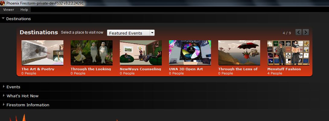
- Opening any one of those drop-down will, very tidily, close the previously-open drop-down
- Hovering the mouse over the middle of any of the images in a panel will display a SELECT button; clicking on this will open a pop-up of further information, together with a notice that your start location on logging-in has been set to the selected location
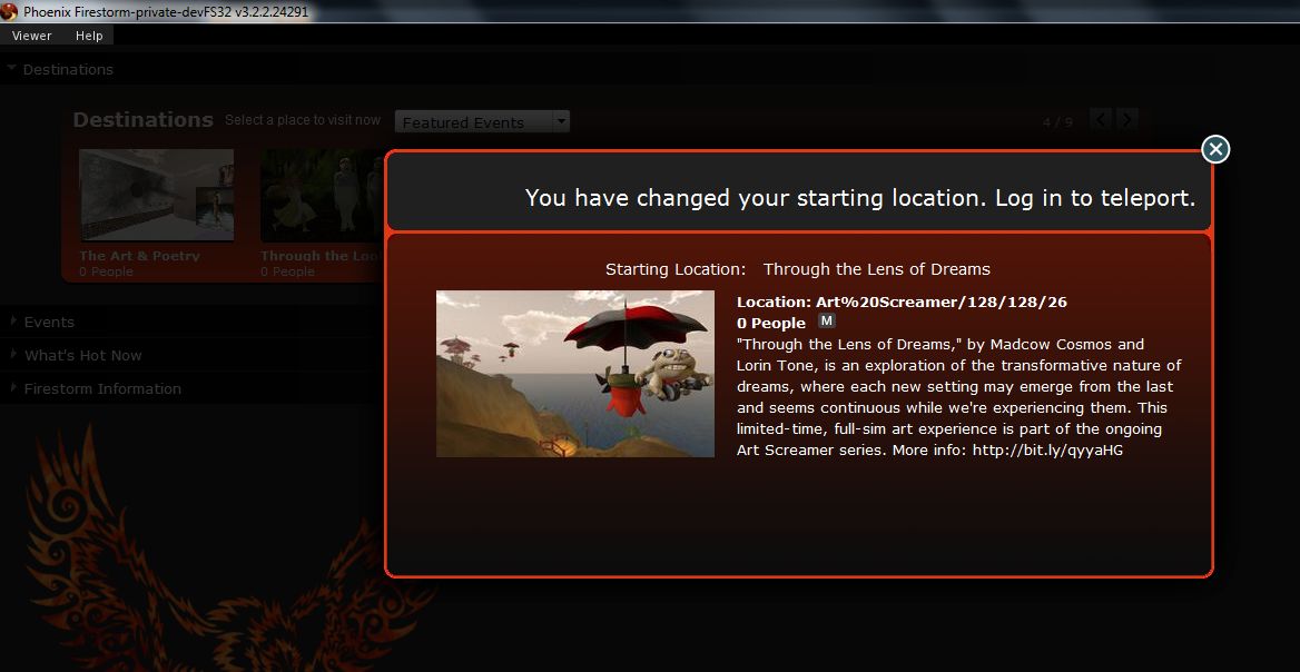
- You can still switch back to your Home or Last Location via the START AT option at the bottom of the log-in screen.
The last option is that of Firestorm Information, which is open by default. This provides links to the Firestorm download page, the wiki pages and the JIRA; the Firestorm Blog; and information on the Viewer version currently under development. most significantly of all, it includes links to the SL Grid Status Page, allowing users to immediately see if there are any known problems of which they need to be aware.
I am an unabashed fan of the Viewer 3 log-in screen; that Firestorm has adopted it is a major plus in my book. That they are further willing to go where Linden Lab apparently refuse, despite repeated cajoling through the likes of Twitter by a lot of people, gains it another huge tick in the Pey Book of Viewer Satisfaction. Would that LL understood the need to put this information front-and-centre, especially given that with the best will in the world, the grid dows tend to go Swedish Chef every so often and bork, bork, bork. But then, the Firestorm developers are all regular users of the platform…
At the bottom of the log-in screen are the familiar log-in credentials boxes. As is common for TPVs (and previous versions of Firestorm), the Viewer can store log-in information for different accounts, making logging-in with an Alt, etc, a matter of simply selecting a name (or indeed, name / grid combination) from a drop-down list. A DELETE THIS ENTRY button allows for the removal of any selected account from the Viewer’s records.
Default Settings (Viewer Modes)

The log-in area also includes a DEFAULT SETTINGS drop-down. This allows you to chose from one of three operating modes for the Viewer. These are: Phoenix, Hybrid, and V3.
I’ve already outlined the three UI looks, and this version doesn’t change them that much, so I won’t spend time on them here per se; however, for the curious of mind, the default settings for each mode can be found in the table below (from the Firestorm wiki).
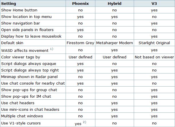
Note: Phoenix does not mean the Viewer will present a Phoenix / Viewer 1.x-style interface.
Preferences
Firestorm’s preferences have had a major overhaul, with many options being more pragmatically grouped and thus hopefully easier to find. I’ve tried out outline the key changes below. You can also find a quick reference table to the changes in the Firestorm wiki.
General
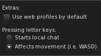
The general tab now includes and EXTRAS panel that allows you to:
- Select whether the Viewer display your own or other people’s in-world profile or your / their web profile
- Whether the WASD keys will move your avatar or focus the cursor on the chat bar (also found in the Chat tab).
Note: By default, Pressing Letter Keys is set to START LOCAL CHAT for the Phoenix mode, but set to AFFECTS MOVEMENT for the Hybrid / V3 modes.
Chat
The Chat tab rationalises the majority of options associated with setting chat preferences. As well as presenting the expected Chat options, the tabs originally located in Preferences->Firestorm->Chat (General (renamed “Firestorm”), Radar and Keyword Alerts). This tab also includes:
- Popular chat log options also found in Preferences->Privacy
- The option to auto-hide the main Chat Bar
- The new Viewer translation tool options
- A Notifications tab, allowing you to define how IM and Group Chat notifications are handled using either the Viewer 3 pop-ups an/or in the chat console (i.e. lower left-hand corner of your screen, as per Phoenix / Viewer 1.x)
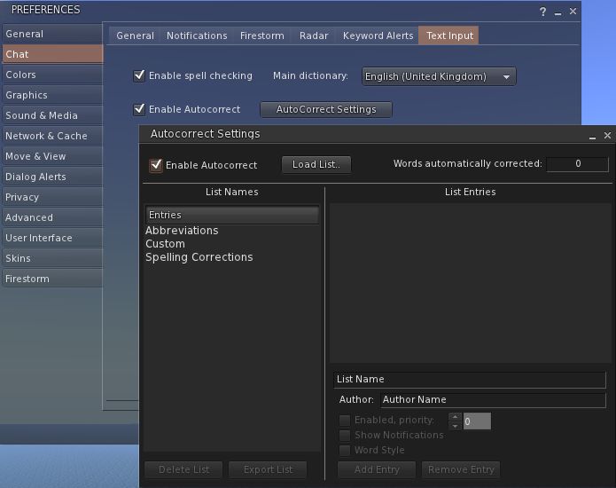
- A Text Input tab comprising the Spell Check and AutoCorrect functions
Graphics
The graphics tab see the arrival of a FULLSCREEN mode for Firestorm. The option requires a restart to take effect, but renders the Viewer beautifully on screen without the usual application window.
Sound & Media
The Sound & Media tab has been refreshed, splitting media and Voice functions into two sub-tabs: General and Voice Settings. The General tab now includes the Media Audio Rolloff Distance settings originally located in Preferences->Advanced.

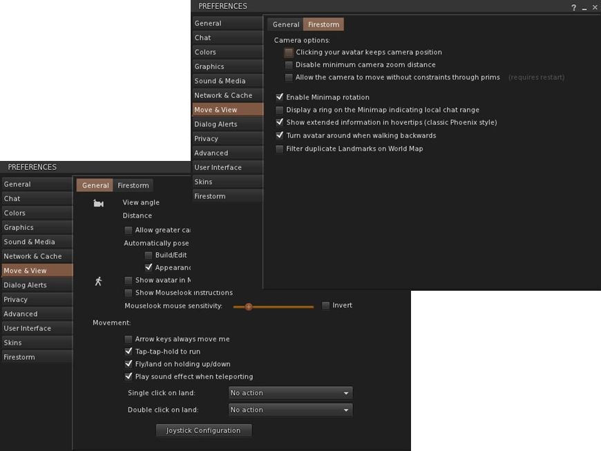
Move & View
The Move & View tab includes the Viewer 3.2 “click-to-move” functionality (which will reverse avatar mouse steering if you use it!), and moves the Firestorm Camera options originally found under PREFERENCES->FIRSTORM->VIEW to a new sub-tab called Firestorm.
Privacy and Advanced
The Privacy tab is rationalised so that LookAt options are now located on their own sub-tab, including the LookAt Target option originally found in Preferences->Firestorm-General.
The Advanced tab has been reduced to the Viewer / grid / Advance / Developer Menu options.
User Interface
Originally called UI Extras, this tab now:
- Includes the UI Scaling slider (originally in Preferences->Advanced)
- Includes the lag meter check box (originally in Preferences->Firestorm->General)
- Includes the Avatar Head movement options ( originally in Preferences->Firestorm–>Avatar)
- Allows both script dialogue and Group notices to be displayed in the top right of the screen a-la Phoenix / Viewer 1.x.
The Font tab has been expanded to include options to adjust chat line spacing and folder item height.
Firestorm
The Firestorm tab has undergone significant changes
- The General sub-tab has been rationalised as a result of options being either moved elsewhere or dropped
- The Protection tab now include the Phoenix Spam Protection options
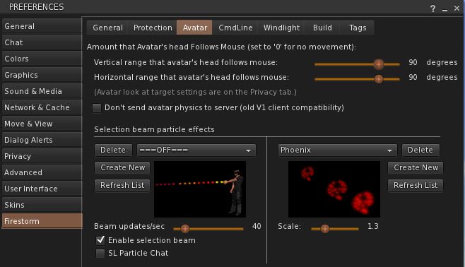
- The Avatar tab replaces the View tab and combines the Avatar Head movement options with Selection Beam Particle options
- The Windlight tab includes additional options for accepting region settings and cross-fading changes.
Chat Bar and Chat
The Chat Bar now includes two buttons: the first opens / closes the Nearby Chat floater, while the second opens the Conversations floater. However:
- If the Nearby Chat floater is docked with Conversations (as it is by default), then both will appear to perform the same function.
- With Nearby Chat undocked, Conversations opens to display your Contacts.
New Feature: Hiding the Chat Bar
Like Phoenix, the Firestorm Chat Bar can now be hidden:
- Go to Avatar->Preferences->Chat->Firestorm and check AUTOHIDE MAIN CHAT BAR
- The Chat Bar is now hidden.
- To access it, tap ENTER – the Chat Bar will open at full window width
- Type your text and press ENTER – the text is sent and displayed in the chat console or Nearby Chat (if open)
- If you open the Chat in error, simply tap ENTER or ESC to close it without typing anything.
If you prefer, you can set the Chat Bar to open as soon as you start typing:
- Go to Preferences->General->Extras or Preferences->Chat->General and make sure PRESSING LETTER KEYS is set to STARTS LOCAL CHAT
- Pressing any letter, number or character key will now open the Chat Bar and capture your typing
- As above, pressing ENTER will both display the test and close the Chat Bar
Note: setting this behaviour will disable the WASD keys as avatar movement keys.
To disable Chat Bar hide, the feature, go to Go to Avatar->Preferences->Chat->Firestorm and uncheck AUTOHIDE MAIN CHAT BAR. Remember to reset your the WASD functions, if required.
Additional New Chat Features
There are two further new chat options in this release:
- Visible hint for when someone is typing: go to Preferences->Chat-> and check SHOW TYPING INDICATOR IN BUBBLES… tags will update to show if someone is typing, even if they have the typing animation turned off
- You can display an optional channel selection box in Nearby Chat. Go to: Preferences->Chat-> and check SHOW CHANNEL SELECTION IN CHAT BAR

Chat Echo Fix
In previous versions of Firestorm, both the chat bar and Nearby Chat would echo whatever was typed into the other. This has been fixed so that text can be typed separately into each.
Camera Floater
 The Camera floater used within the Phoenix /Hybrid modes has been refined, with the view buttons (rear, front, 3/4s, zoom & Mouselook) now along the top of the floater. This makes the floater more compact, by some may find it harder to reposition once undocked from the toolbar as a result.
Quick Preferences
The Quick Preferences button now includes options to turn name tags over avatars off / on, and a time-of day slider for altering the region daylight in your own Viewer.
Mesh Uploads
One of the most eagerly-awaited capabilities within both Firestorm and Phoenix is that of mesh object uploads.
This release sees Firestorm gain the capability, thanks to Nicky Dasmijn. The upload process uses the latest Viewer 3 upload window, and while I am no mesh expert, it appears to match the official Viewer in terms of smoothness of operation.
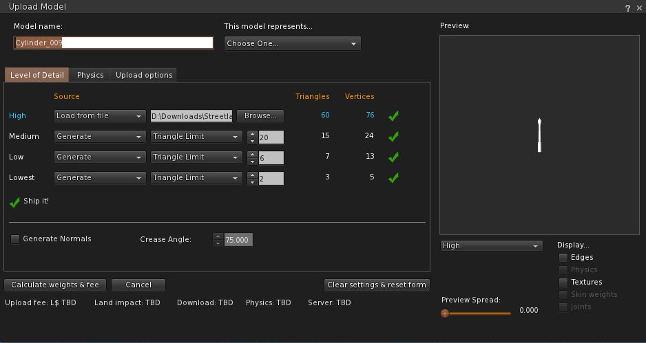
Note that the upload feature includes the fix for CTS-627 (Mesh upload crashes Linux).

You have done a great review and Firestorm team has put out a product that I am so happy with from what I have seen tonight.
Three cheers woooot
LikeLike
do you Have to bash Linden Lab to promote another viewer?
that is so immature, how about if LL would do the same every time they release a new version? “we added this new features and the other third party viewers suck because they dont have them yet!”
to bash the competitors is a very low form of promotion, the good features should be enough to make a product likable, if you have to recourse to bad talk the competitors to be liked, it means youre not good enough.
LikeLike
I disagree with you, Canoro. Inara’s being extremely fair with her assessment of the Lab’s behavior and misbehavior when it comes to viewer development. I myself have been way less patient when it comes to the SH-2240 and SH-2276 frustrations as well as the many steps backwards with V2 and V3 before the customizable trays and sidebars release came. (It still pains me to read the comment on the Metareality Podcast site where I suggested LL look at the handy Quick Preferences in Phoenix for Windlight settings changes and a Linden pretty much went “duh… what’s that?”)
Not only is this a good overall look at Firestorm’s new and revamped features, but it’s helpful in re-setting up my Firestorm now that the OpenGL patches are in place and kicking ass.
/me salutes
-ls/cm
LikeLike
I’m not bashing or promoting. I’m pointing out what I consider to be a shortfall in the official Viewer that Firestorm has rectified (as do other TPVs).
One of the most important items of information we need to have is the current status of the Grid. If there are in-world issues, then it is entirely possible that people may not only be inconvenienced by failed teleports – they may actually lose No-copy items should they attempt to rez them in-world; they may well suffer L$ errors such as failed L$ purchases that take time to rectify (and which would have been avoided had they had fair warning of issues), and so on.
As such, having links to the Grid Status Update Page makes sense – it is an additional line of defence that allows people to readily see what going on with the grid and make an informed assessment as to what they should, or should not, consider doing when in-world. Further, it serves as a pointer to keep one eye on the Grid Status Page itself to check the on-going status of issues, or to see if they have been resolved.
Linden Lab used to support this, but in their wisdom, they removed the capability from their Viewer log-in screen a long time ago, and have repeatedly ignored requests that it be returned. At the same time, they’ve ceased giving in-world notices when widespread issues impact the grid, and they’ve become more sporadic as to which grid updates make it to people’s Dashboards.
You may not like the fact that I’m calling LL out on shortfalls, but I’m afraid that’s a matter of perspective. However, I see absolutely nothing wrong in pointing out an issue that is so intrinsic to people’s use of the platform. I’ll continue to do so, where and when appropriate – the same way as I’ll continue to give credit to LL where and when appropriate, as I’ve actually done in this review as well. Twice.
LikeLike
What with the OpenGL fix (for my GTX460 SOC), a spell checker, the ability to dock Nearby Chat to Conversations, the chat echo fix, “C” and “P” returned to the build floater, the Inventory “jump” fixed – using this viewer over the Lab’s official viewer is a no-brainer for me.
And that’s without even mentioning any of the other enhancements and benefits.
Thanks for this review and thanks to the Firestorm team for developing a viewer with SL *users* in mind.
I look forward to downloading and putting it thro’ its paces when I get home this evening.
LikeLike
I dunno why they have named a mode: “Phoenix” mode…on their Firestorm viewer, if it’s not actually Phoenix – That’s rather misleading.
“Yes, the UI isn’t V1.x, but that shouldn’t be a reason not to change – or anything to stop you.”
You do realize that is the very reason a lot of people are NOT changing? It sort-of felt like you knew from this and earlier posts, but now I’m rather curious.
LikeLike
I do realise, and frankly, speaking as a die-in-the-wool Phoenix user (up until the arrival of Firestorm), I have difficulty in understanding the stance people do take.
Certainly, when V2 first came out there were huge issues relating to usability – as this blog shows, I was highly critical of the Viewer, as many were – and rightly so.
However, the V3 codebase we have now is *not* what was delivered 18-20 months ago. Yes, it took LL an inconceivably long time to come to their senses, but the basic code has improved, the UI has improved, etc. On top of that, the Firestorm team have gone to extraordinary lengths to provide the kind of functionality users have been demanding, and do much to improve the look and feel of the UI to the point where – if one looks at the two UIs totally objectively, Firestorm offers by far the more customisable experience than the V1 UI, and offers greater span for intuitive use for those coming into SL for the first time.
On top of that, they’ve now added a means by which Phoenix users can now start-up the Viewer with as many of the same Phoenix start-up defaults as possible – hence the mode name. For that, I think they are to be roundly applauded.
If there is an unwillingness to engage in the Viewer simply because the buttons aren’t in the same place or look the same and/or use icons ranther than words, or menu options have moved, then I hate to say it, but that’s not a user interface problem – that’s a user problem. And with the best will in the world, the Firestorm developers cannot solve that.
As Jessica herself has stated, and many have commented (and Oz Linden has warned), there is a lot coming in to the V3 code base that is not being integrated into the old V1 Snowstorm code (which has been untouched by LL in something like a year now). Ergo, for SL-centric Viewers are concerned, it it a lot easier for developers to build on the current Snowstorm code from LL, rather than to constantly have to backport features from that code and try to integrate it into the V1 code.
So long as Linden Lab don’t slam the door on external code development, the trend of Viewers like Firestorm and Exodus (with its enhanced combat and graphics options) remaining well head of the curve in terms of delivering an all-round user ecperience that includes the majority of features and functionality coming out of both LL’s and TPV dev environments. Ergo, to me, it makes sense to give Firestorm a decent try.
People have nothing to lose, and quite possibly everything to gain.
LikeLike
The usability hasn’t changed all that much from v2 to v3, that’s why people still have the same opinion on new viewers using the v3 codebase…
The v3 UI is essentially very very similar to the v2 ui, clearly enough to discount it as more or less the same. Moving the new v2/v3 hard-to-see/hard-to-click buttons from inside a bar at the bottom, to floating at the bottom (or now you can make them float on the sides too) is a minor visual change. The notices are still quite hard to see (especially if you play in darker areas).
The sidebar is something that simply should have never existed, so they get no points for removing it and returning to…You guessed it…V1-styled with some minor v2 tweaks added.
Small, dark, textless-by-default buttons are not intuitive – Both for computer-savvy users, and especially those who don’t use a computer too often. This isn’t Firestorm-teams fault, they’re doing the best they can with the half-dried Playdoh they were given – I’ll applaud them for their efforts, it’s definitely the best V3 out there.
– Unable to find option to change buttons (I can add/remove, I swore v3 had add-text-to-buttons)
– All chatbars are in the lower left
– Notifications are still incredibly hard to see (playing with different colour schemes takes a long while)
– Still lacks IM pop-ups
– No friend notifications
– Search still looks ugly (LL’s fault), but has to ‘load’ every single time.
– Top menu bars are still messy (LL again)
– Still a little lost in preferences, stuff is hard to find, but I like the level of options
– Rather ugly minimap colours I can’t seem to change
– As above, some weird/ugly colour choices on things you can’t change, or have to completely change the entire colour scheme
– The minimalist theme LL is going for is…unsurprisingly, lacking.
– I’ve flipped thru all 3 of the styles, and the only one that appears different is V3, because it has the sidebar, which is even more strange…because V3 was heralded for REMOVING the sidebar.
I’ll emphasize that Firestorm did a fantastic job, and I’m impressed with a lot of the fixes they did, but that’s just a shortlist of only-UI issues keeping at least me on the still-superior V1 TPV’s.
LikeLike
That’s where we’ll have to differ. I find (eyesight and all), easier on the eye. Buttons are cleaner and better-presented and allow doe more functionality to be accessed via a single click. Menus are far be presented in terms of coherent information; the minimalist approach gives a feeling of a larger amount of space for my in-world view. IM toasties can be a pain, but take a minor amount of adjusting to (and now you get to have V1-style IMs-to-chat console, so the best of both worlds).
The three modes aren’t designed to be visually different – they refer to the defaults used. Phoenix reverses the standard V2 defaults and present V1 defaults (pie menu, group notices and script dialogues to top right corner, use of the chat consle for IM notifications ,etc,). The V3 mode presents the V2 / V3 defaults. Hybrid (my personal preference) sits between the two.
As to the Sidebar – it is there because this release is based on Snowstorm code that didn’t have the new button-lead UI. However, you can expect to see the V3.2 button-lead UI in the near future.
At the end of the day, one’s preference for the Viewer is as much a subjective matter as it is objective. What you view as poison, I enjoy; what I see as anathema (V1.x’s untidy UI, the wasted space, the sprawling menus, the awkwardness of the pie menu which can take 3 or 4 clicks to reach a function where a context menu takes two…or even one) you see as a blessing.
I merely encourage those that have been curious about jumping the chasm to give it a go; Firestorm goes as far as possible to make it painless.
LikeLike
I’m not sure what skin you’re on, but much of it is harder to see, and some of the other skins I tried were downright ugly.
I don’t know how 1/4th the size buttons, without text, and semi-ambiguous silhouette images is ‘cleaner’? I tend to find them hard to see, and hard to click. I don’t find their functionality more functional to current v1 TPV’s. The menu’s are too many, too long, and basic stuff (Like uploading) has been hidden away – That’s LL’s fault, but hiding common tasks is not sensible.
The minimalist approach shows itself to be a lot more cumbersome, because you end up having to go searching through things to find what you want. Unless you’re playing on a cell phone screen, you can afford 1/6th of an inch here and there. Floaters are easily hide-able in V1 viewers thru one or two easy keystrokes, and ta-da, you have your full screen available.
vs.
My floaters are not the same size, obviously, but the top bar is the same width (top to bottom). The size difference between V1 and V3 on my 19.5 inch screen is about… http://i41.tinypic.com/28084n8.jpg …~5mm (about half a centimeter). I now regret using the term minimalist, because the difference is tinier than the diameter of your pupil.
The IM-alert thing needs to be reverted back, LL has been on a quest to make chat and mingling much harder, and I hope a TPV brand can fix it – They’ve gone leaps and bounds beyond LL (like bringing Mesh to V1, which LL said would either break v1 or simply not be usable)
I probably should’ve read up on the differences between the modes, I thought they were intended to be visual, but I did notice the preference differences (say that ten times fast).
I agree that preference comes down to the user, but the reasons are sort-of dwindling now that I’m breaking it down.
I’m not telling people to go tell the FIrestorm team that they’re wasting their time, and to quit – But that the V3 viewer is a slight improvement of a terrible (v2)iewer, and still has a way to go, the Firestorm viewer taking a bigger step than LL initially did. I applaud the Firestorm team for working hard to bring back proper functionality, and I hope they’re given better code to play with soon – Just waiting…and waiting…and waiting for LL to continue this path of bringing back the right UI & functionality. (This is intended to be a reply Inara Pey, but won’t let me for some reason)
LikeLike
Well have to agree to differ, I’m afraid.
And with respect, the majority of your comments demonstrate the subjective nature of Viewer usability.
Things hard to find? I can lay the same claim at the Phoenix /V1 UI’s door; to me it is cumbersome, untidy, confusing and very much gets in my may.
Menus? Well, both actually have the same overall number of menus (9). However, to me, Firestorm wins hands down as the menus more logically group functions by operation (so my account info, the options for me to run a character test (in the event of a severe bake fail), and so on, are all under Avatar – no more hunting around View or Advanced or whatever).
To me, the massively-rationalised Preferences in Firestorm win hands-down over V1 / Phoenix, again becuase options are more logically grouped and displayed.
Again, this may well mean things have to be re-learned – but as I said, that’s not a failure of the UI.
IM alert needing to be moved is also subjective; to me, havng them appear in the toolbar and actively indicate who is IM’ng me / replying to IMs is an absolute boon over the V1 approach.
Of course, theree is functionality missing from Firestorm – just as it has added functionality Phoenix / V1 lacks.
So the argument becomes circular, and could go on ad nuseum. Am I advocating people should abandon Phoenix? No. What I am saying is that with this release of Firestorm, and for those that are curious, there’s never been a better reason to give it a go.
LikeLike
And in the end, there’s not much there for the borderline or the curious. It may be the best V3 viewer out there, but it’s still a v3 viewer v:
LikeLike
It’s V2/V3 based, yes, but the rest is subjective ;).
LikeLike
I dunno what’s subjective about the last thing I said O.o
LikeLike
Personally we waited a long time for the phoenix team to move things around in Preferences?
Mesh uploads and Spellchecker was expected as was the translation tool, due to Googles changes
only thing worth having from this release is the ability to refresh a single texture, that stays grey sometimes.
There was so much more they could have done, specially in the time they had!
They need another release or 2 before they even match the normal viewer supplied by LL
By which time Linden Labs will have rolled another out probably
The problem with making the public wait eagerly for something for so long, is it has to be amazing!!
Bit like when i waited 17 years for the new Guns n Roses album Chinese Democracy, that wasnt worth the wait either.
sorry to be so negative, its just my opinion
LikeLike
You have not even the faintest clue just how much work went into this release. We had a pile of work to do just straightening out the bugs that were in the Mesh Beta. Then we added a huge number of UI changes on top – dialogs in the top right, something that’s been at the top of everyone’s wish list since V2 first dropped!, just for one example – and fixing LL’s bugs too. Then we spent time testing and integrating the fixes from the OpenGL rework that made sense and didn’t cause bigger problems. Test, rework, test, fix, test some more, all by a team of volunteers who, for the most part, have paying jobs.
If you want Linden Lab’s viewer, you know where to find it.
LikeLike
Quote: “Then we added a huge number of UI changes on top”
Really, looks the same to me? only thing that looks different is the preferences.
Quote: “dialogs in the top right”
I used Emerald, then Phoenix then Firestorm….What Dialogs?
Quote: If you want Linden Lab’s viewer, you know where to find it.
This is true…..Its the thing i had to install because you was playing with preferences and i wanted to upload Mesh.
LikeLike
Hide the chat bar; switching WASD modes; new mouselook view options; integration of spell-check with UI chat and notecard windows; incorporation of additional right-click functions; improved search capabilities in Inventory; client-side typing hint; changes to the Map functionality (hide the legend / search / text area); updates to Quick Prefs; integration of Mesh Upload window; ability to adjust worn attachments via edit menu; additional keyboard shortcuts; radar updates; additional Group Notice display options to mimic V1 functionality….the list goes on…
Just because a UI change doesn’t scream at you / slap you round the face in the manner that LL’s recent UI changes might have, doesn’t mean it isn’t there. Nor does it mean any less time has been spent on ensuring the change has been smoothly integrated into the UI / Viewer when compared to other more noticable changes (such as the rationalisation of Preferences).
LikeLike
Thanks very much for this wonderful review. Top job!
LikeLike
A myth “meshes can be ported to V1 look viewer”
My problem, for ppl like me, with poor eyesight, it was impossible to use Firestorm or any other viewer based on the v2 code, as the image are a lot harsh to the eyes!
Besides that the size of the letter when typing on local chat was barely impossible to see.
Do that changed?
LikeLike
Several V1 Viewers now have mesh rendering – I’ve reviewed them in this blog . Thanks to Nicky’s work, they may also shortly have mesh uploads.
Not sure what you mean by images being harsh on the eyes.
As to font sizes, But Firestorm has always had the ability to change chat fonts (Nearby Chat and console) between three different size settings. It has also more recently gained the ability to change the overall UI font (present in current Betas as well as this latest release). However, as things like menus and header areas, etc., are all somewhat fixed, there is a risk that altering fonts dramatically can lead to display /alignment issues.
LikeLike
Well, i used to ask on their forums, just the type of letter on the 1st firestorm version, when you type on local chat, it was unreadable, before you hit the enter key.
It means i was not being able to read what i was typing!
None gave me an answer to that, so i just quit firestorm 1st beta, cause it i couldn’t use a viewer that was forcing me to stress my eye sight just to see what i was typing, before i hit enter key, so not after you talk, just when you type to talk!
About the visual, well I have a 22.5 inch Led monitor, a real good one and a Nvidea gtx 580 on a pretty good ring!
All the viewers I tried, Singularity mesh, firestorm 1st beta, all have the same problem that old emerald (the 1st viewer i used) and phoenix don’t!
What i see on them on my screen, is 2 bright and harsh compared to emerald/phoenix.
not only in default but also in my light setting i use normally, nan optimal setting 1.
So I cant handle more then a few minutes using them, before my eyes start to complain.
As Singularity is a v1 with mesh ported and firestorm a v2, and as i read from others, complains about how v2 code, is terrible to users with eye sight problems (cant tell, never tried nor will, a LL viewer)
So i can be in world for more then 10h straight with Phoenix, but i can’t with any other viewer, strange but as simple as that!
LikeLike
Absolutely fabulous job on the latest Firestorm viewer. I no longer crash which makes me in heaven! I have not used the Phoenix viewer for 6 months or more and could never go back after having used Firestorm exclusively since it’s preview.
I also urge Phoenix users to now switch to Firestorm as they got it right and the time is right.
It took me 3 days tops to become an expert in the controls and preferences of Firestorm and if you set your mind positively to trying it you too will soon love it!
I would PAY to use the Firestorm viewer it is that good!
For those moaning about bashing the Linden Viewer, well the Lindens get nothing right with that viewer and it is like using a wheelchair instead of running compared to Firestorm. Prehistoric!
The future is Firestorm!
LikeLike
Is it fairly easy for me to choose one of the 3 defaults, and then alter a preference or two to get a setting that was in the others?
And lastly; does it do snapshots to profile feeds, or not yet (since that’s still only even present in the beta viewer on the official line).
LikeLike
Mode defaults: you can change most of the defaults in one mode (say Hybrid), to those of another (say Phoenix) using the table in this review, and a combination of selecting the relevant button(s), updating Preferences, and setting where you want certain panels / floaters to open (i.e. undocking them from the right side, in the case of getting Hybrid to mimic Phoenix, or placing panels against the right side of of the screen to get Phoenix to mimic (loosely) Hybrid.
To mimic Sidebar behaviour from V3 in Hybrid or Phoenix, use one of the skin options that uses the Siderbar tabs.
As to the camera snapshot floater, as buried (somewhere!) in the review, FS doesn’t have the leatest floater with the Feed option, but uses the older version with the added Flickr option.
LikeLike
Mmh. Just tested Firestorm. The first impressions were great, although now I miss the “dragging icons around” functionality of the latest SL viewers. Oh well, we cannot have everything, I guess.
I wasn’t as thorough as you were looking for all the thousands of options that Firestorm provides (it’s getting as hard to configure as… AutoCAD! But then again, that’s the whole point of Firestorm: giving you all the options you need), so I might have missed a lot.
Nevertheless, the OpenGL patches, even though they shouldn’t make a difference for someone on a Mac with an ATI card… do a LOT of difference! There is really something rotten and broken on the LL viewers for sure. I managed to get back to the usual settings I had, several months ago, when suddenly Vertex Buffers failed to work on certain combinations and performance degraded a lot, until I managed to get some acceptable settings once more. This release of Firestorm allows not only to get me back to my usual settings — including atmospheric rendering — and enabling Vertex Buffers to get almost twice the performance, so, as a result, with far higher settings than on the LL viewers, I have at least a 50% performance increase! Way to go, Firestorm team! And this is really a notable change, because the latest Mesh Beta had the same graphics limitations than the LL viewers. I guess I can put all the blame on the OpenGL bugs that the Firestorm developers managed to fix. Woo hoo!
Firestorm even managed to “survive” on ADSL connection loss. I remember taking a look at the viewer code eons ago, and this is supposed to be possible, but I never actually saw it working on either a LL viewer or a TPV. Maybe I was just lucky. But it certainly impressed me!
During an hour on a very graphically intensive location with 20+ avatars furiously typing, I just crashed once with this version Firestorm — it was one of those “spectacular” crashes when the viewer is gone in less than a fraction of a second. But I attribute it mostly to my setup and not to Firestorm.
To be honest, there are some things that I seriously like about Firestorm: the ability to view the “old” V1 profiles, which are blindingly fast (I’m quite sure that the problem with the built-in browser is on the startup routines for WebKit, which requires looking for all installed plugins, independently of which ones are used or not; worse than that, once you close a browser and load it again, WebKit will force the plugin search once more. That’s why it’s so slow. I’m sure that LL developers don’t have any plugins installed, and for them, the browser appears magically in a nanosecond, and that’s why they never figure out why the rest of the world doesn’t like web-based profiles, search, etc.). Having the option of getting the Pie menu is always fun, even though I much rather prefer the rectangles (but having more choices is good! Not everybody likes rectangles!). The chat interface is easier to use. Inventory sort order… sort of works. Well, it works better than what the LL viewer does (oddly enough, my inventory gets sorted on some computers but not on others, and this is irrelevant of how clean the cache is. Firestorm seems to provide a bit more predictable behaviour).
What I miss now is a customisable UI
And I haven’t tested uploading meshes to my own OpenSimulator grid yet. That should be fun to watch!
LikeLike
Customisable UI – in terms of V3.2 buttons – is liable to be coming. I notice some in the Firestorm team are using “Firestorm 4.0″ – which I’m *assuming* could be a pilot with the button-based UI.
Glad you’re enjoying the experience. I’ve no idea if the OpenGL issue did affect any ATi cards (I’m nVidia), but a couple of people have said that shader and other isses they were epxerienceing on their ATi-based cards have “gone away” with this release. Coincidental? I’ve no idea!
I’ve still to experience a single crash, although I admittedly do have a list of potential issues I need to check against the JIRA to see if anyone else has encountered them & reported. The “IMs and Group Chat to console” options appear to be convoluted, the Phoenix default doesn’t work as anticipated (IMs go to chiclets & no console pop-up, which isn’t “Phoenix-like” behaviour).
What does impress me is the ease with which – on my system, which has struggled in the past – manages both Linden Home sims with *both* shadows and DOF enabled on FS 3.2. The Beta releases of FS would crash within minutes on these sims, and Viewer 3 would give me an fps of around 1 or 2 with shadows enabled. With FS 3.2, I’m happily tripping around (and have even boated my way up and down a river…admittedly, paddling the boat from my Linden Home to the river probably looked odd….
LikeLike
“I guess I can put all the blame on the OpenGL bugs that the Firestorm developers managed to fix. Woo hoo!”
They simply used the fix from inside LL’s GL Development Viewer.
http://automated-builds-secondlife-com.s3.amazonaws.com/hg/repo/davep_gl-development/rev/245234/index.html
Kudos has to go to Runitai Linden 🙂
LikeLike
Oh, and it would be nice to have some user-configurable “camera presets”; I tend to be a big fan of the camera settings you’ve posted here and now use them all the time on all viewers and computers But it would be nice to be able to use them as a configurable default, instead of using the Debug Settings all the time.
I suppose I could script it, though. Hmm.
LikeLike
Still, I’m in world and don’t see more then 10 pct using either viewers then Phoenix!
Si maybe I’m on the wrong grid, as the one i use and go every day, most of users don’t give a damn about loosing their time learning a new viewer when they have one they know and it works..
LikeLike
Great review! Is it possible to copy the Firestorm preferences/configuration so I don’t have to go through the painstaking process of setting up my preferences with each of my computers? I’m guessing there is a file or two somewhere which contains these prefs, and which could then be simply copied over to my desktop from my laptop, etc?
LikeLike
You can.
The precise instructions depend on your operating system. I’ve just written a little tutorial on it :).
LikeLike
Have I proclaimed your awesomeness recently? 🙂
LikeLike
its been months since I’ve tried to put shadows…I have a macbook pro and everytime I put the shadows, it crashes isntantly 😦
LikeLike